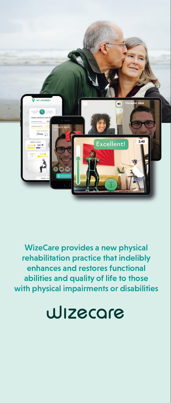
WizeCare is a leading cloud telerehabilitation platform for at-home use. Our platform empowers physical therapists to build personalized video training programs for their patients and track their progress remotely. With WizeCare, I designed for the web, mobile (iPhone android), as well as the backend for clinicians. Creating a visual language that worked for all scenarios was an exciting challenge. With WizeCare, I not only had the opportunity to make an incredible technology user-friendly but also help everyday people.
Branding
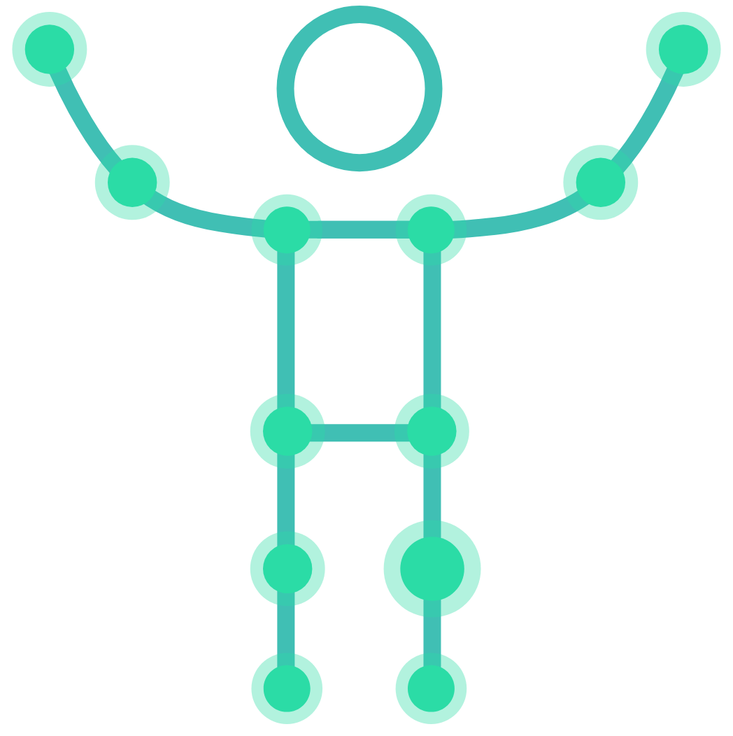
Wizecare's revolutionary MoveAI logo inspired me to use the man icon as its main logo. I used this logo, and its circles in all print materials, and web/app designs. I used two different kinds of green. On MoveAI, green meant success, so the positive view of green being used in branding made sense
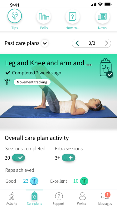
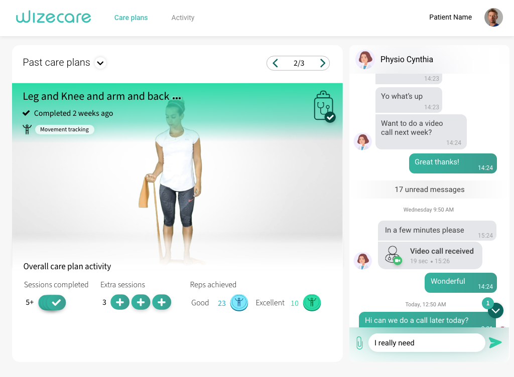
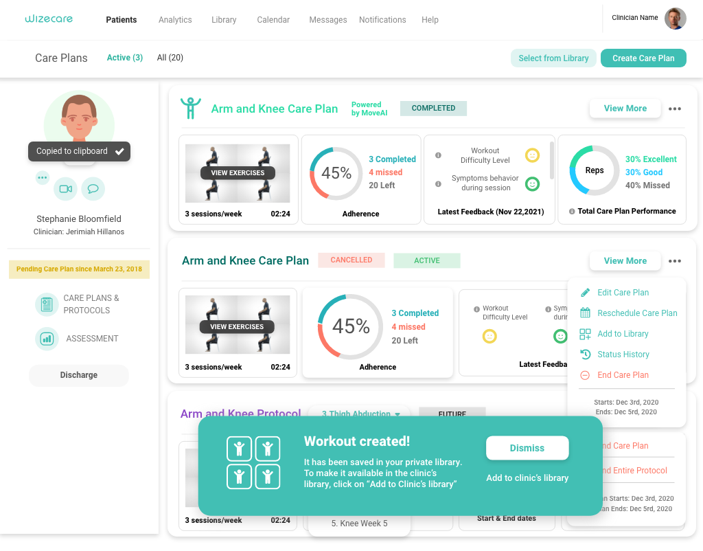
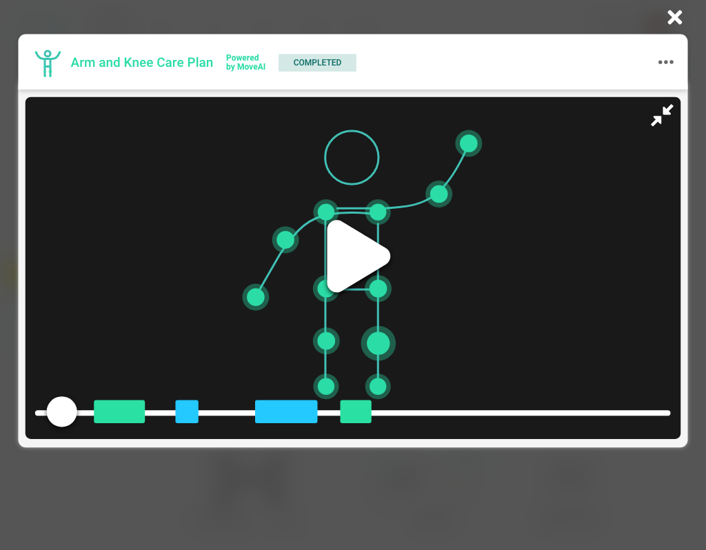
Patient care plan page final
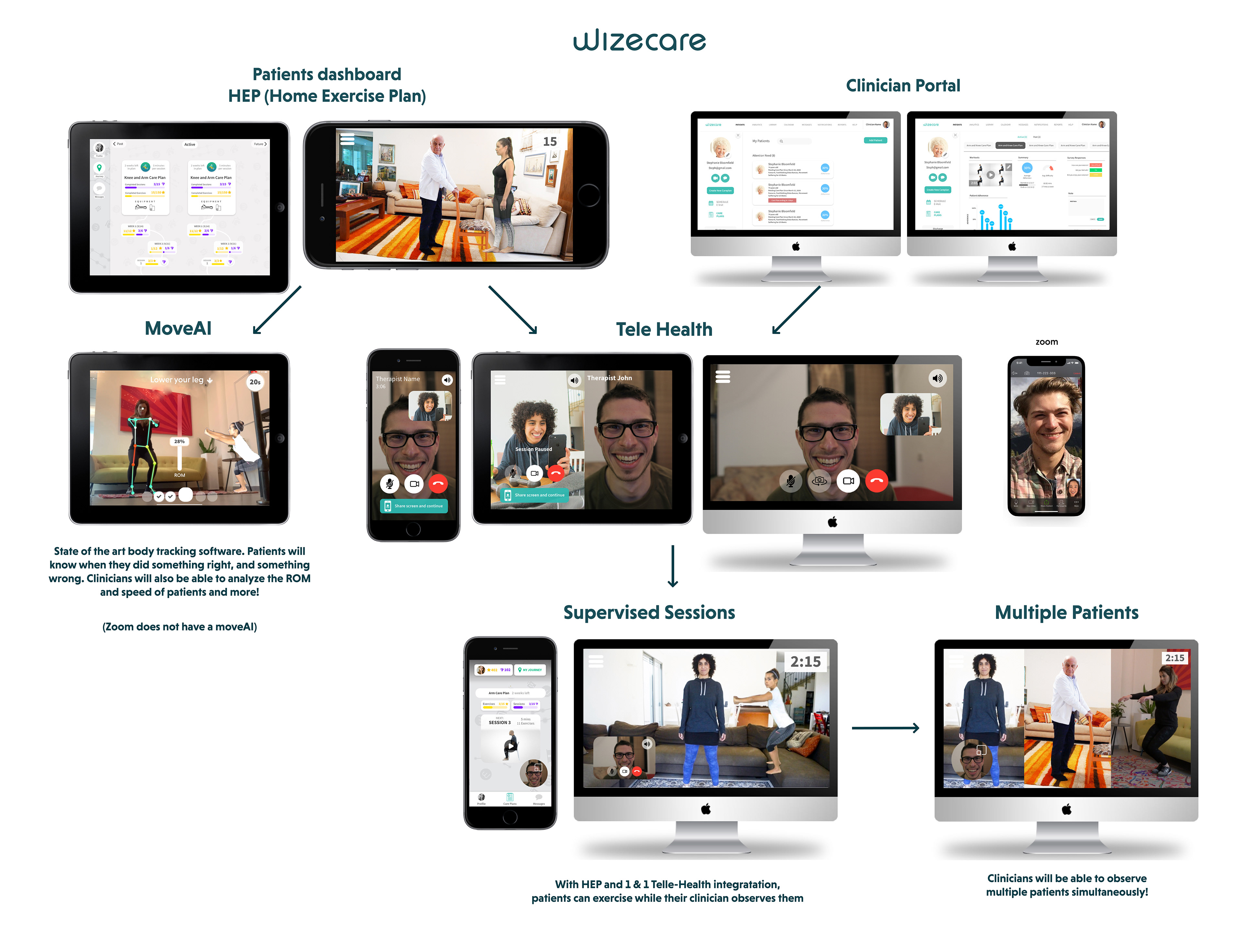
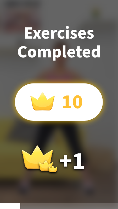
The care plan page for the patient was very important. We created it for iPad, iPhone, Android, and web. In the beginning, we had a strong focus on data, and feedback for the user. For mobile, we created a journey, focusing heavily on gamification and fun.
After some research, we learned that ease of use was the most important factor. We needed to present what the user wanted the most first, exercising for that day. Everything else was secondary. We chose to remove the journey and create a simple card layout. Having a journey (history) is still on the table for the future, but not at the forefront. We are passionate about the gamification aspects, but we felt this was too much and too quick for the users.
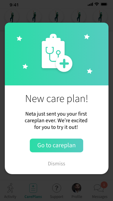
Branding-wise, because of the focus on gamification, we experimented with a fun and funky style. We later moved to a cleaner design, mostly because our users are older, and we felt like we were overwhelming them with a point system.
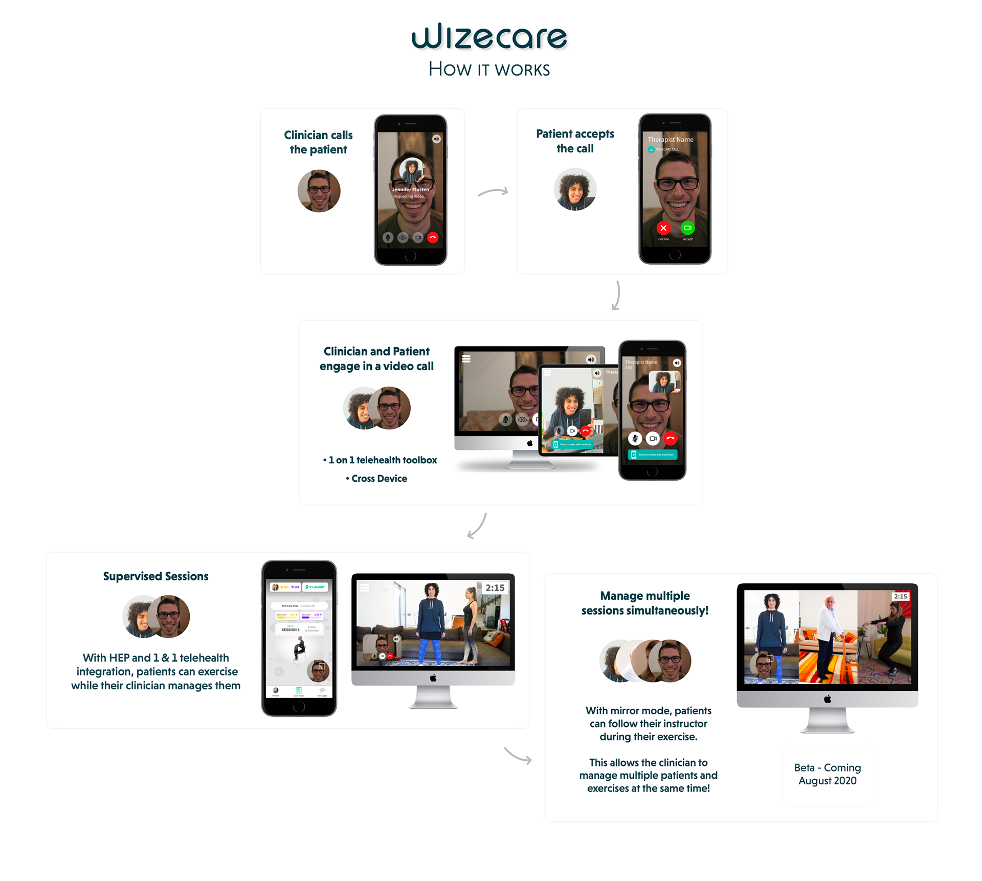
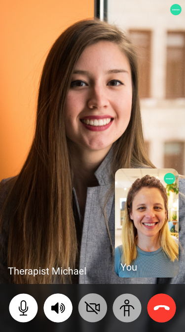
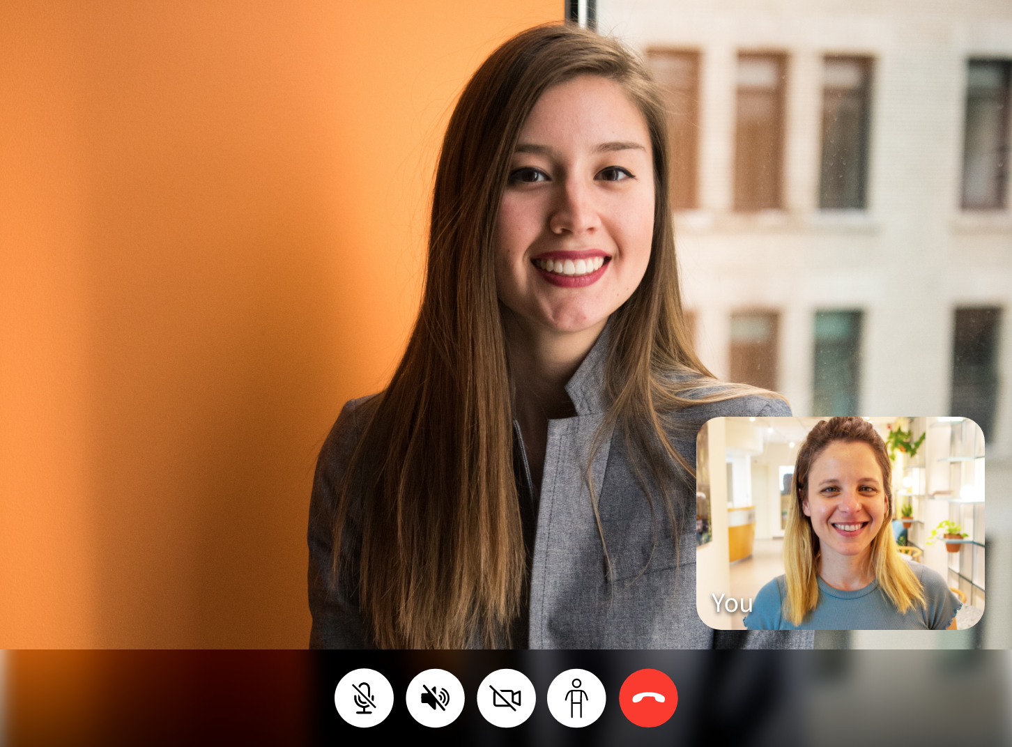
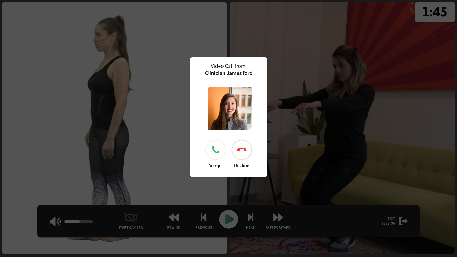
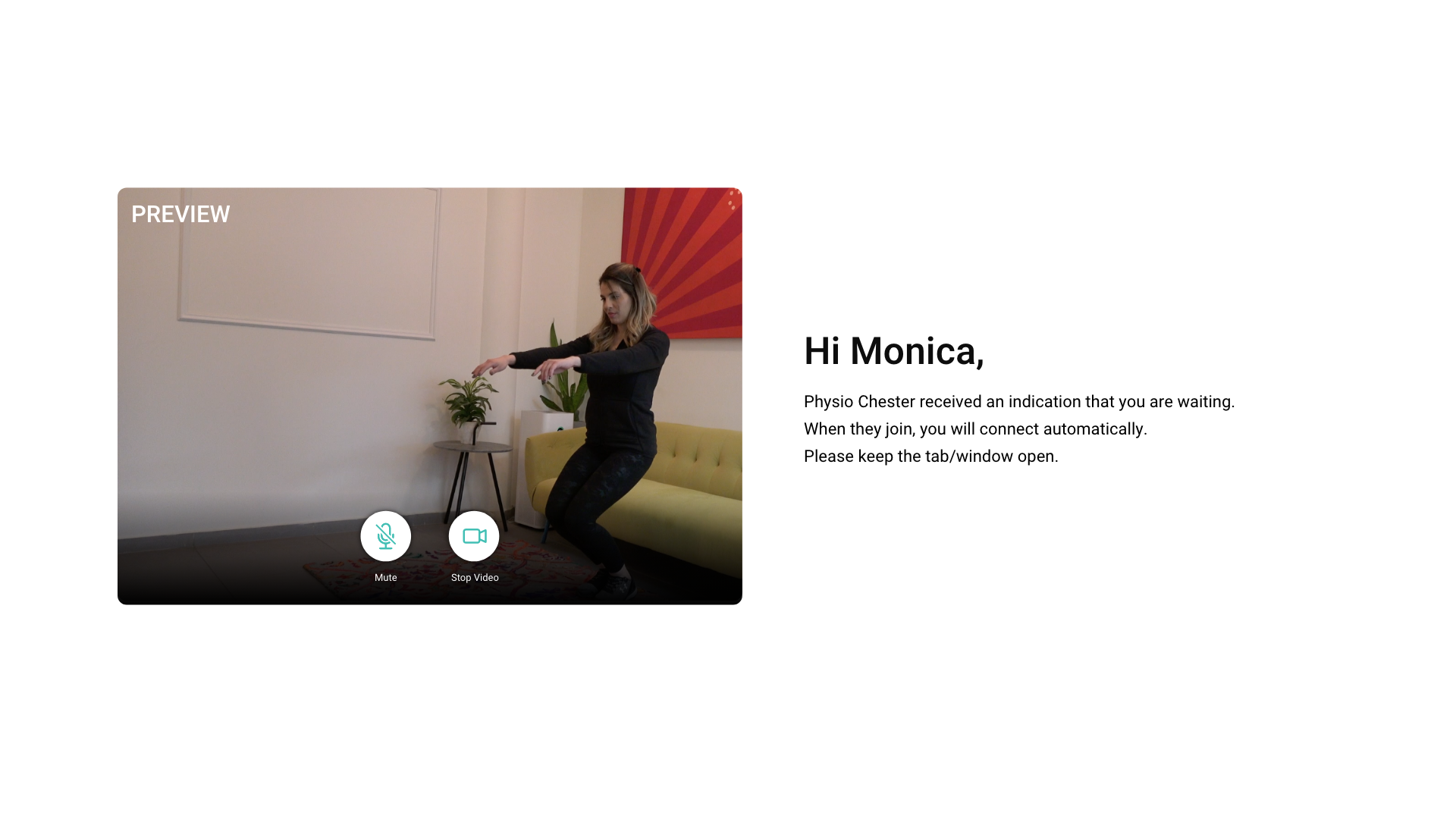
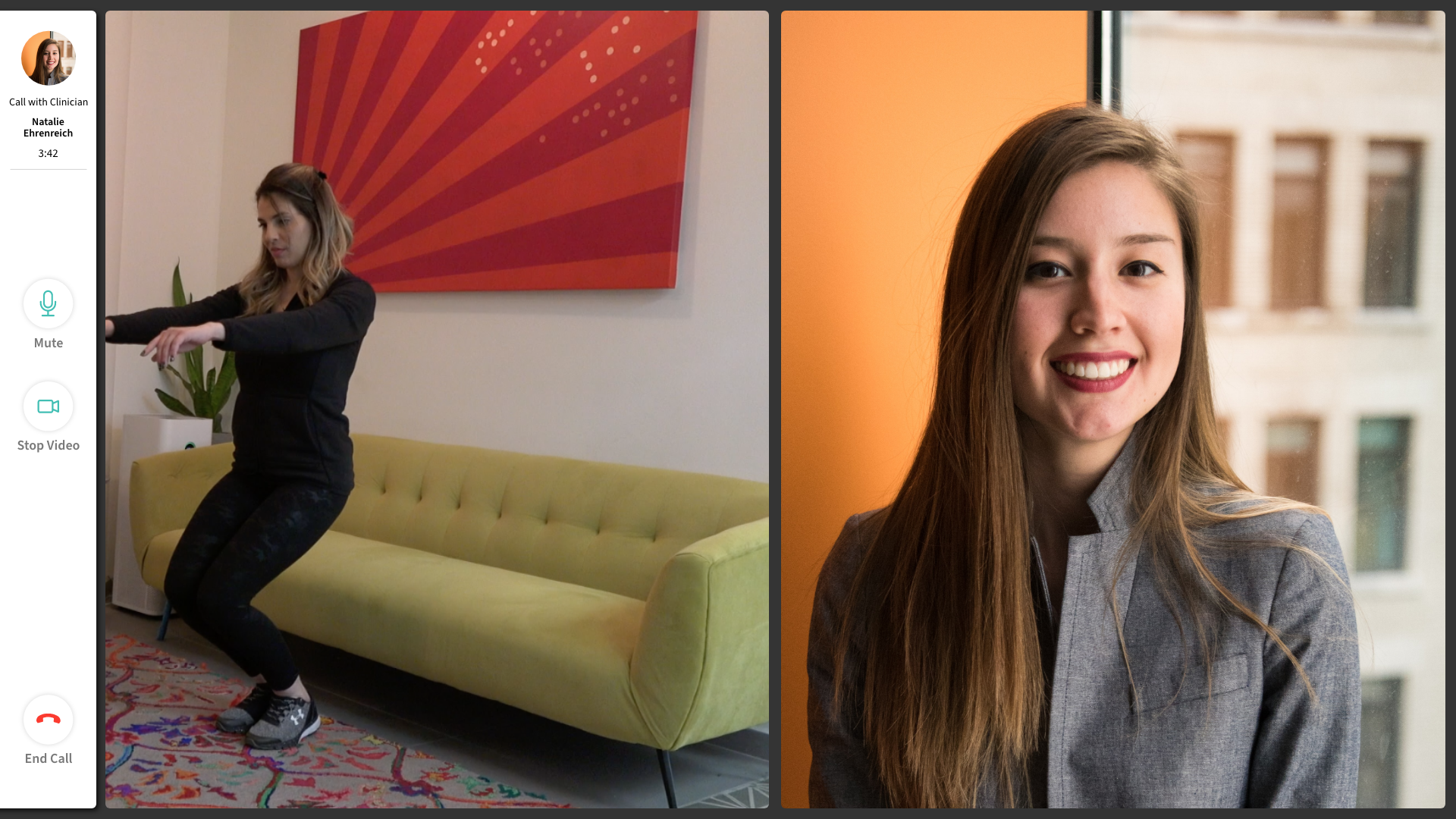
Final Video Chat/Call
All the UI you see I created. From the sound icons to the background patterns. We have video chat for iPhones, iPad, Android, and web. We initially thought about having a split-screen, but instead went with a floating video icon because we wanted the clinicians to easily see the exercises the patient was performing.
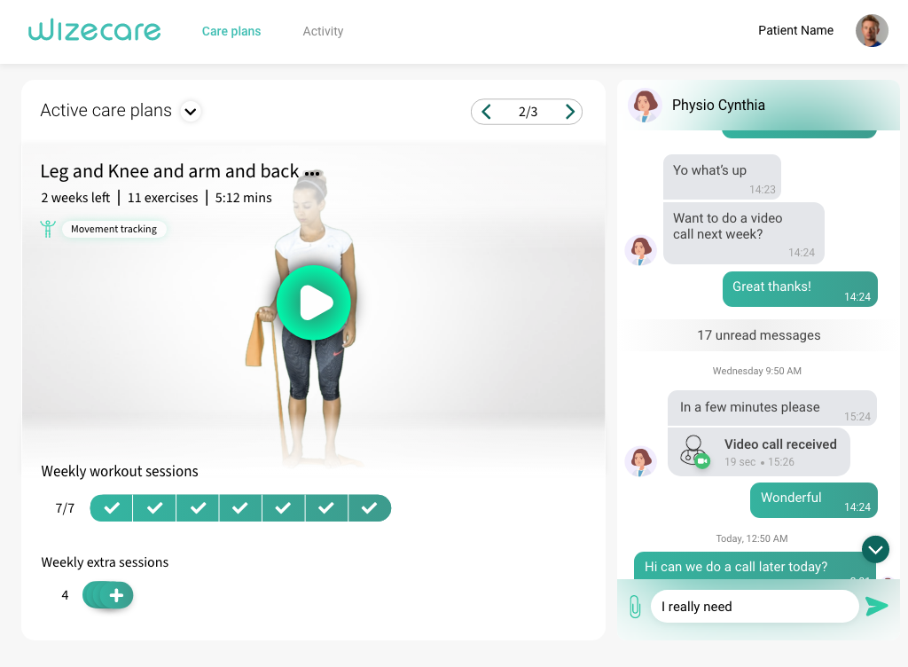
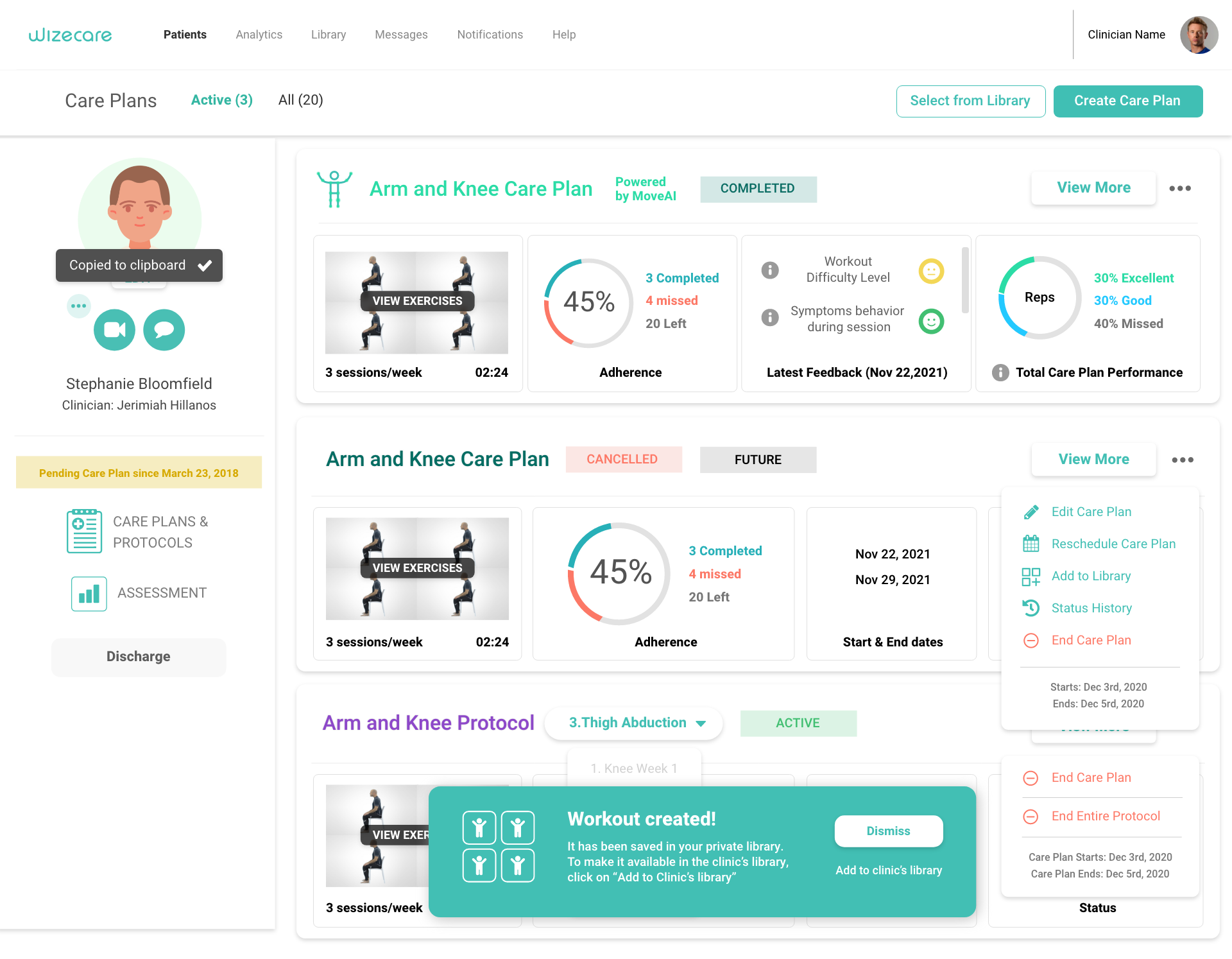
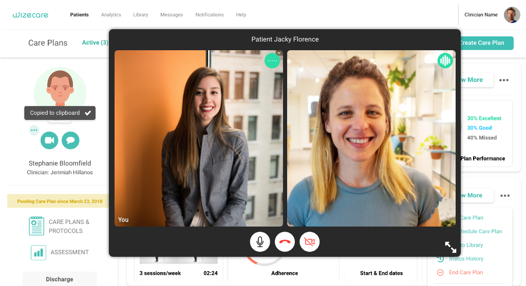
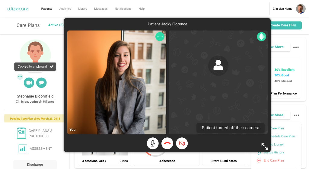
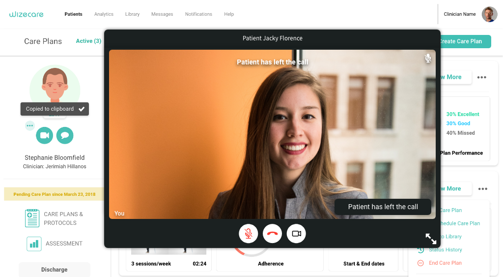
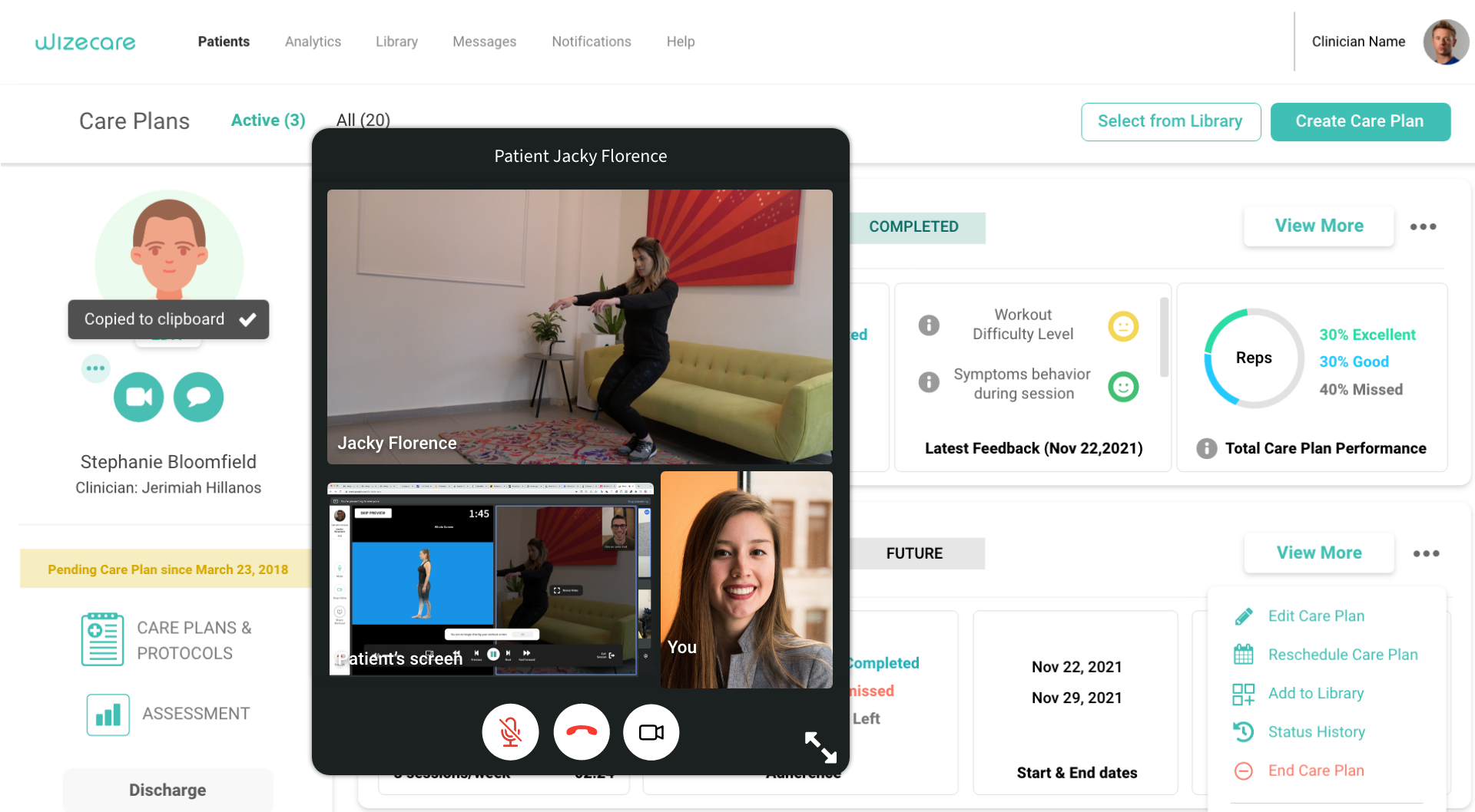
Final clinician web design
The amount of data and information added to the opening screen constantly increased month to month. Things like feedback, reps, adherence, video chat, messaging, and more were added. Another challenge was visually differentiating between move ai care plans, regular care plans, and prototypes.
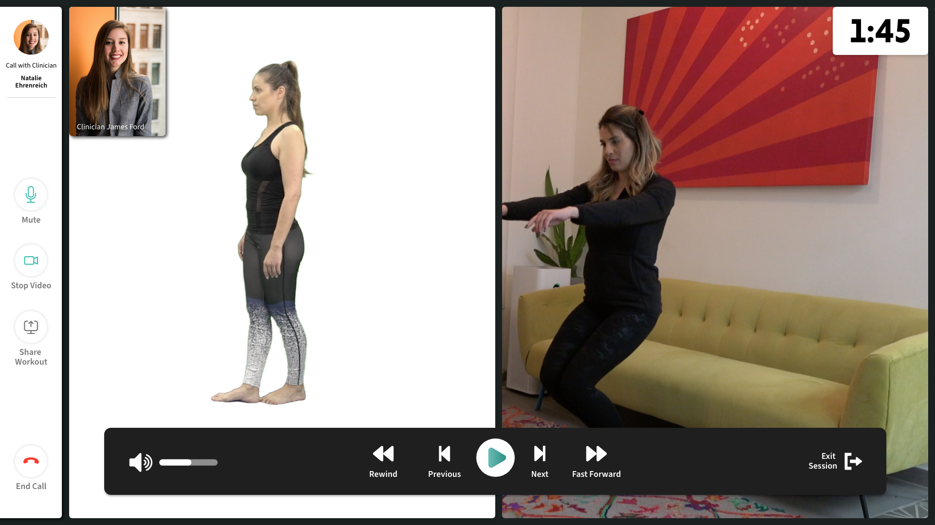
Web patient video call final design
For the web, the video chat had to be radically different. Not only would they be speaking with their clinician, but they would also be potentially exercising at the same time. I created a video chat navigation on the left side, signified with white. The bottom bar, like in other layouts, signified controls for the exercise.
Separating them was important, while at the same time making sure they felt like they were part of the same design even though they had very different functions. Everything was designed to be as big as it needed to be to ensure that the maximum space for the exercise was created.

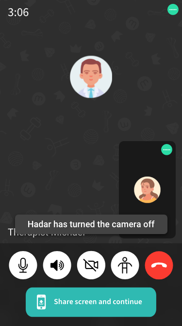
Clinician web video call
For clinicians, the video chat needed to be as simple as possible, and also size adjustable so that they can view the care plans while speaking with the patient. Our users are less technologically adept, so having large expand arrows are necessary so that user can know to use them.
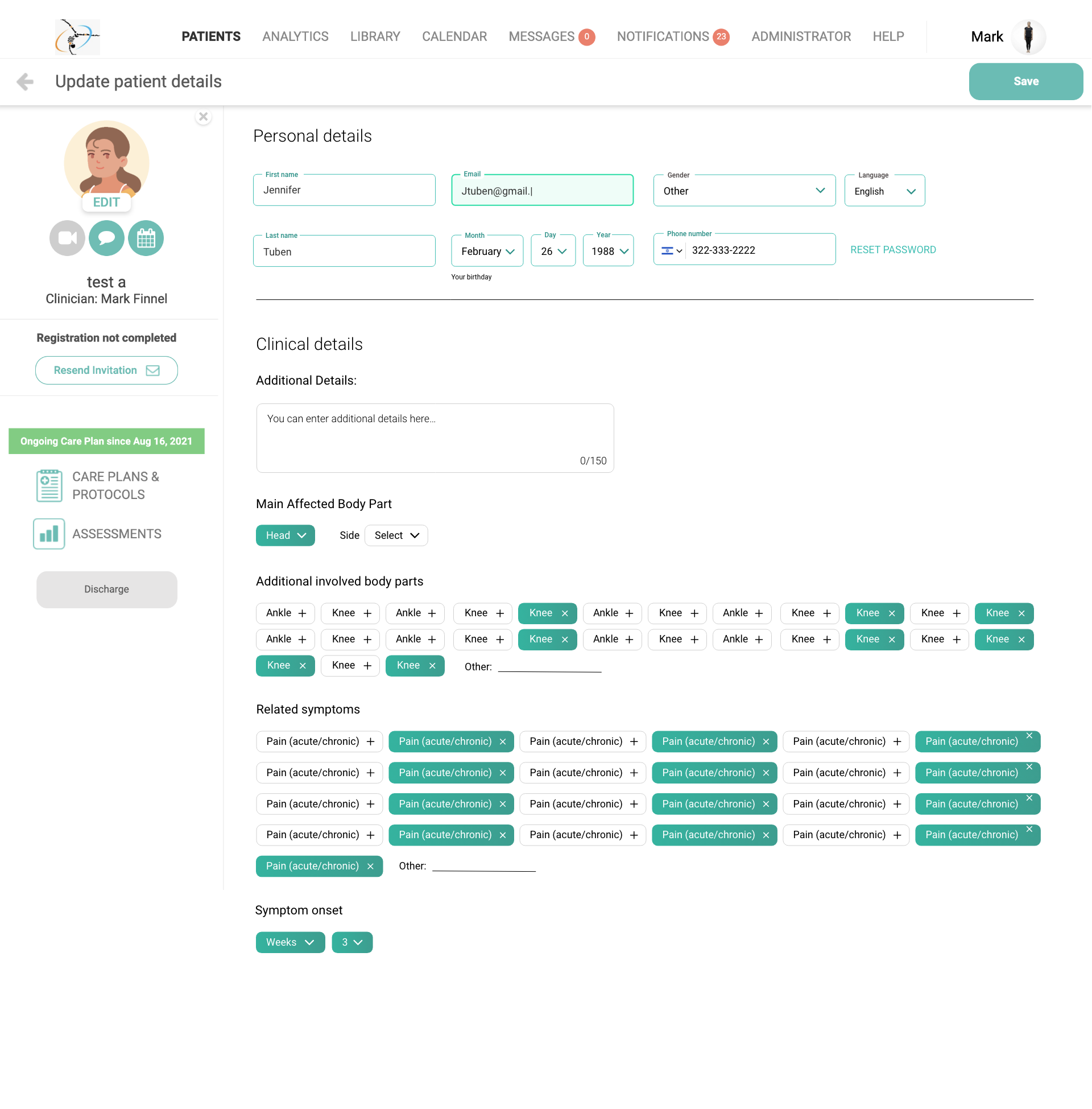
Patient details final
For forms, we decided to go with material design for these pages. One advantage is that the user can still see the name of the field when it's selected, without sacrificing space. Another is that error states take up minimal space as well. It's a clean design that we decided to use throughout the app that works for any kind of field.
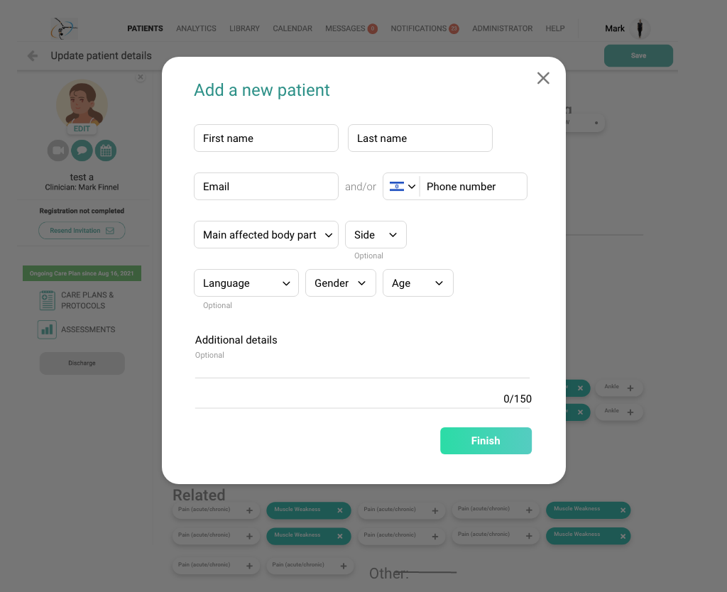
Add Patient final design
At first, the add patient was a long complex wizard with many pages. We then moved to a single popup and allowed the user to add the extra information later. I created visually appealing full-screen designs but decided to go with a simple popup design. Although beautiful, those designs felt intimidating when what we really wanted to evoke was a sense of ease.
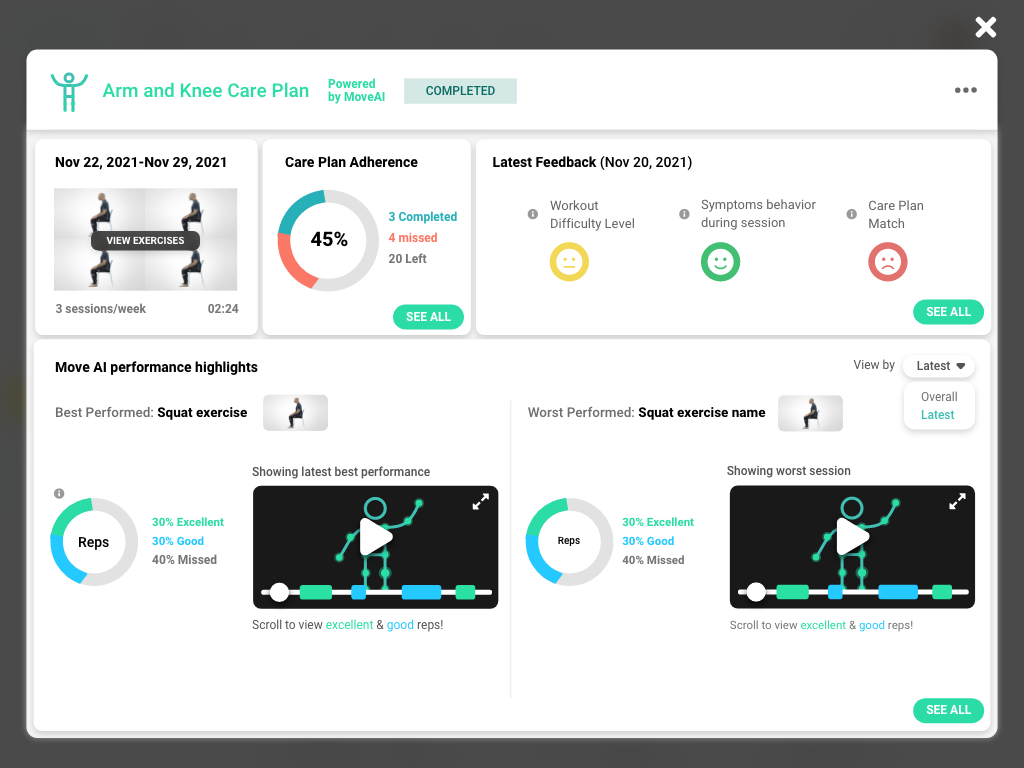
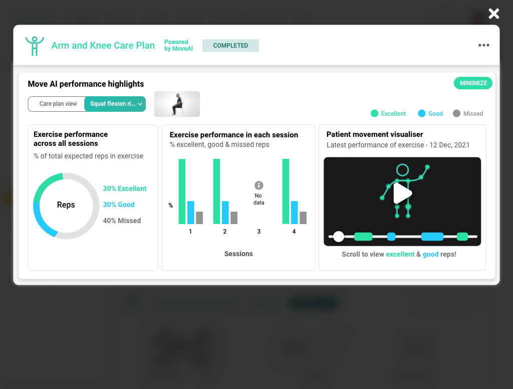
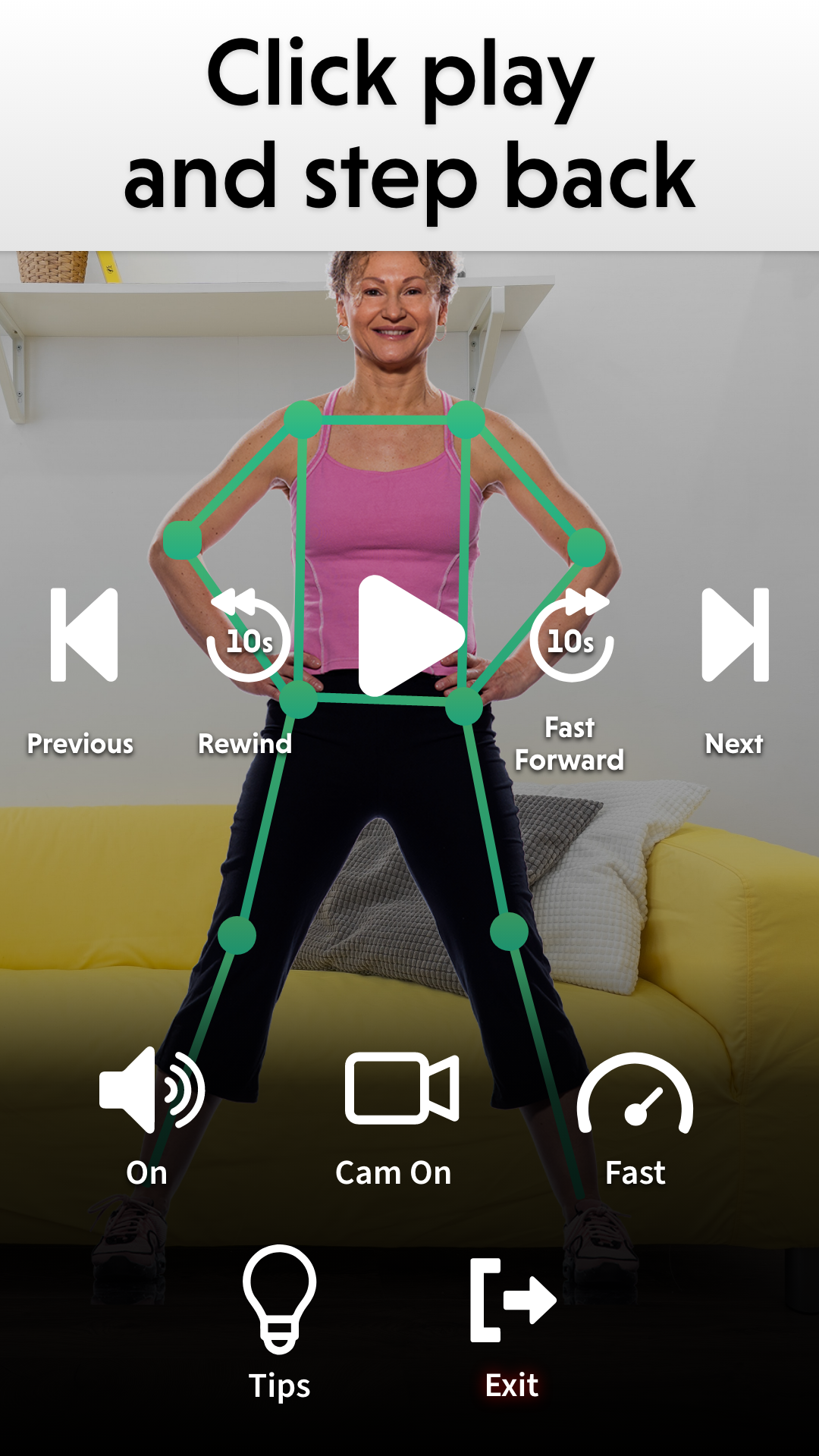
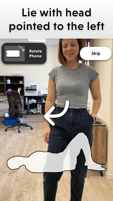
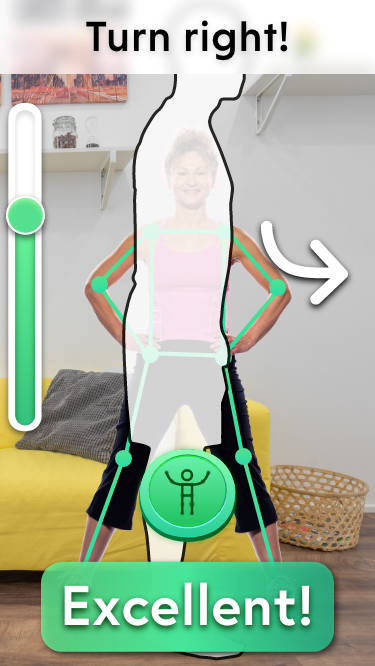
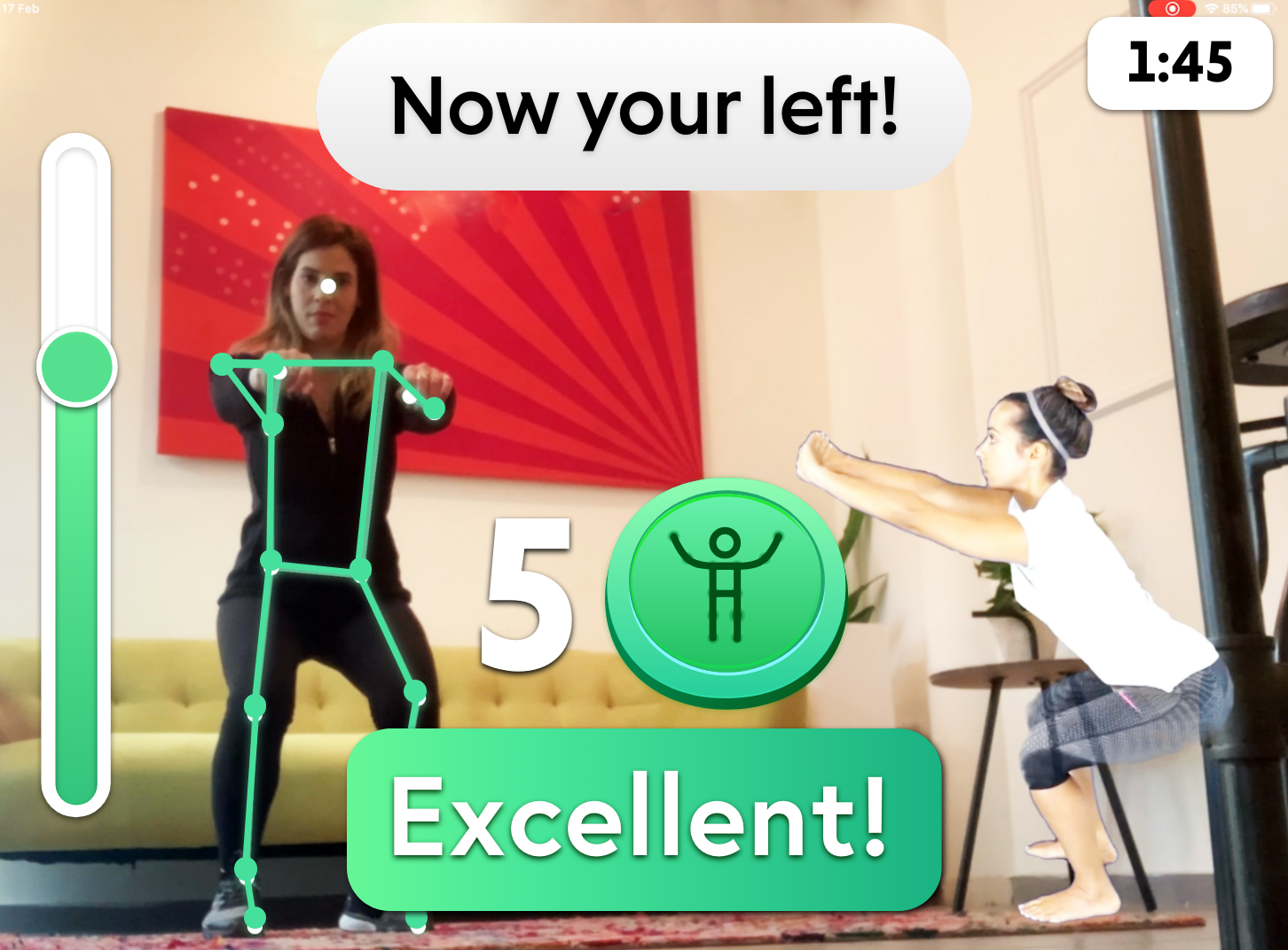
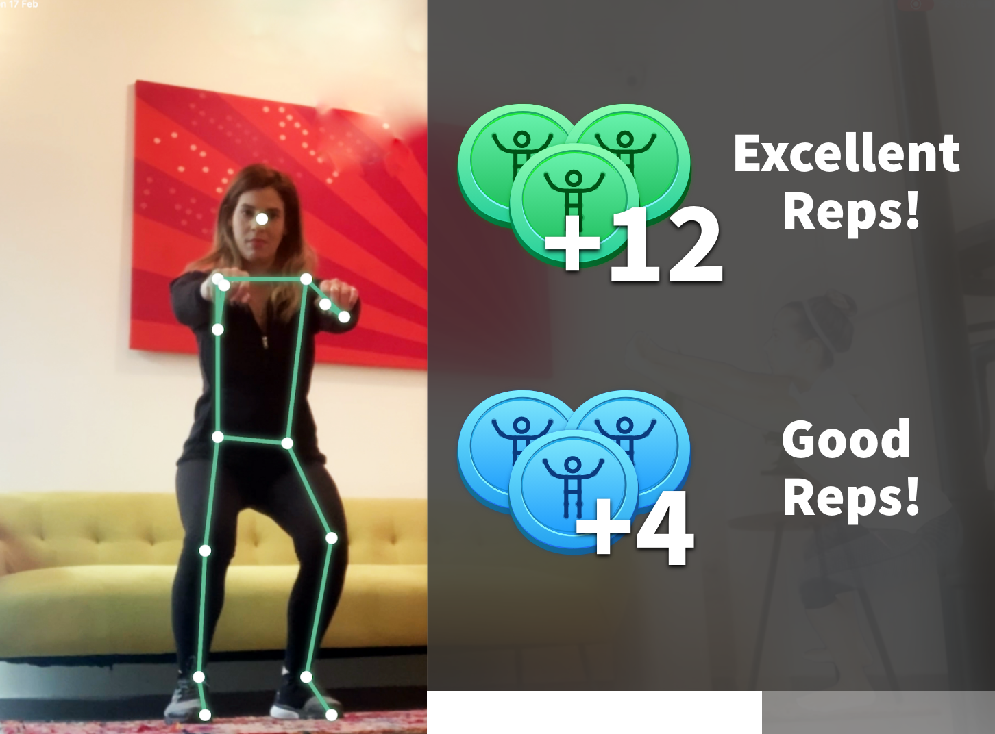
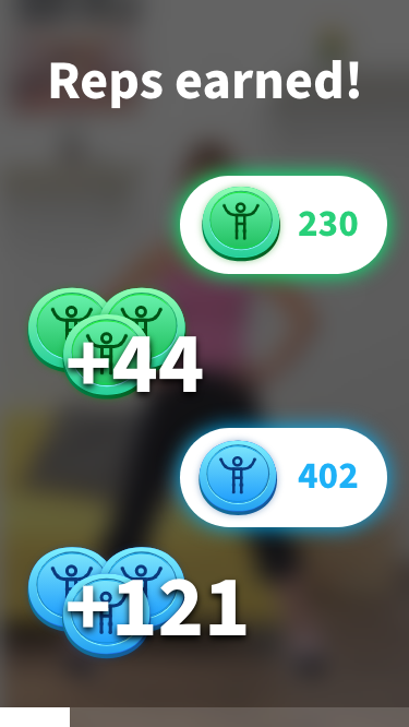
Exercise final design
This was easily one of the most important and technologically fascinating aspects of WizeCare. We went through many many designs before what we have today. The technology actually knows when the user is making a mistake or doing something correctly. Many different kinds of ROM bars were created. The designs had to change while the ability of the technology grew.
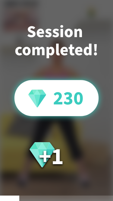
Because the user is exercising away from the screen, we wanted to create an experience where the user did not have to walk to the device in order to continue using it. I created tokens for excellent, and good. Green is our main color, so I used it for excellent. After a few designs, I decided that a black blur as an overlay was the most effective. I wanted to put reps for the exercises, but our technology could not accomplish it so it was left out. Overall, I am extremely proud of the final product (which is still growing) and the patients have very positive things to say.

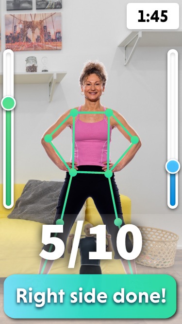
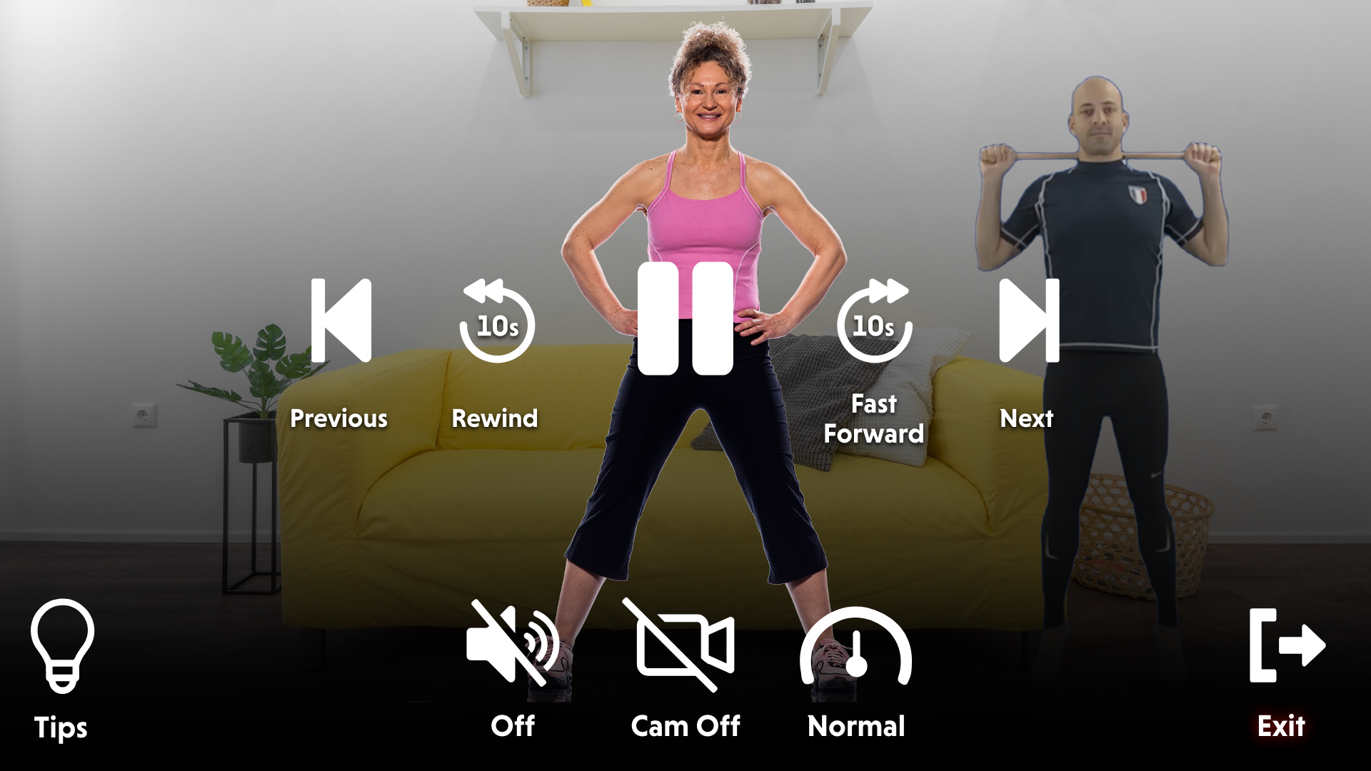
Final exercise designs

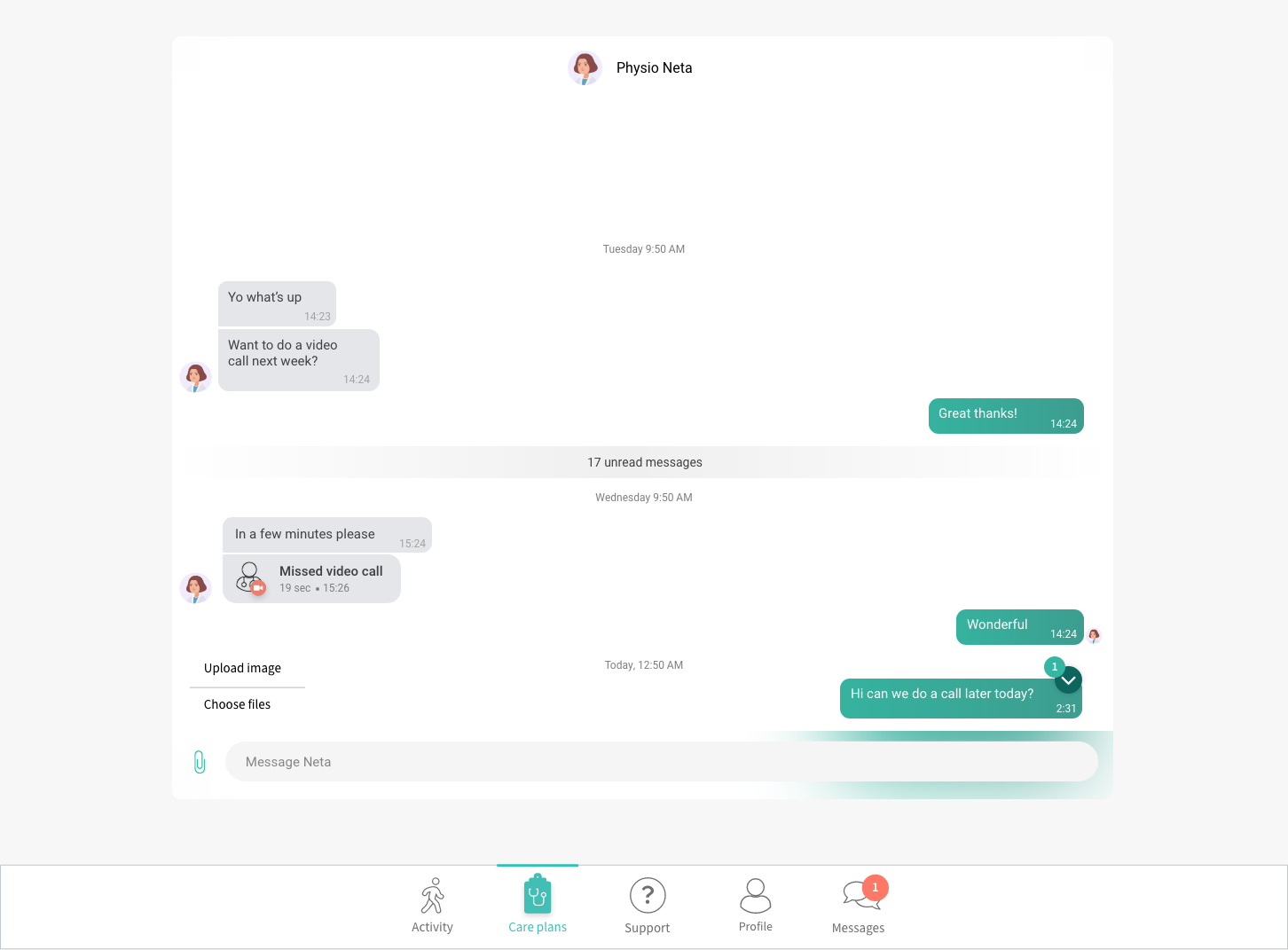
Messages
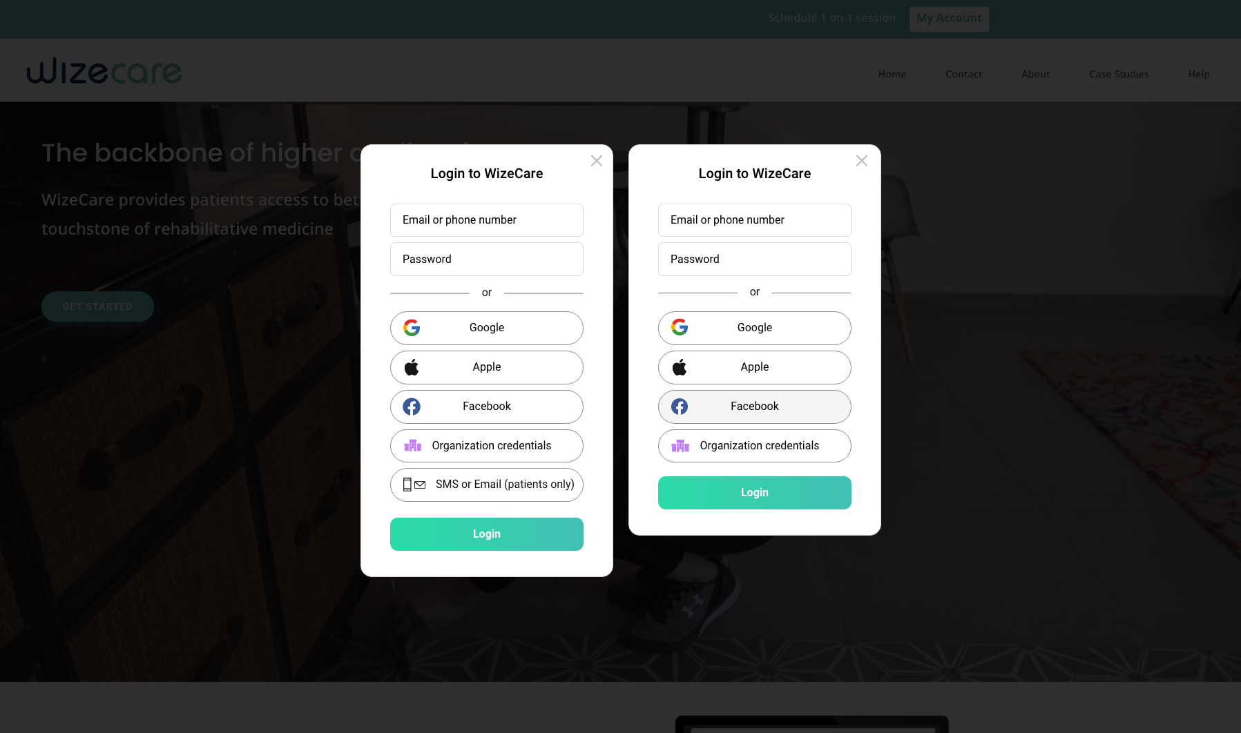
Final sign-in design
The new design for login is simple, clean, and uses material design, thus increasing consistency in the app. The implementation of auto-sign-in with Google and Facebook was also a game-changer. Here you see two versions, one with SMS and one without.
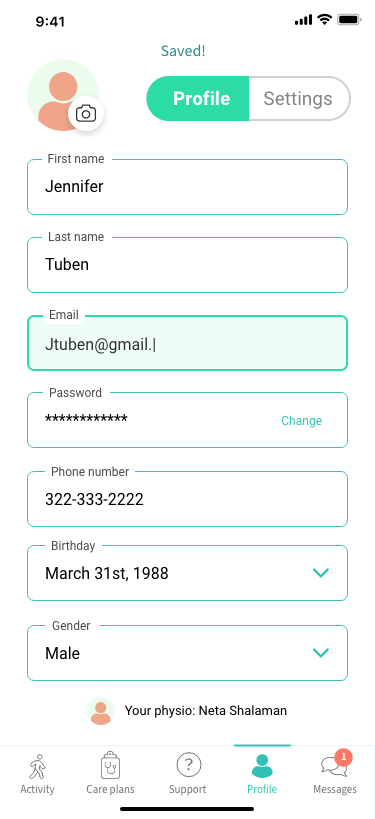
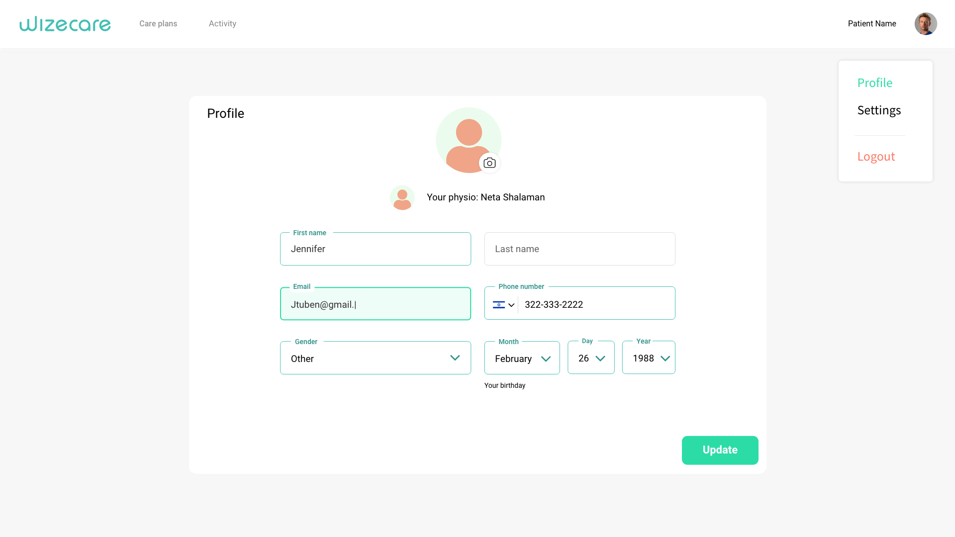
Final profile design
The material design is used to maximize space and ease. Bright teal green was created for fields and selections.
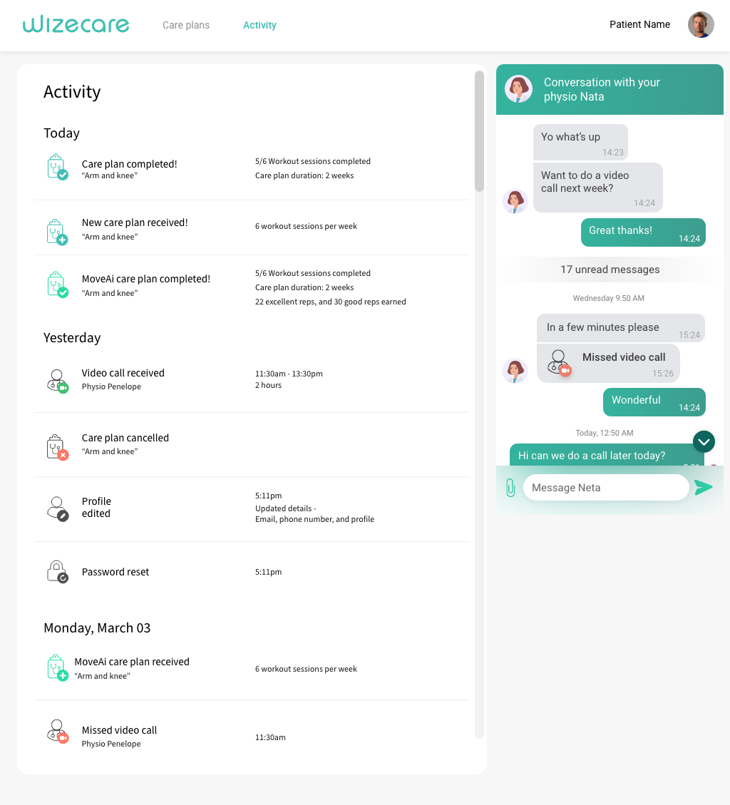
Activity
All icons were created by me. The main goal was to create the right tone, which I think I succeeded in.
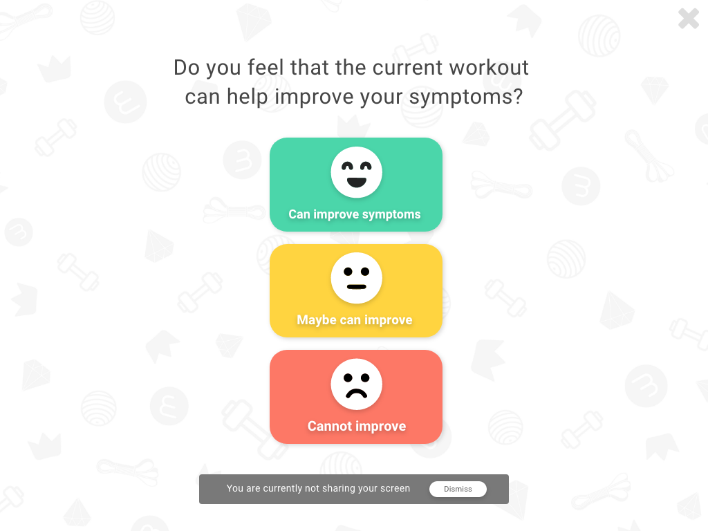
Final feedback design
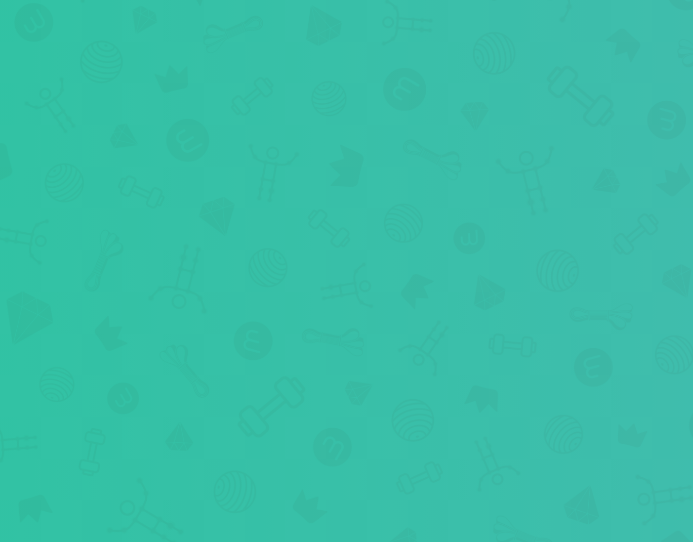
I created this unique background pattern that uses elements throughout the WizeCare app.
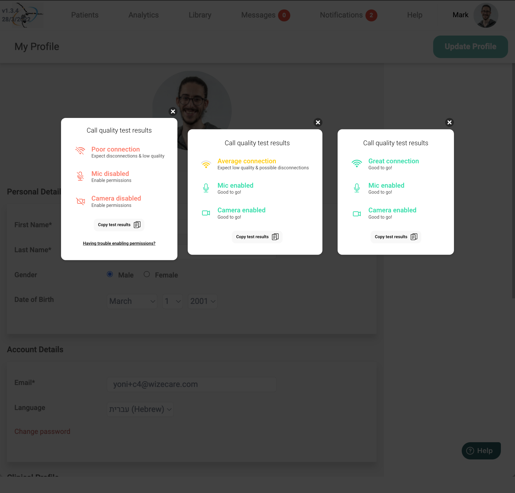
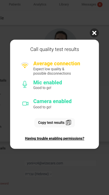
Bandwidth Test
This design warranted a centered layout, especially for mobile.
Casting
I created these videos (also in Hebrew) in after effects.
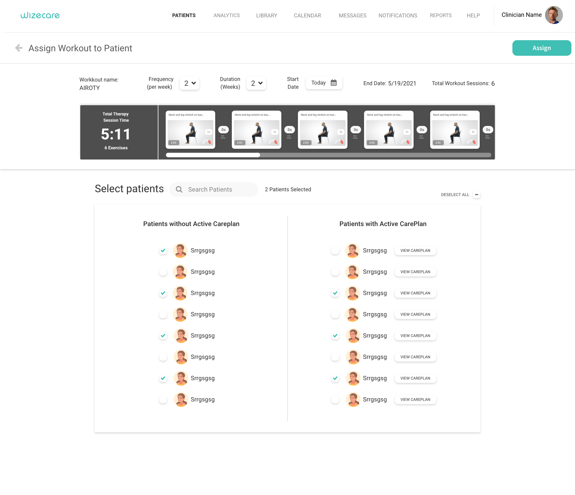
Assign protocol/workout to patient final design
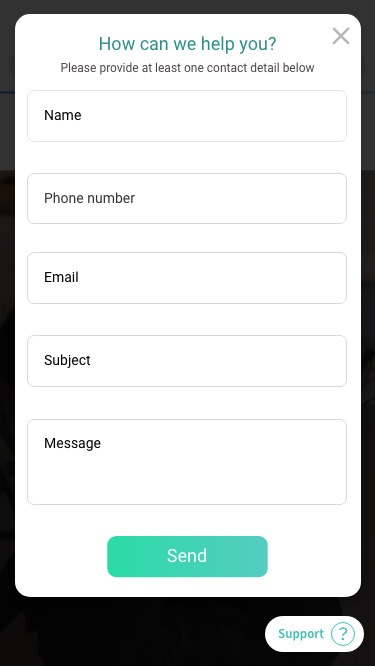
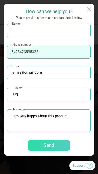
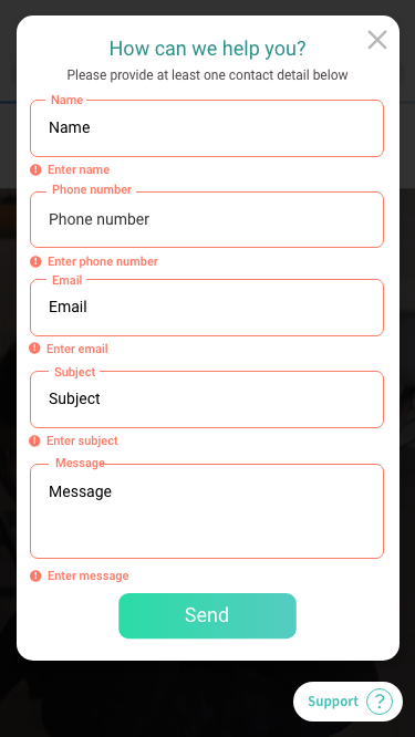
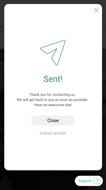
Contact Us
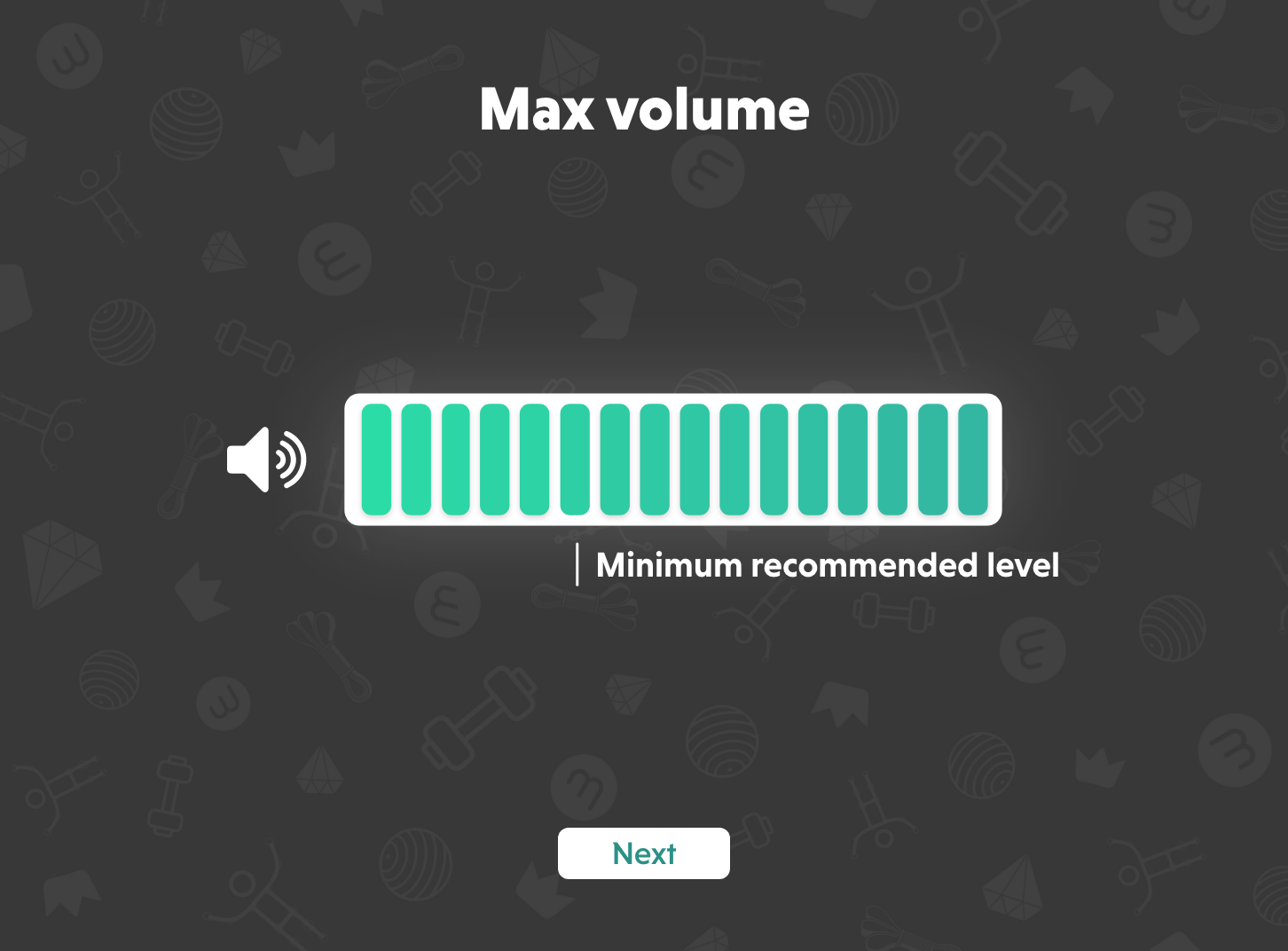
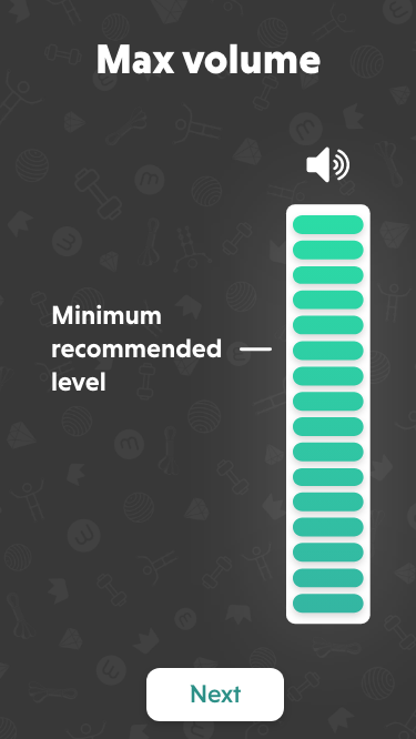
Sound Recommendation
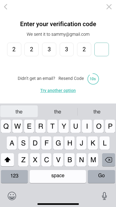
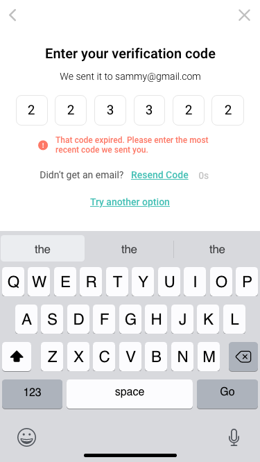
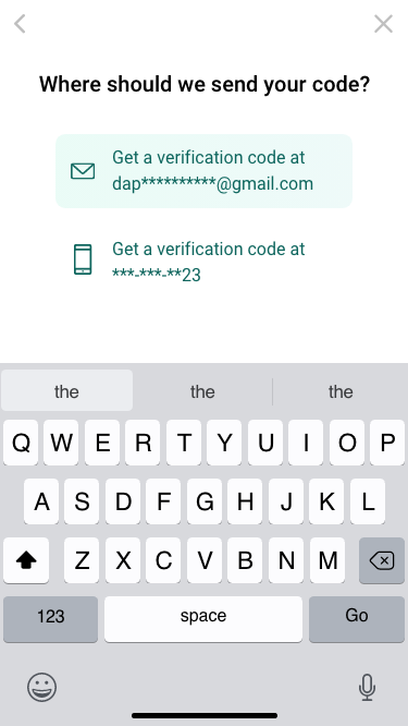
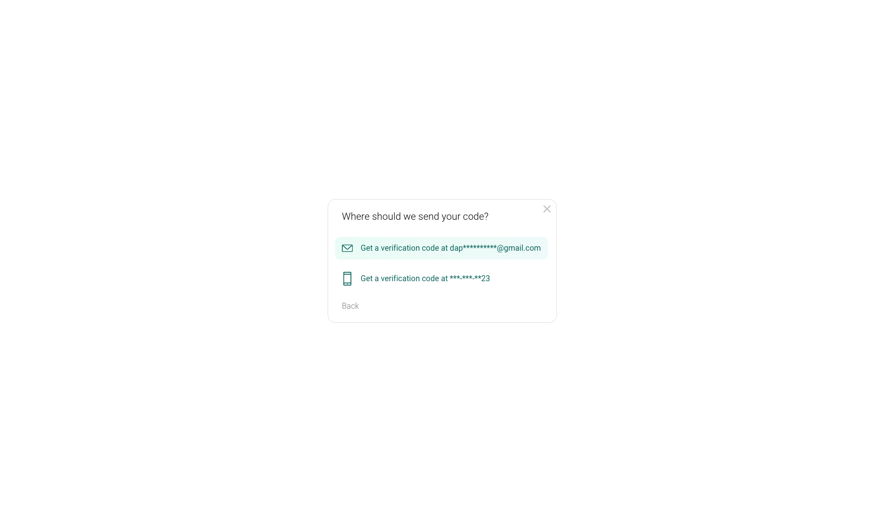
OTP
Loading screen tips
Created in after effects
All Designs
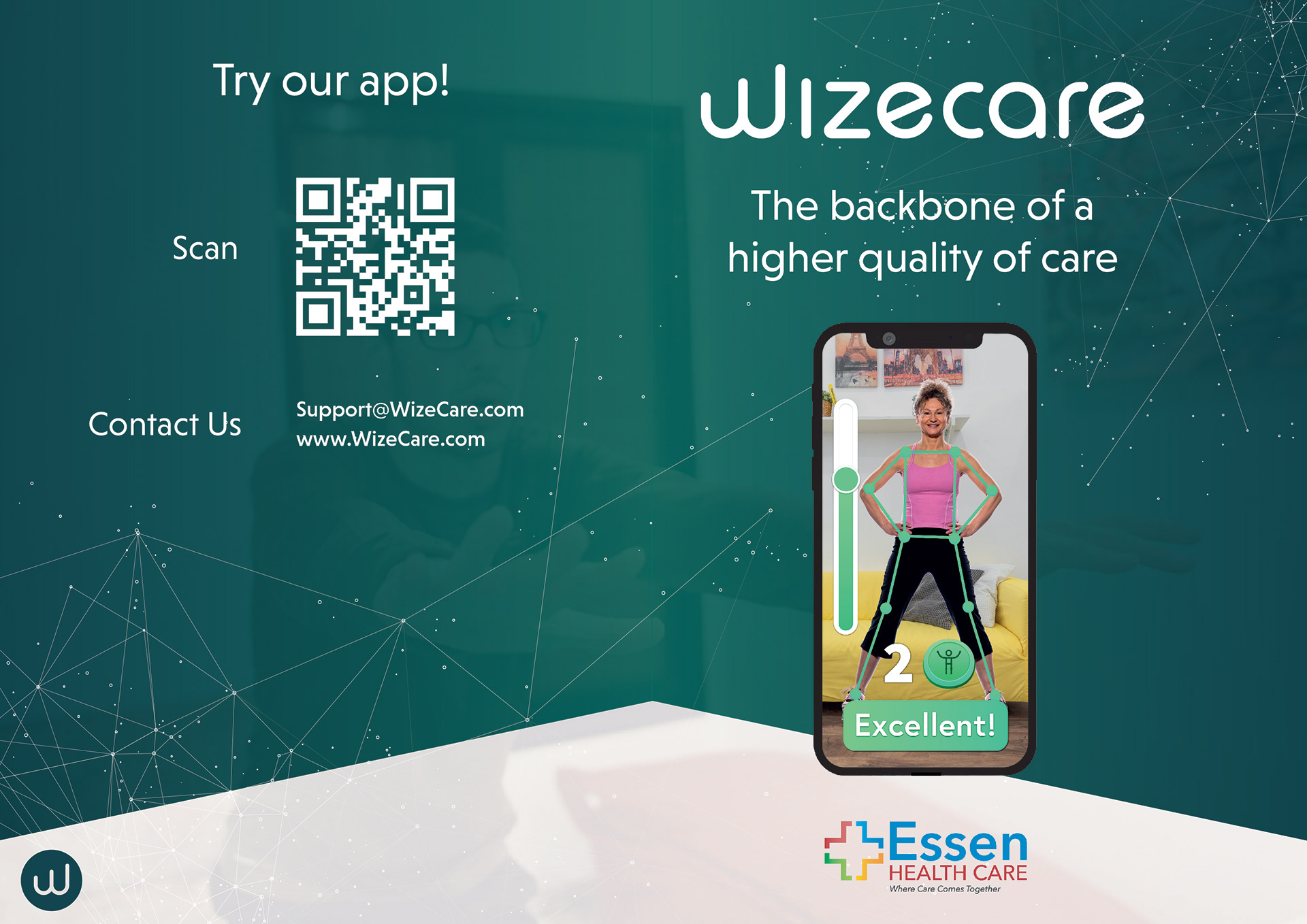
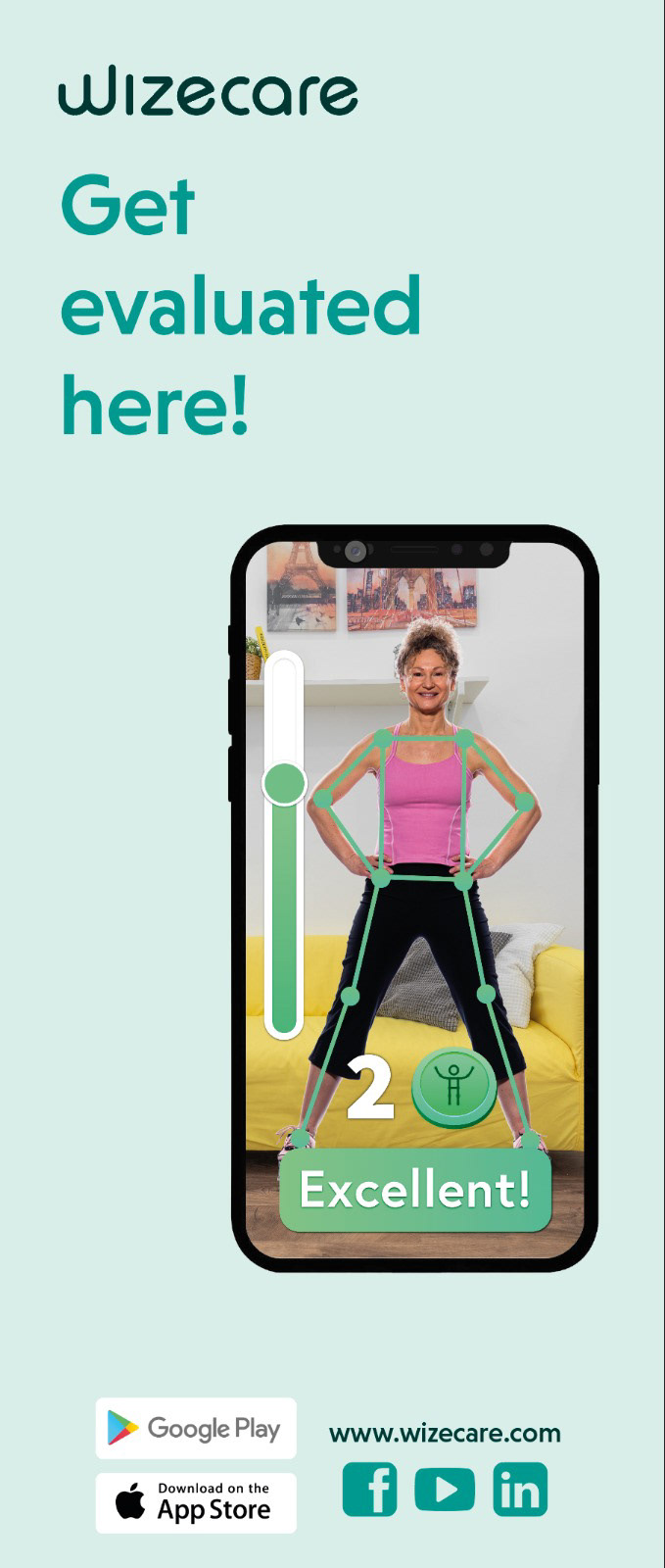
Print work
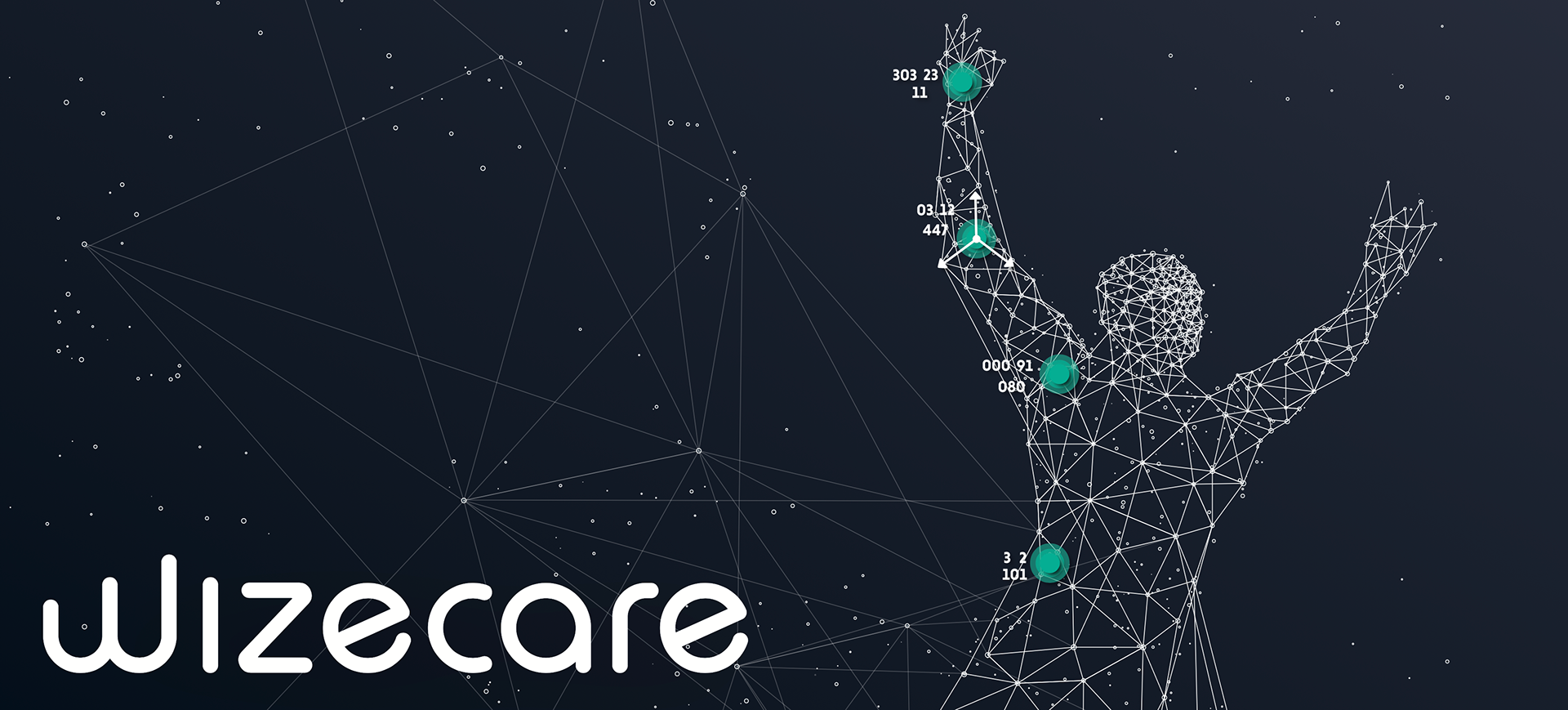
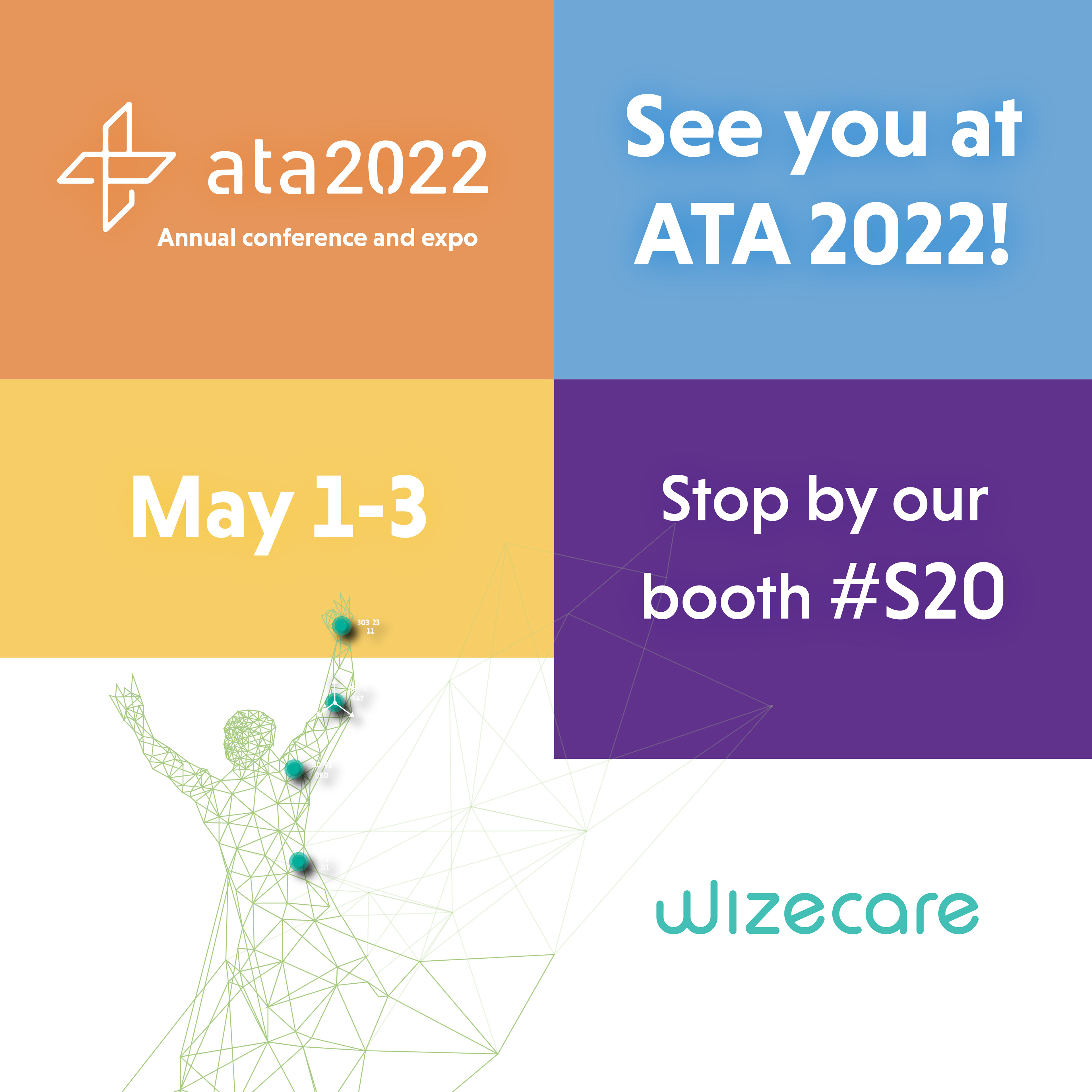
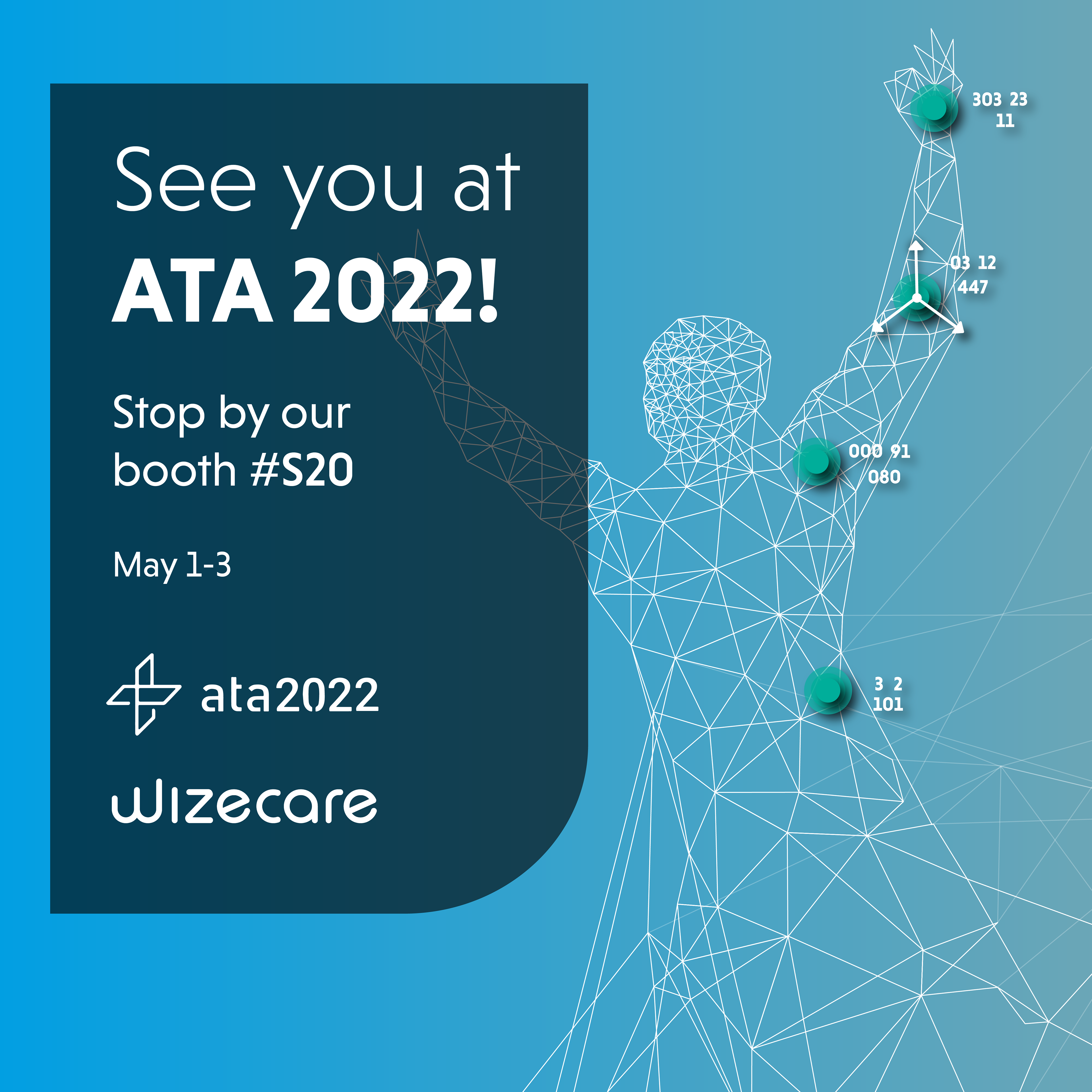
I upgraded WizeCares branding when I joined the company. They had no logo (besides the text), so I decided to use the "MoveAi guy" as the company mascot. Not only was it fun, but it also showed off WizeCare's technology. Initially, the colors were dark green, dark blue, and yellow. I chose to remove the blue and yellow and have a variety of greens, which I think worked effectively. For WizeCare, I created brochures, posters, ads, and user flows.