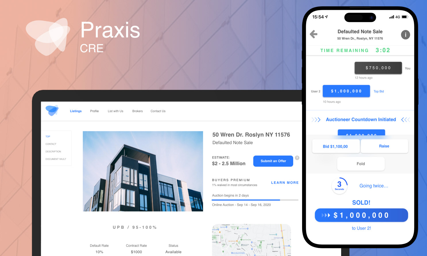
Liquidnet 5
On this project, my task was to create the Ui/Ux for Liquidnet 5. With Liquidnet 5, users can see trading information instantly on their desktop. I worked with the head of design, and financial experts to create the best solution.
In the beginning of the process, I place all the information that is necessary on the allotted space. It's a fun process where I get into brainstorming sessions with managers, CEO's, and investors. We discuss what information is the most important and the least. I see what will take up the most and least amount of space.
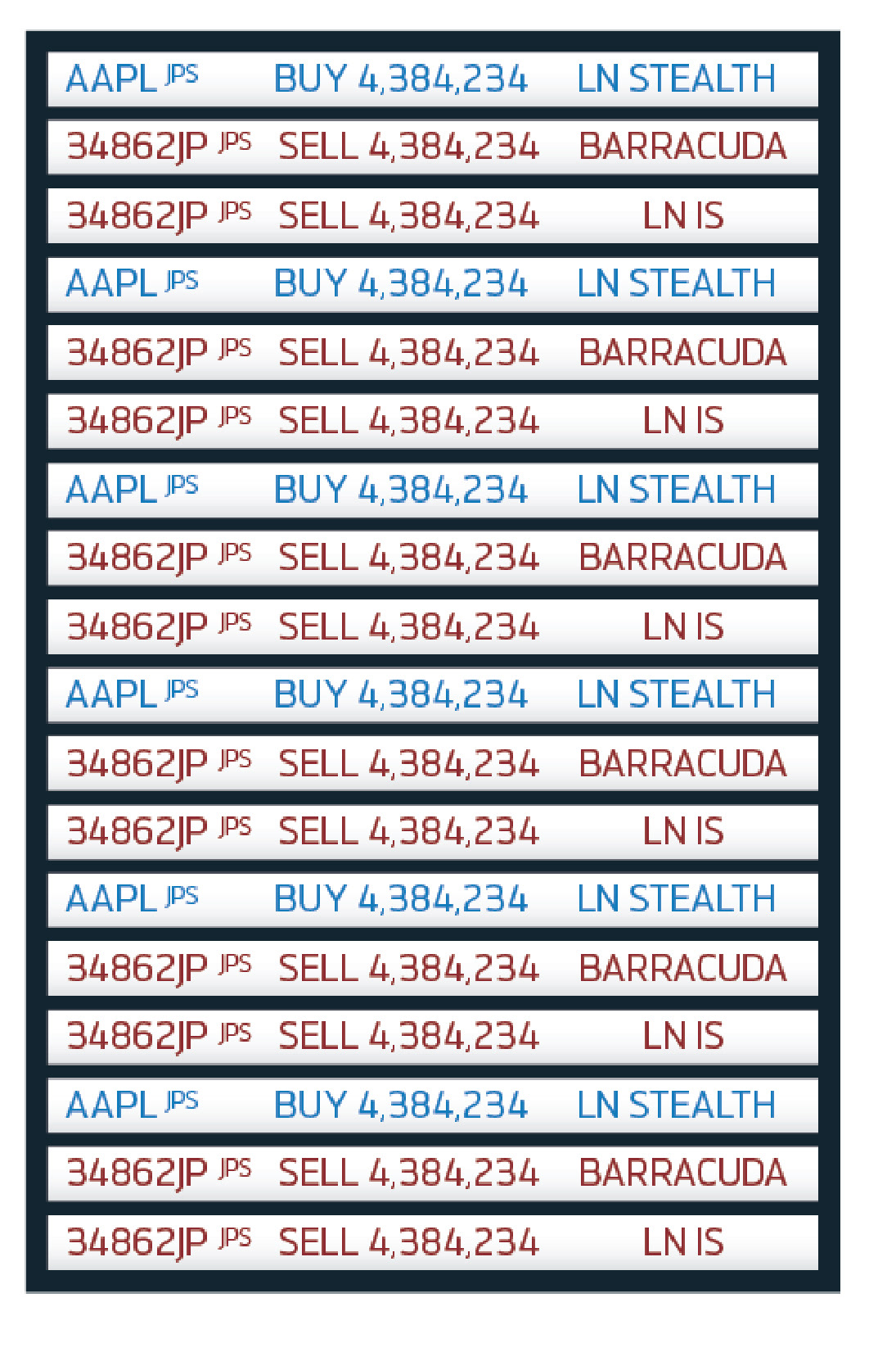
The name of the stock, and its shares are the most important so they are the most prominent. Fills, Leaves, and Limit are the least important.
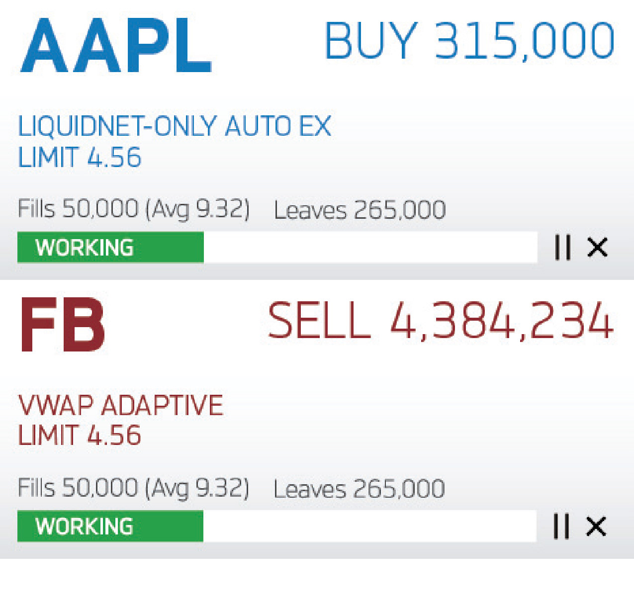

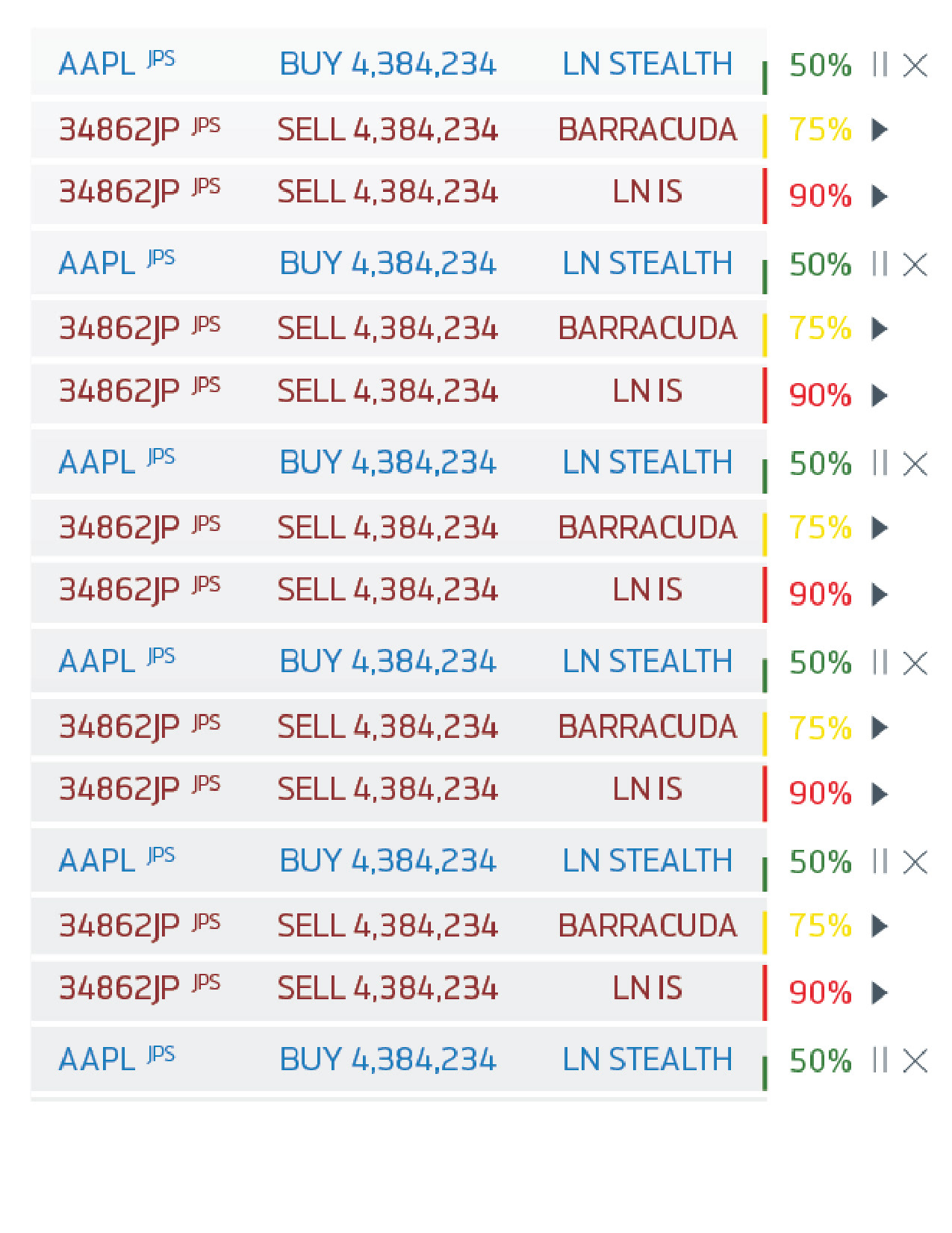
After I do some wireframing and placement, I extrapolate the designs I have made to the desktop software. I quickly see that the biggest issue is the size of the squares themselves Instead of focusing on the internal design, I present multiple size options to the team.
I learn that the users will look at these very quickly. They need to know what's happening quickly with the variety of stocks.

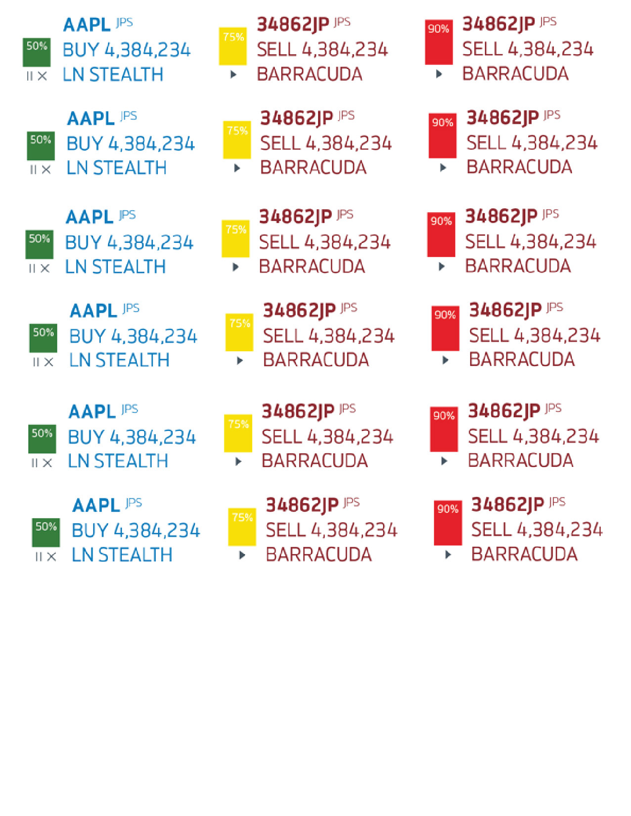
I experiment, and try doing smaller, more leaner areas for the stocks. Nobody asked for this, but regardless I presented it because a big part of my job is thinking of the options nobody else has. The leaner design comes at the cost of removing certain pieces of data.
I get positive feedback at the direction and sizes. It seems that the users and company do want a design that is more lean. But they also say they want all the information inside as well.
Sounds like an impossible task, but I go for it.

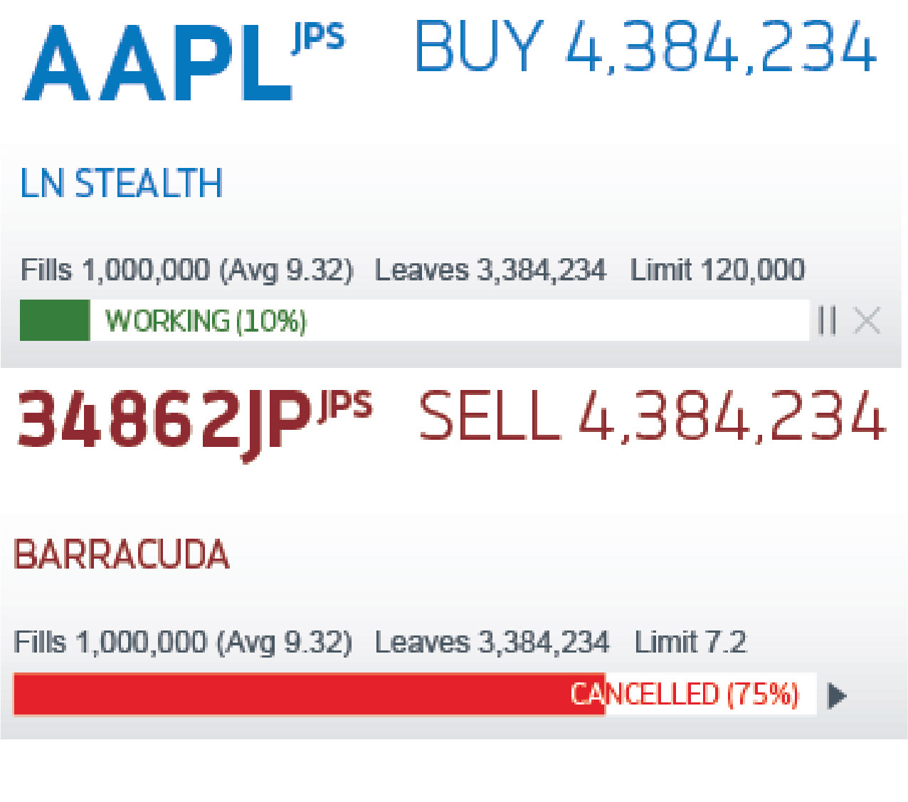
I double the length of the area, while maintaining its leanness, and add in all the information. I quickly see the text is just too small for this kind of size. I present the issue to the managers.
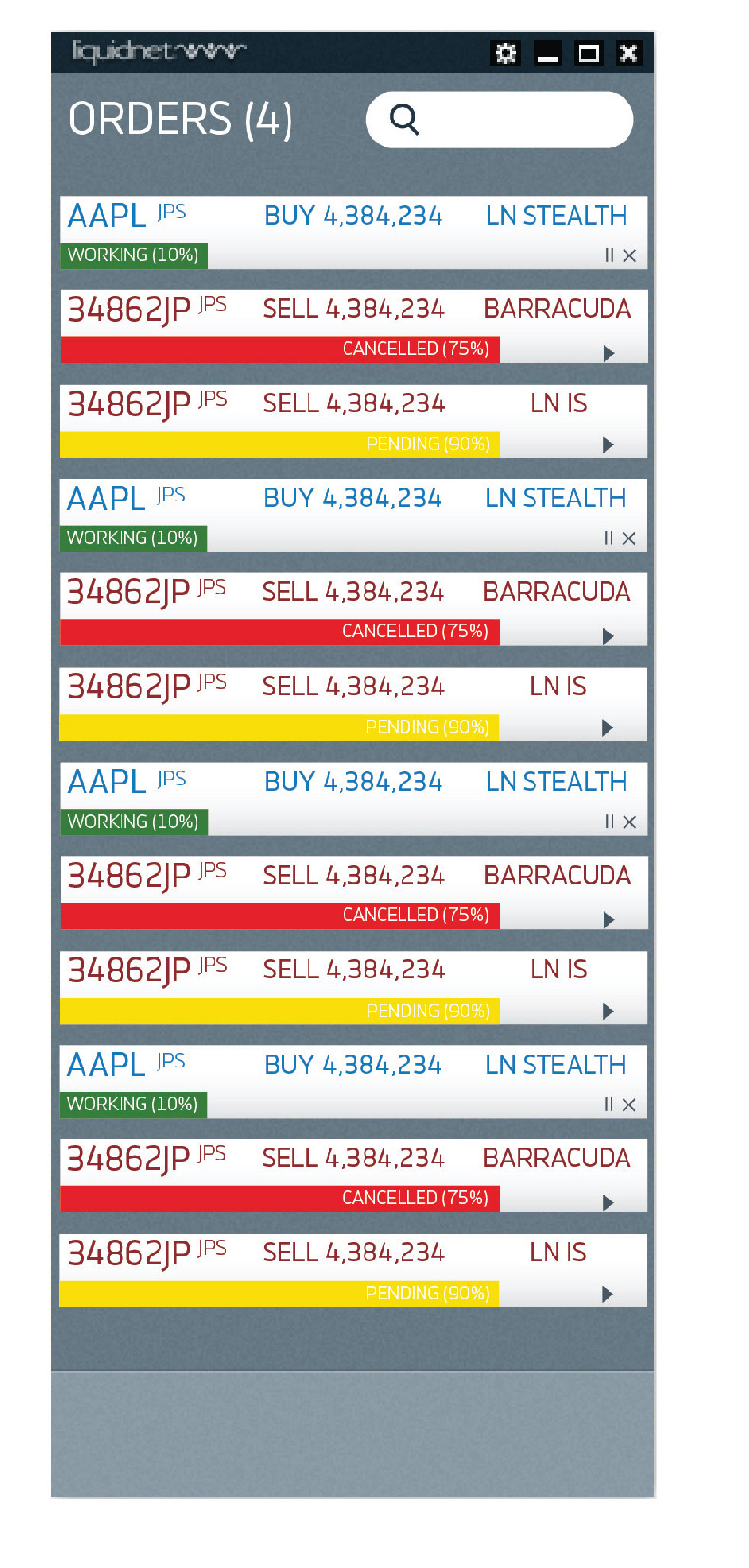
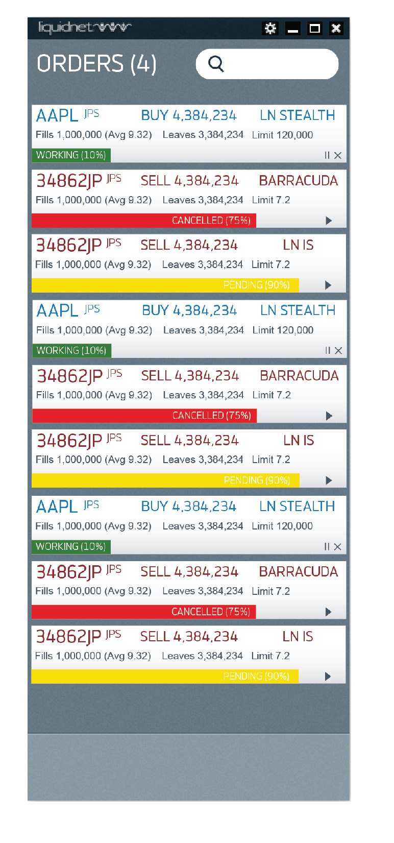
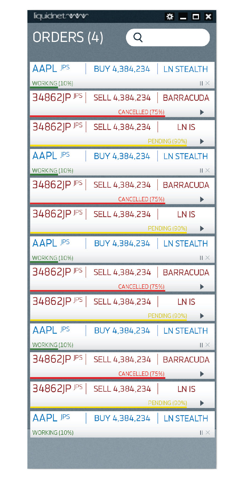
Then, the magic moment happens. The managers realize, that we could do a 3 column spread instead of a single. They would also like a box structure, and they realize that they can remove certain pieces of information.
I make the design and present the hover state. The design gets wide approval.
This process was a great success because I listened and was patient with all involved. A big part of a designers job is to help the managers realize themselves what they want by presenting options. By allowing the managers to realize what they really wanted, the final design was easy to make.
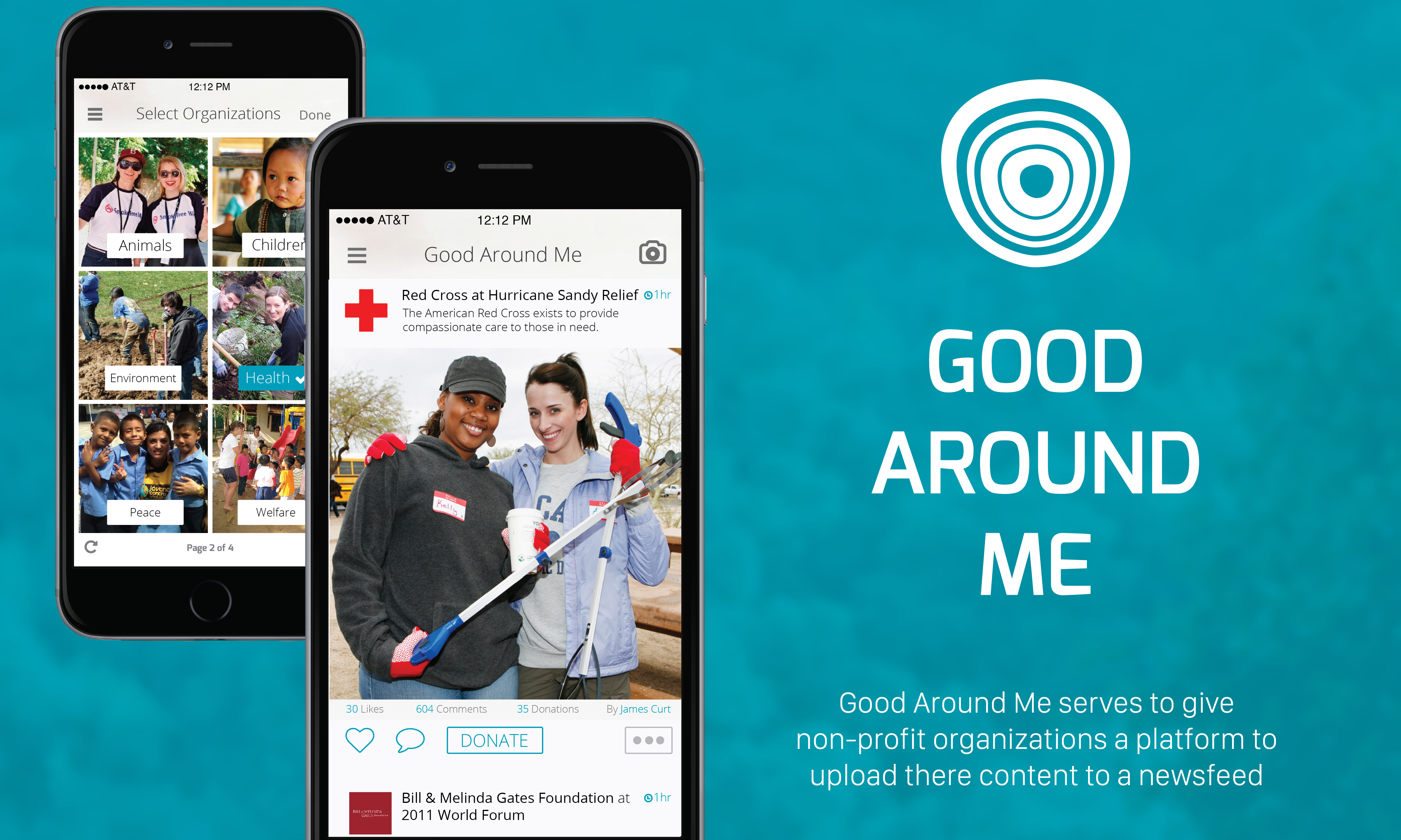
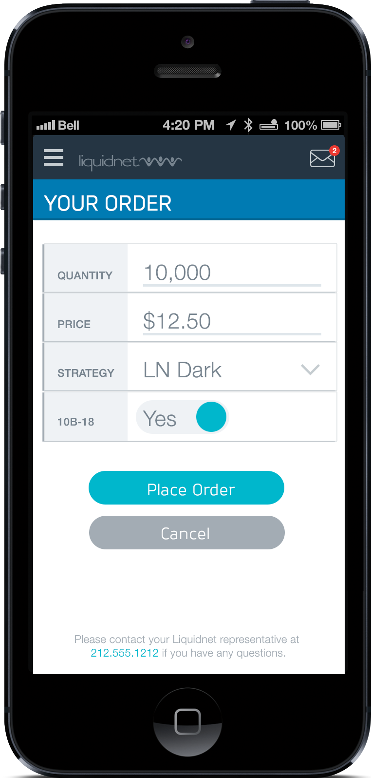
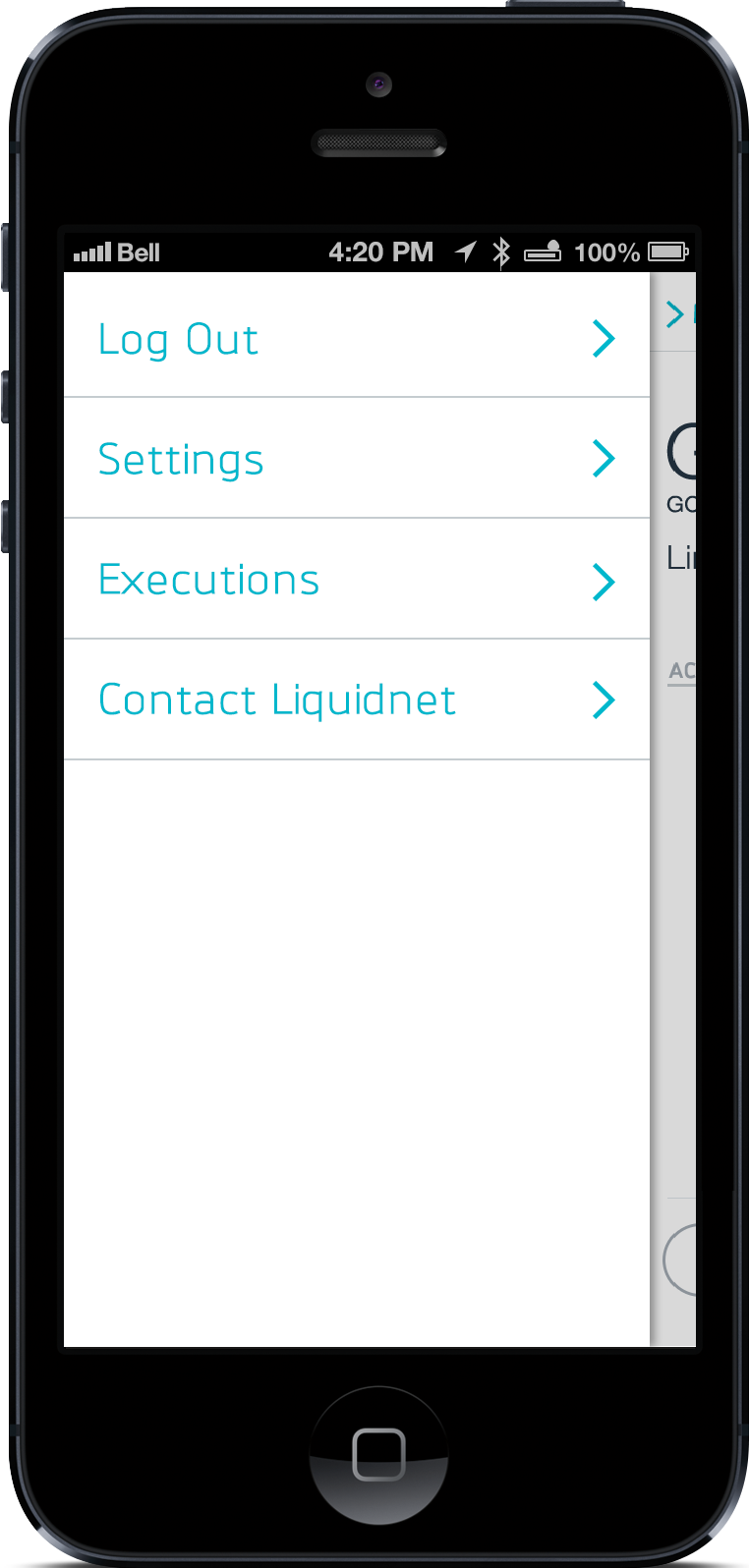
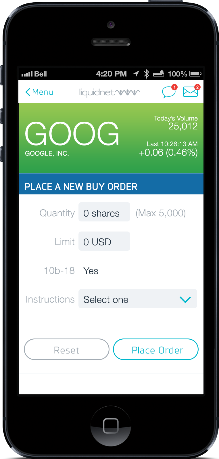
Liquidnet 5 Mobile App
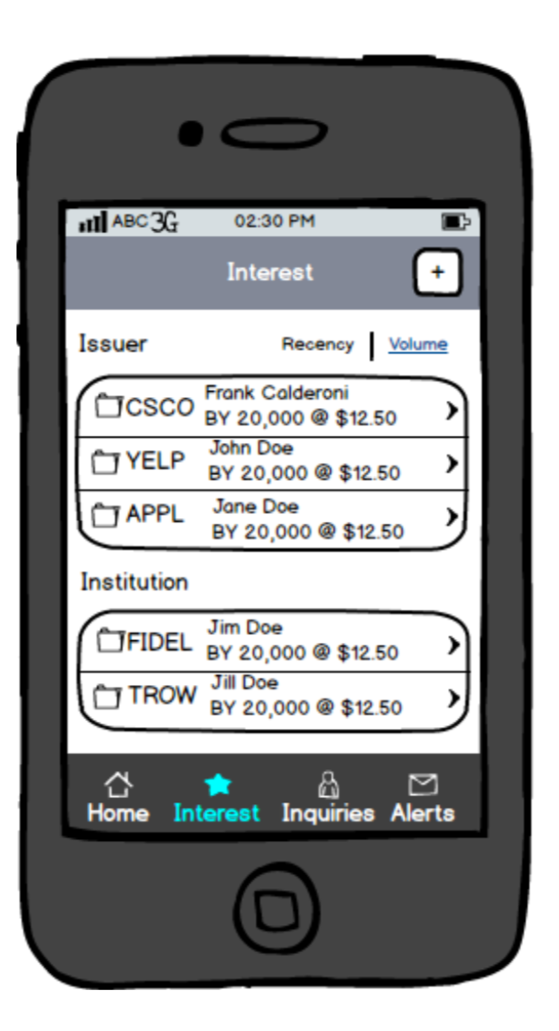

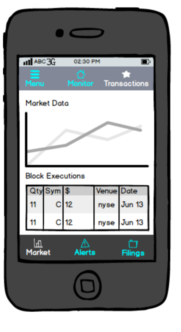
Wireframe v1. I spoke with the head of design, managers, and other financial experts for input on how the user flow should operate
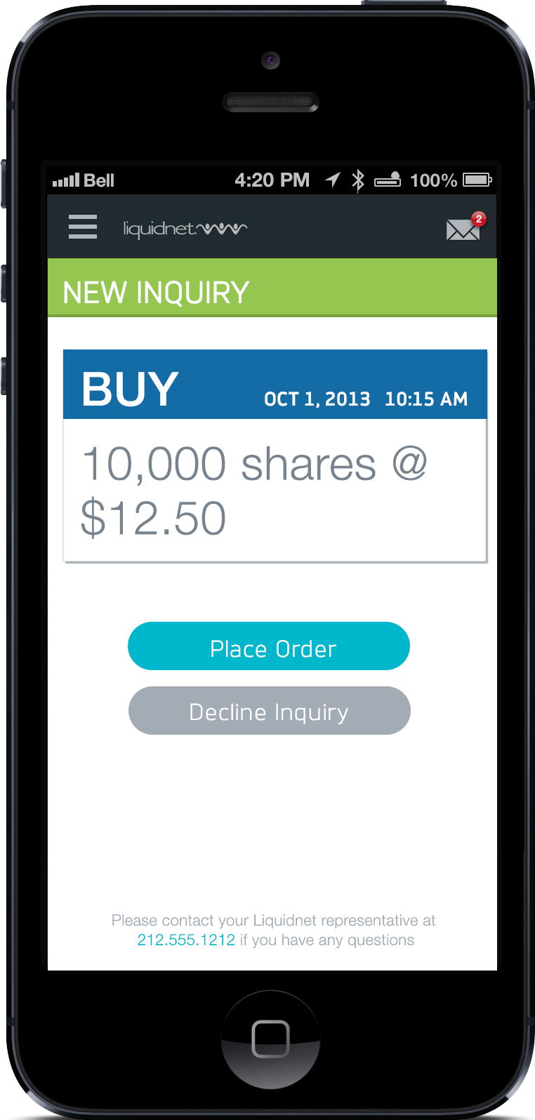
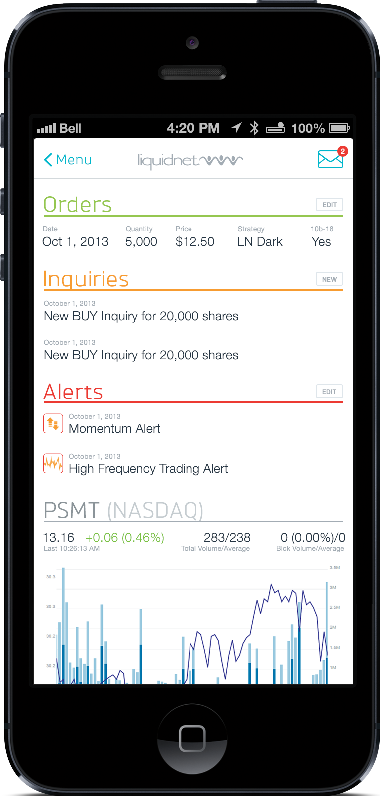
UX design V2

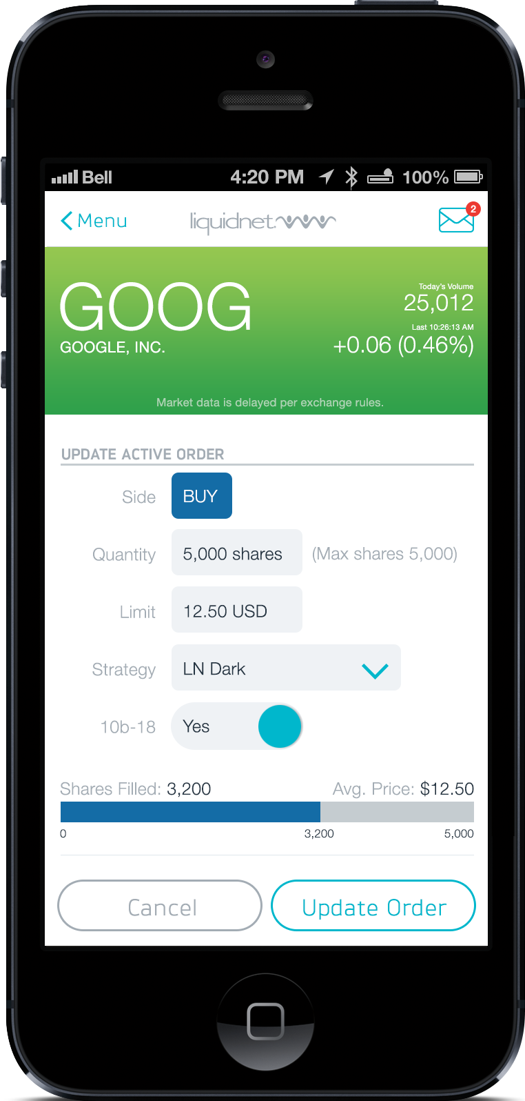
UX design v3


Final Design
Liquidnet Commission Management Voting
I was tasked to create an internal voting system for the internal workers of Liquidnet.
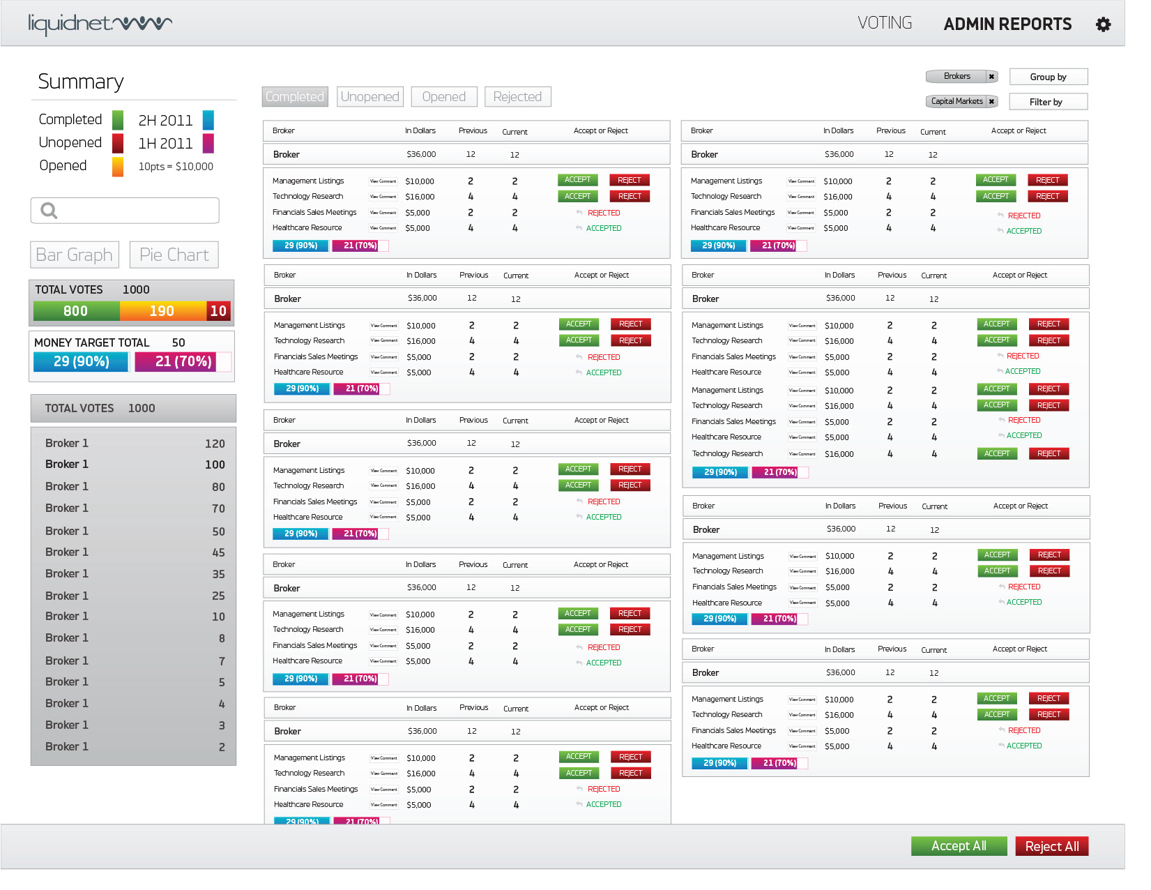
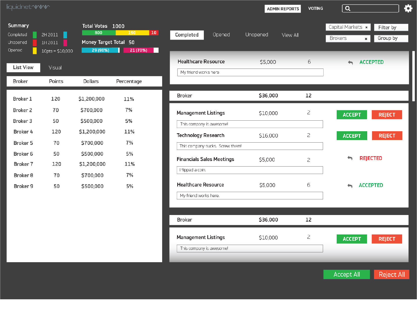
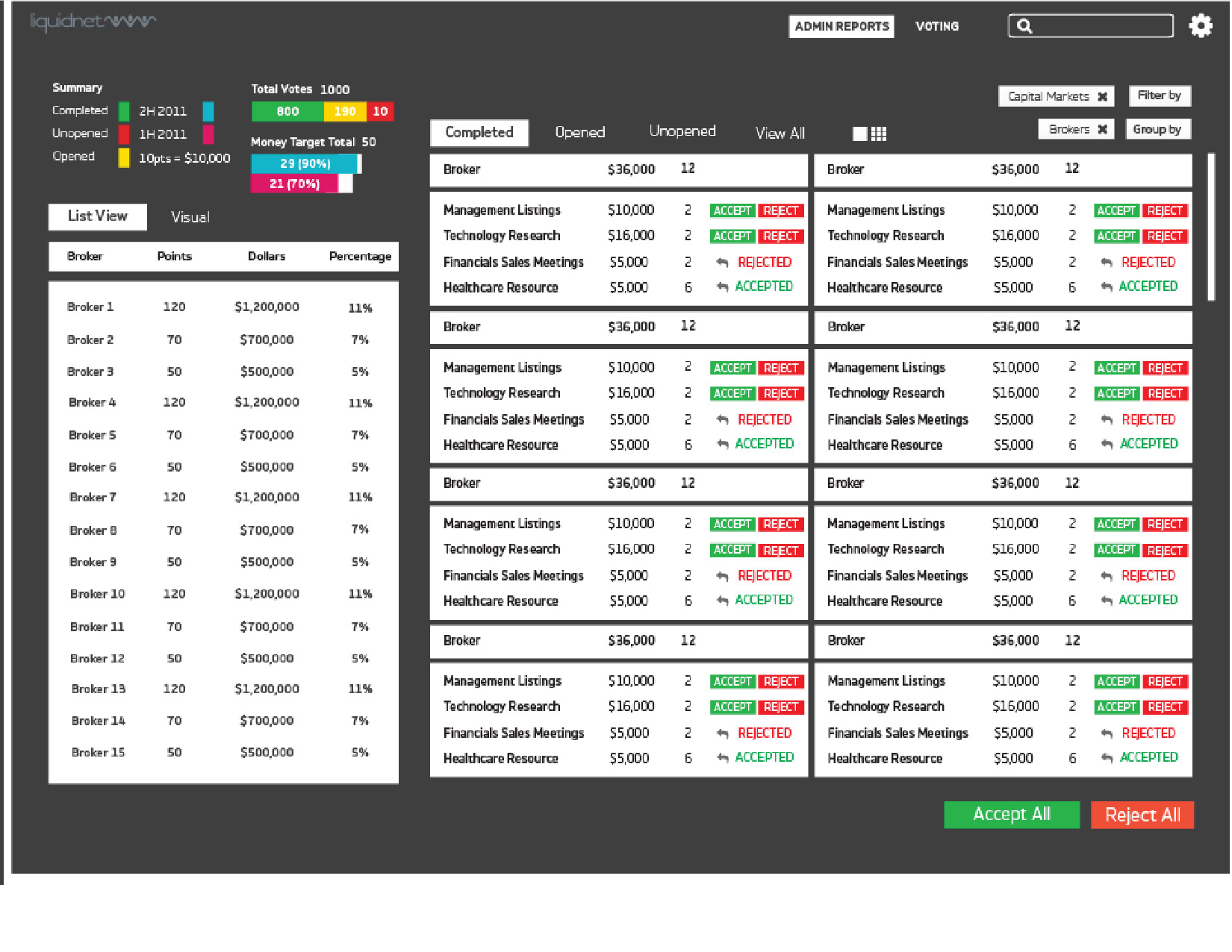
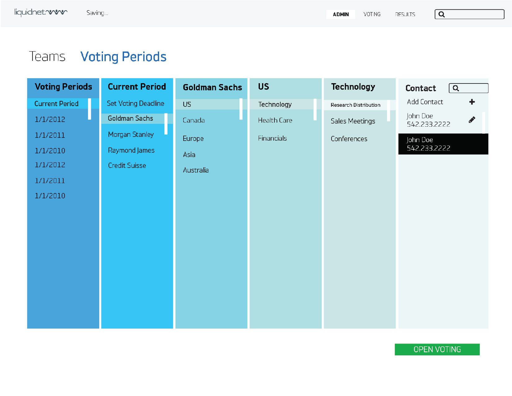
As usual, I ask for all the information needed for the project, and here there was a lot. For the design on the left side, I used the standard designs to just see what it would look like.
I ask if there is a search, what the main buttons are, tabs, etc.
Once I present everything and get the OK that this is all the information that is needed, I start designing. On the right you can see a mockup of a different approach.
I speak to different employees about the process and their frustrations. They see they want something more linear rather than just a sandbox.
Liquidnet has a set design standard, but they also like to experiment with different designs and approaches. If I did not attempt different UXs then I would not be able to solve any problems.
I make everything black and white so that I can focus on the shapes and layout. I ask myself, how are columns set up? What does the user see first? How can I make this easier for them?

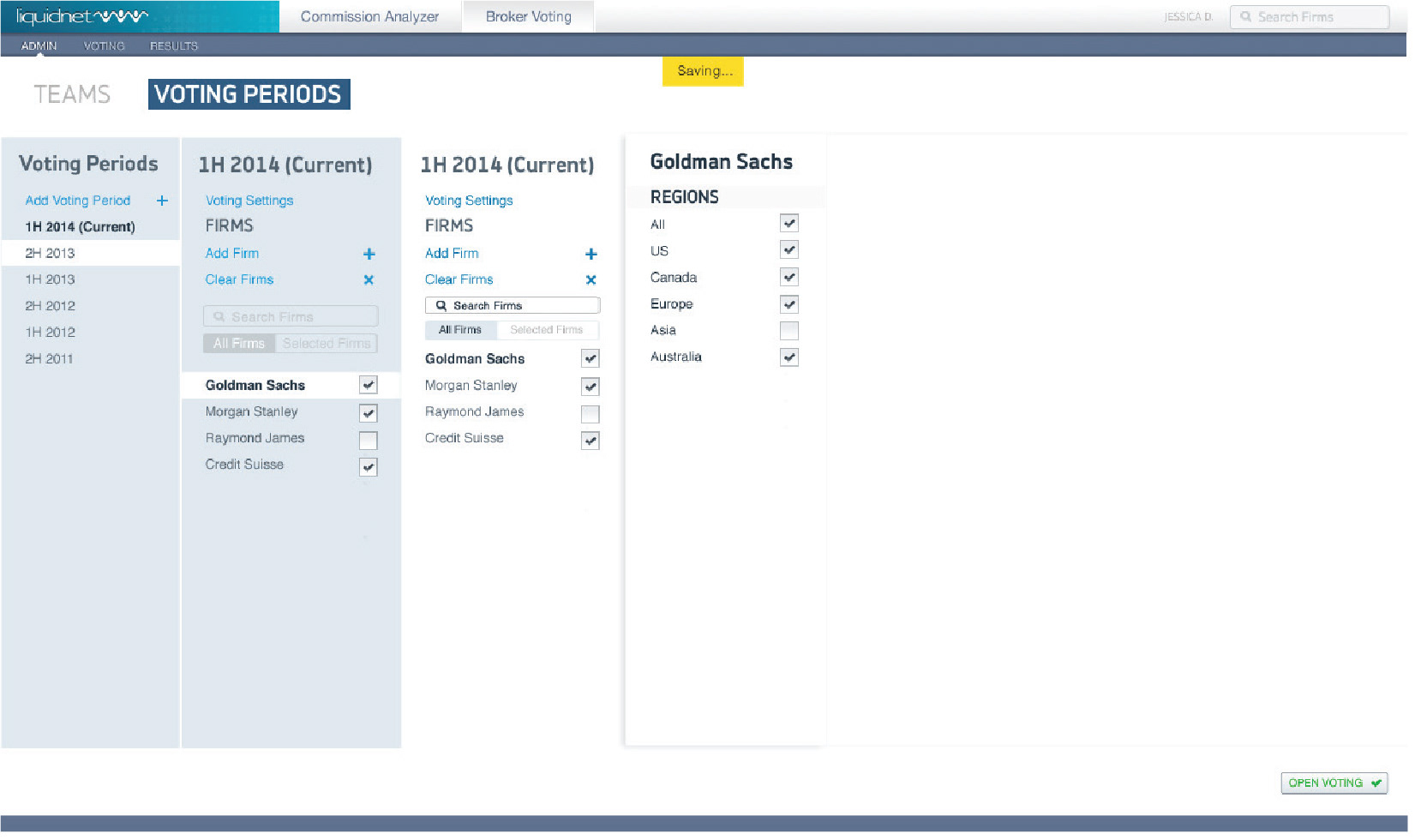
I get feedback that the managers wants to keep the overall same basic UI. I go back to the original layout, but use the new wireframe/Mockup designs I created. Just because I was asked to maintain the main design on the first page, does not mean the other pages needed to be the same also. I am designing in the first place to solve a problem.
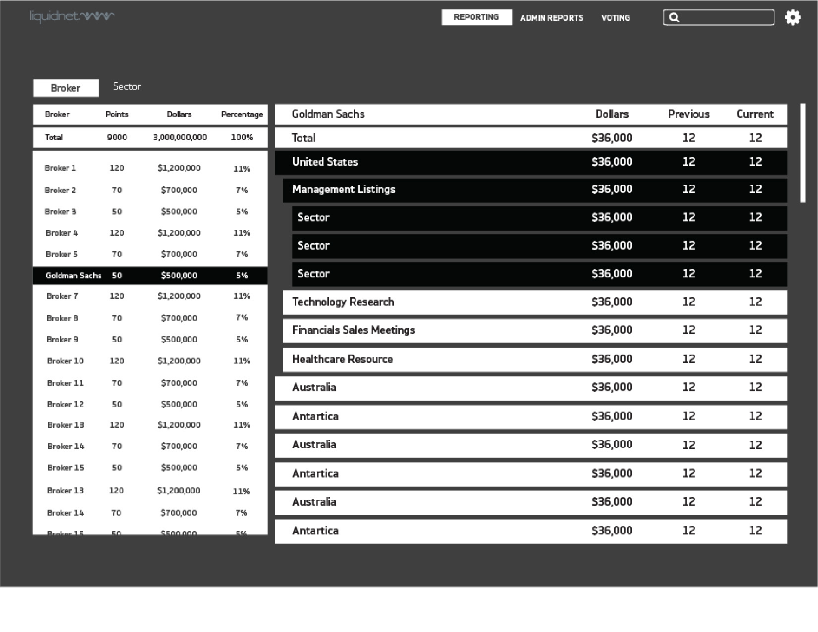
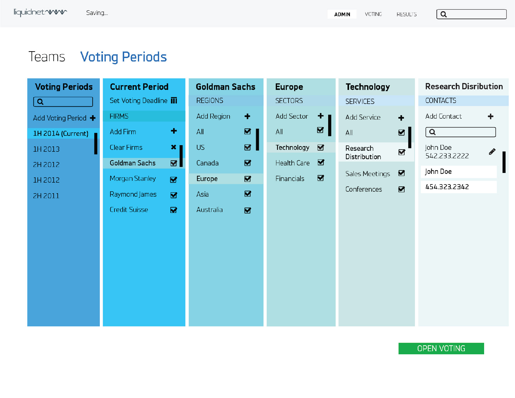
A part of the journey is finding out what the problem is in the first place. I section things off into Brokers, Countries, Sections, Sectors, and Users.
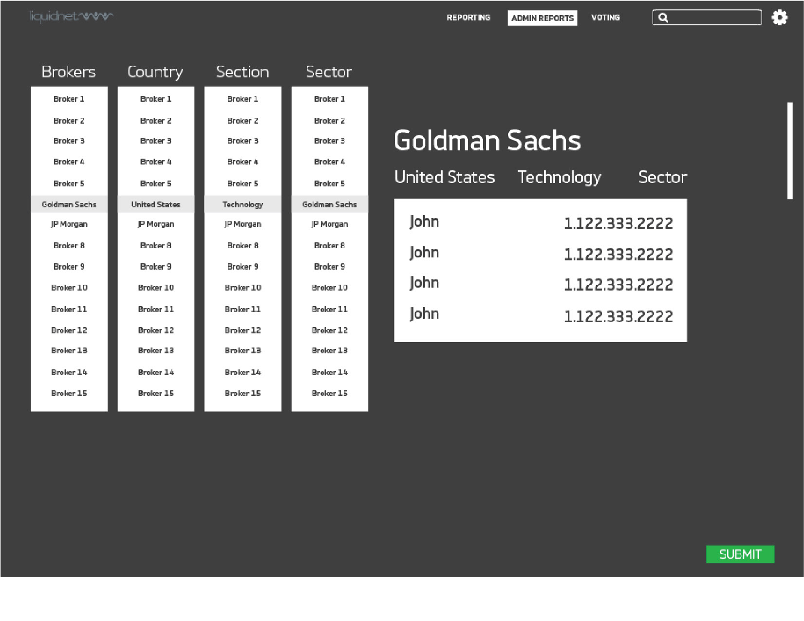
Then, I get a great epiphany that the layout should be sectioned off in a gradual format. When the users vote, they go in a certain order, so I displayed that order in this design. They go from teams, to a specific team, to a user. This is how the employees go through the voting process, and the previous designs before didn't support this path.
Now the employees can see the path they are going through.
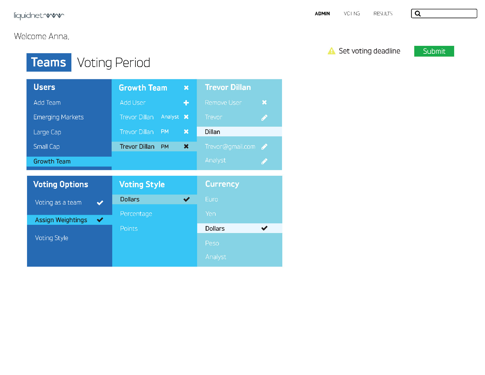
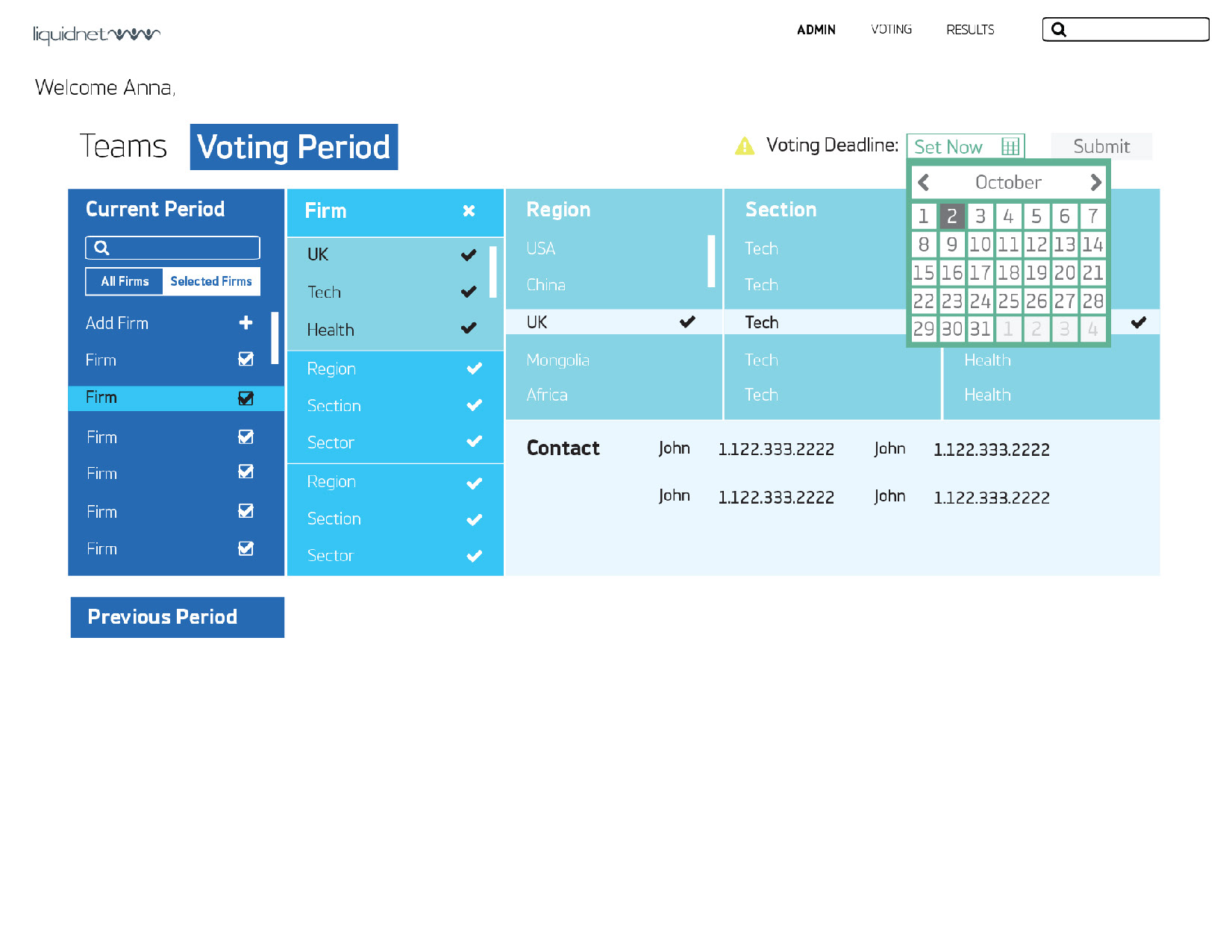
Excited by the new layout, I design the rest of its pages. In order for the managers to understand the new layout, I have to design all of it, not just one page.

I get positive feedback on the layout. Everyone feels like it makes sense. On the other hand, I feel pushback on the custom blue design I created. Managers agree that the UI design should for now be consistent with all the software. Maybe in the future they will adopt the new UI design I had created.
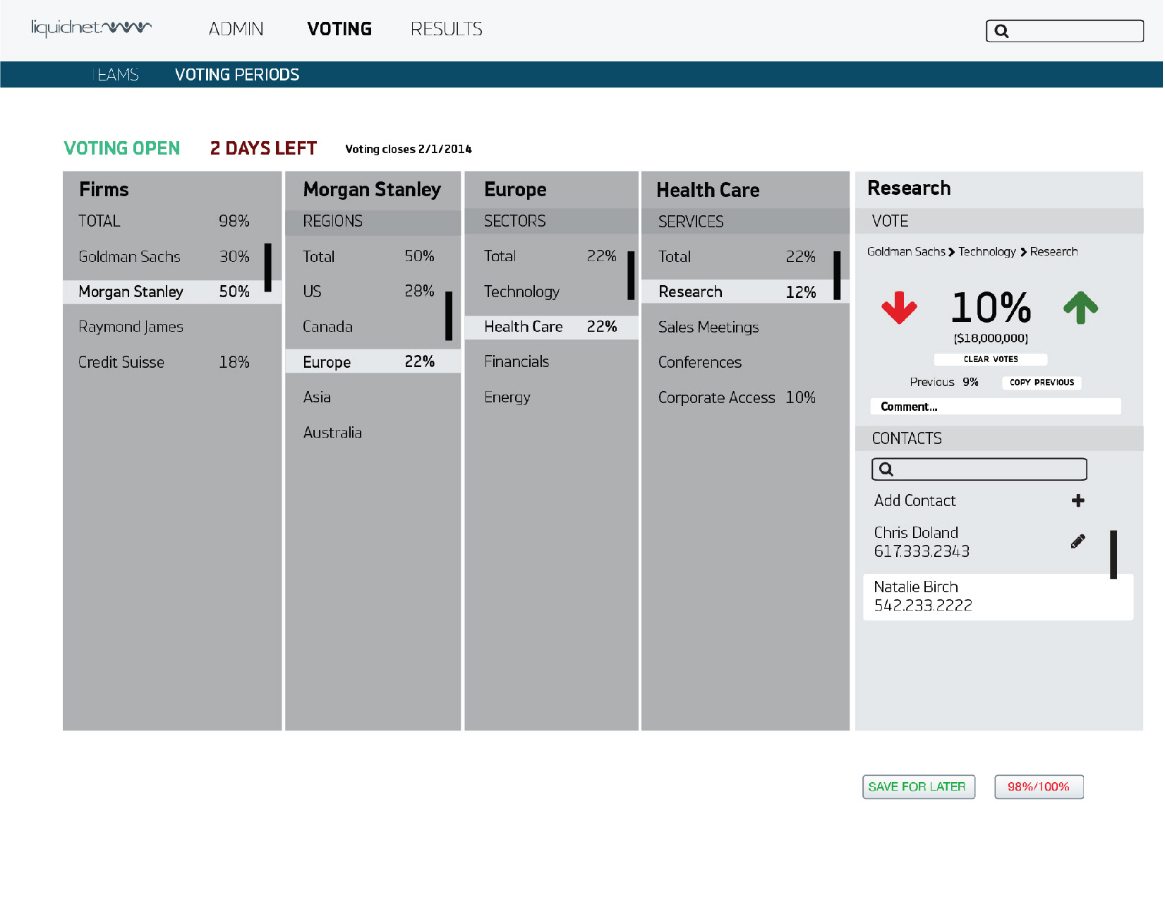


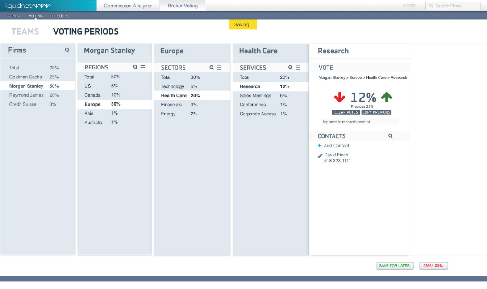
Here you can see the final design. It is a consistent UI with all of the other software, but with a very different UX. This new UX will save employees hours and hours of work time, which is a really satisfying part of my job.