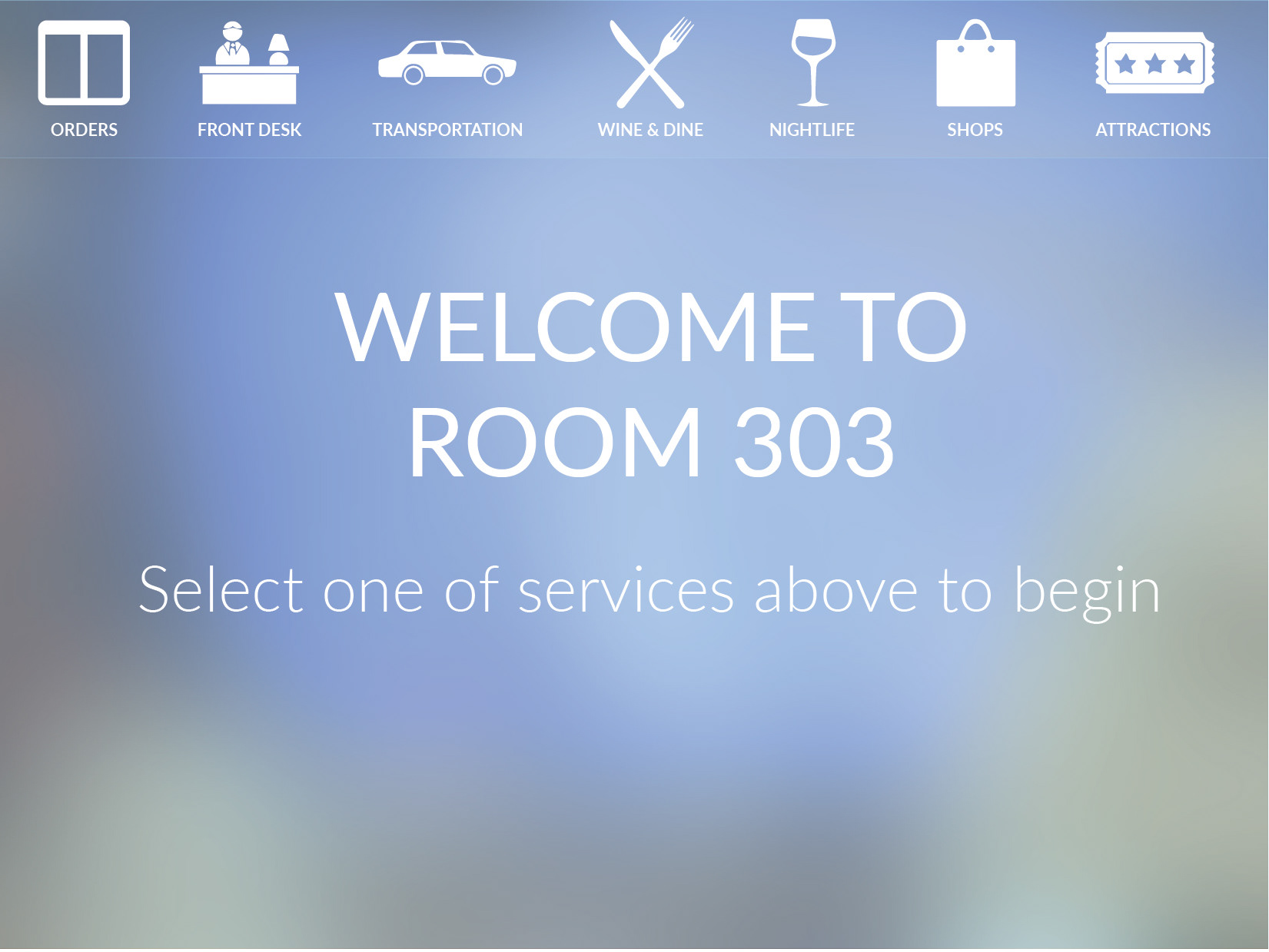
At first, we simply put the ipads in the hotel rooms. Later we realized that theft could be an issue. We also realized that we wanted the screen up so that hotel guests could see it. We hired someone to create a custom case for us. The charger locked into the screen, and one could not take the tablet.
Beauty and safety into one!

In one year, I made over 250 designs for 50 different pages PlusMore contains.
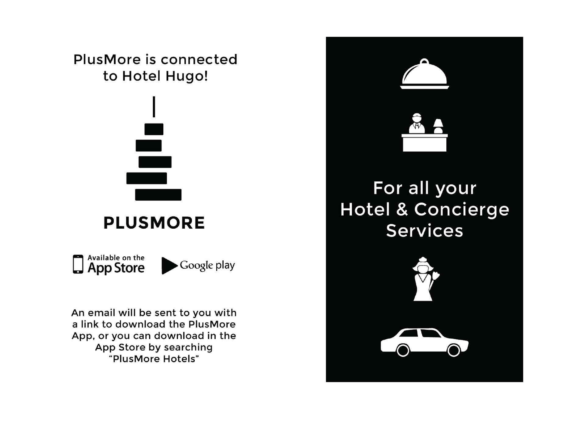
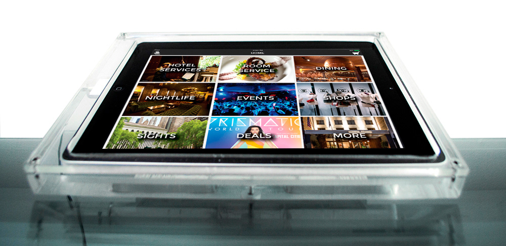
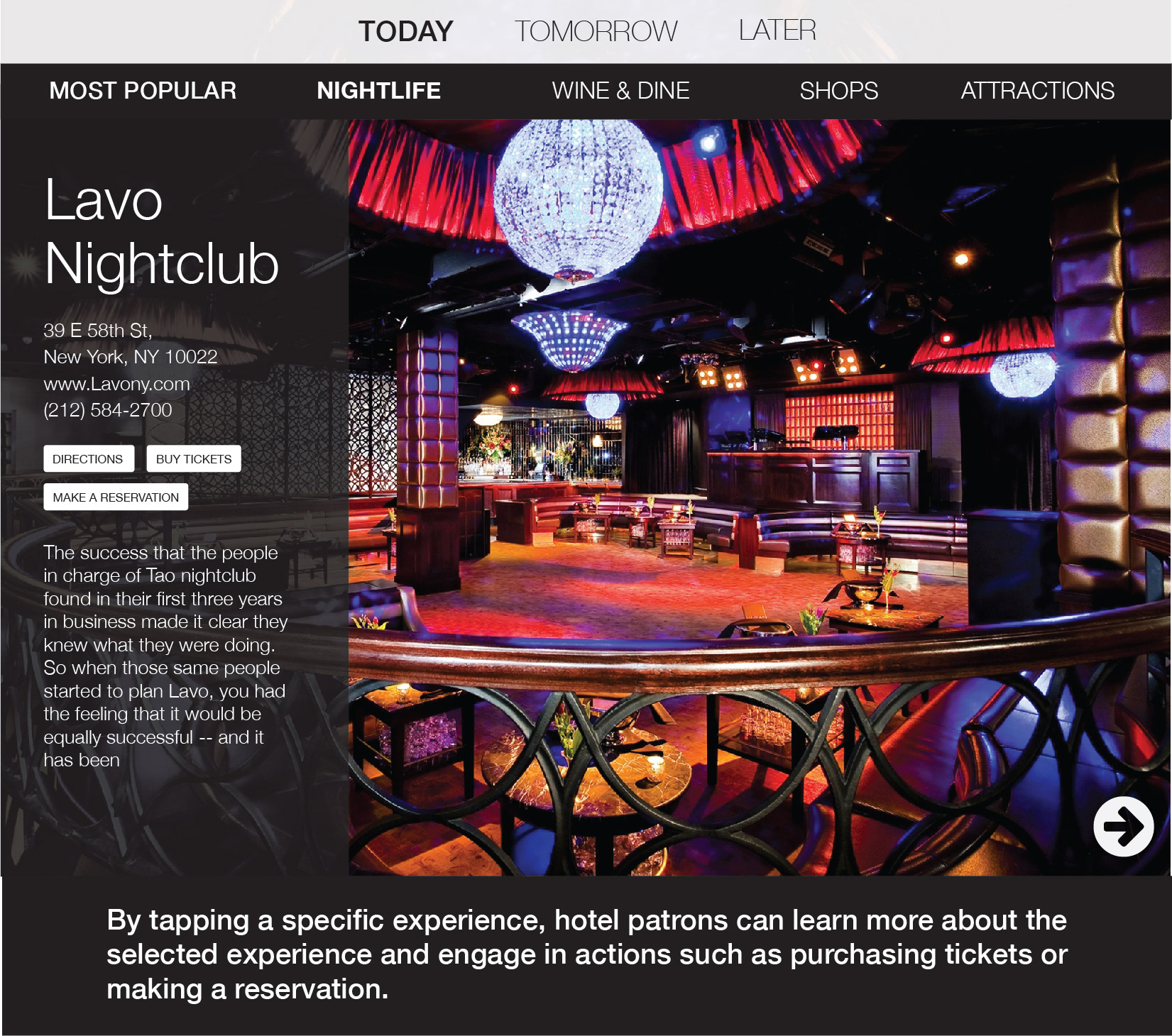
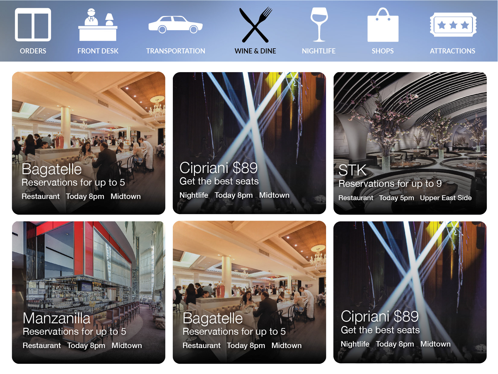
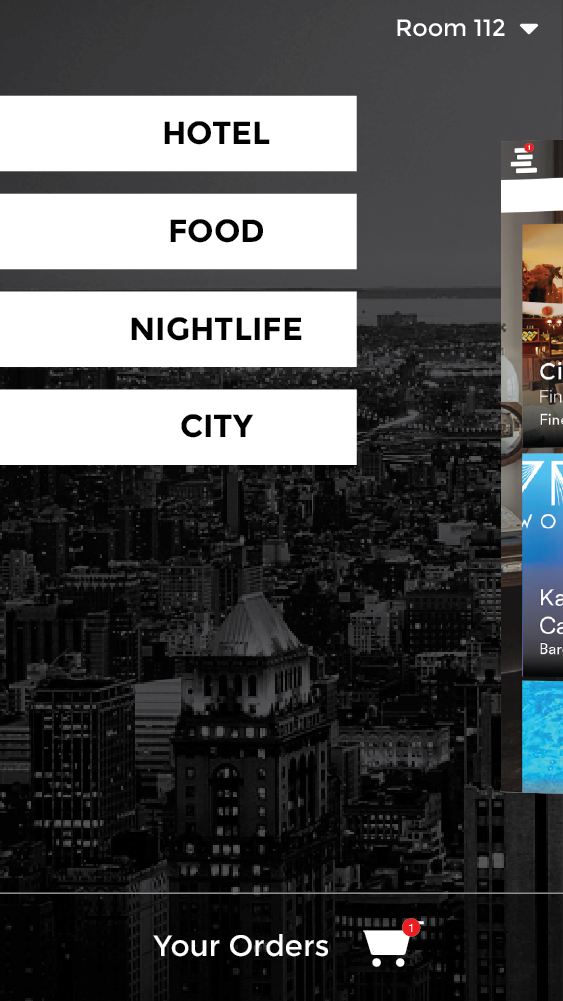
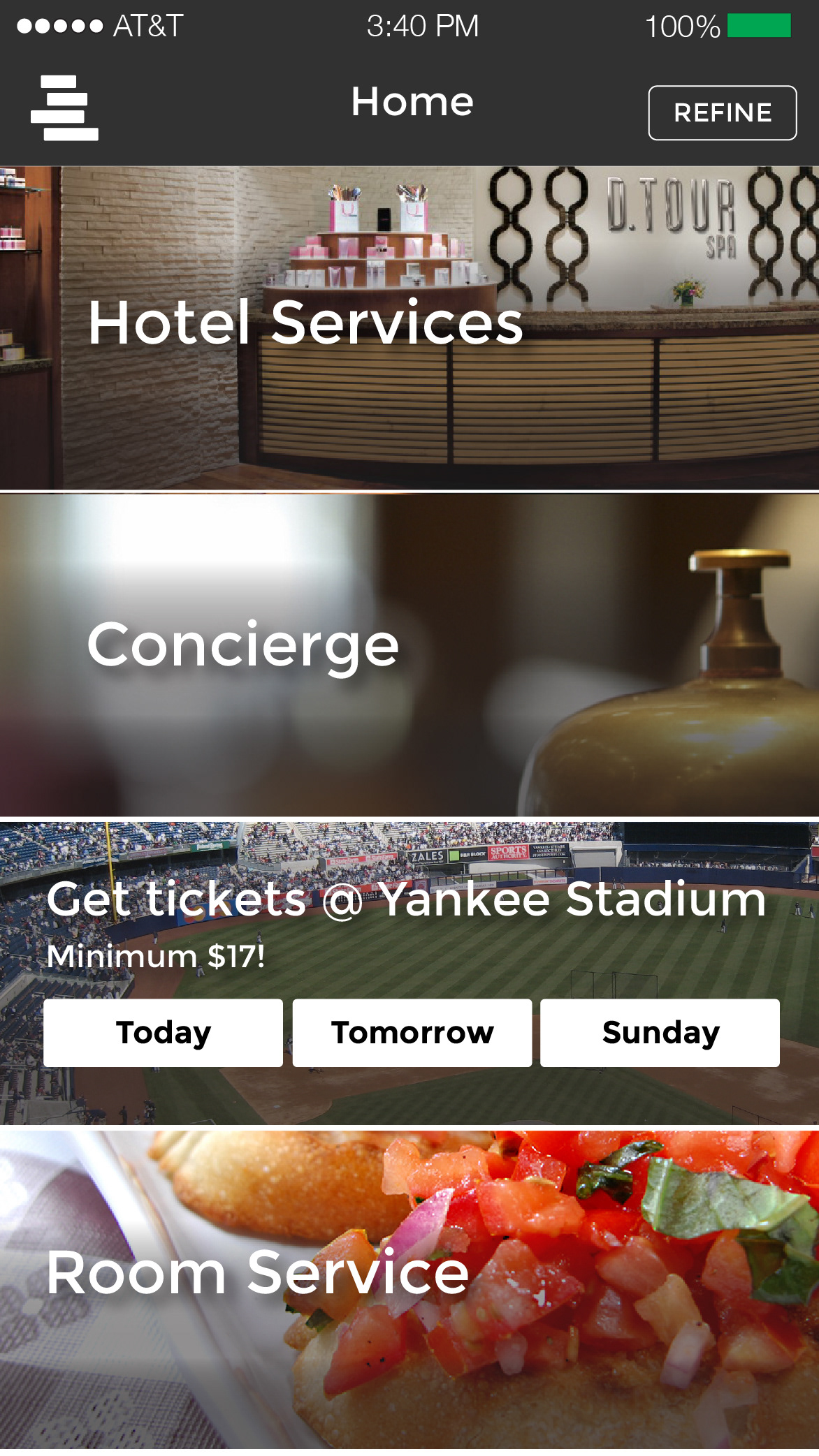
In the beginning, we wanted to simply do advertising in lobbies. There would be an ad for shop, restaurant, and the hotel guest can see the different options in the area.
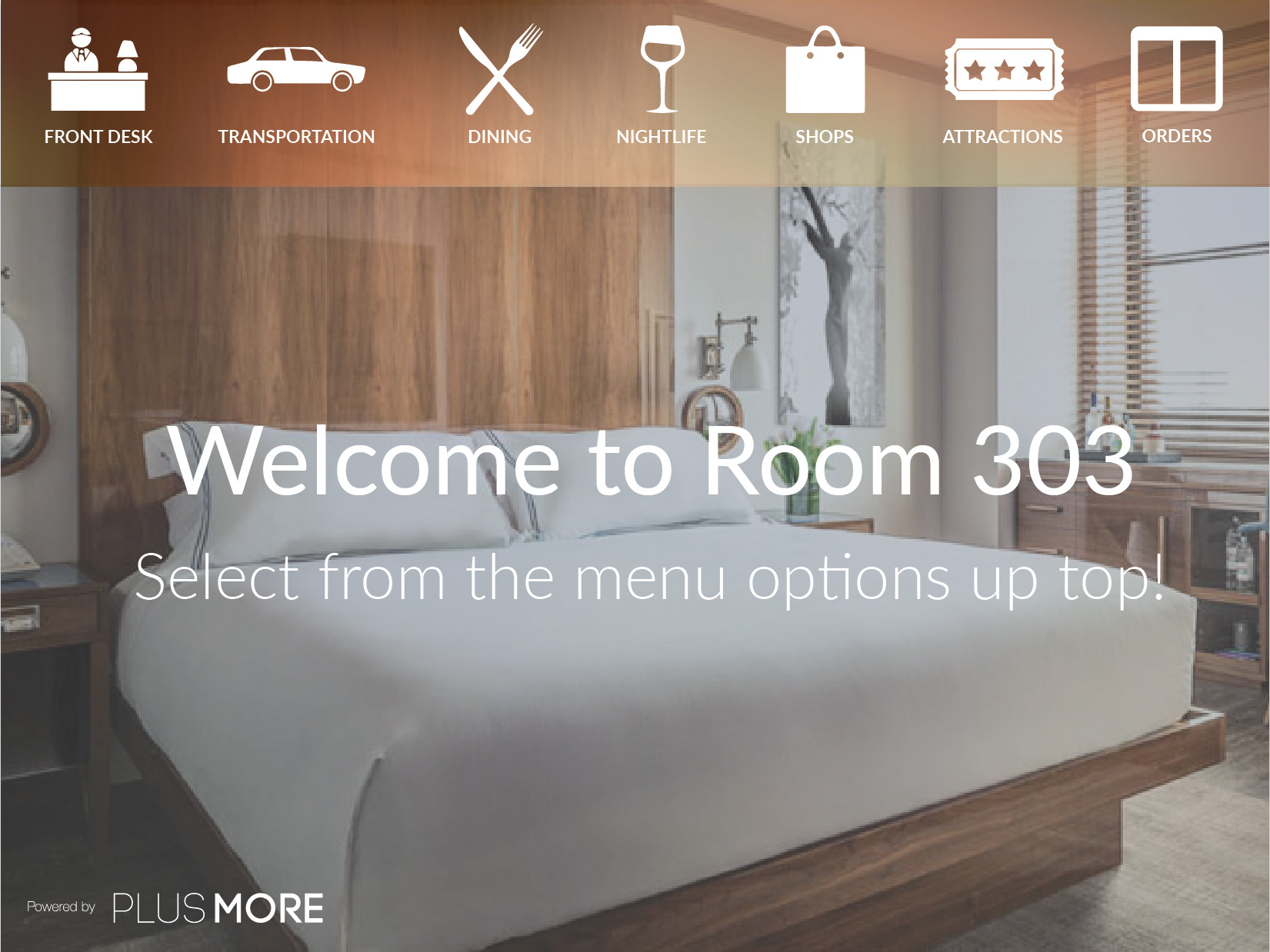
Then we asked a simple question, why not put these in their rooms? From there, we aimed to create a custom experience for the hotel guest. What they could do today, tomorrow, and throughout the week.
We put an ipad in the Hotel Hugo for a week. To our surprise, we received a 90% engagement rate with an MVP product
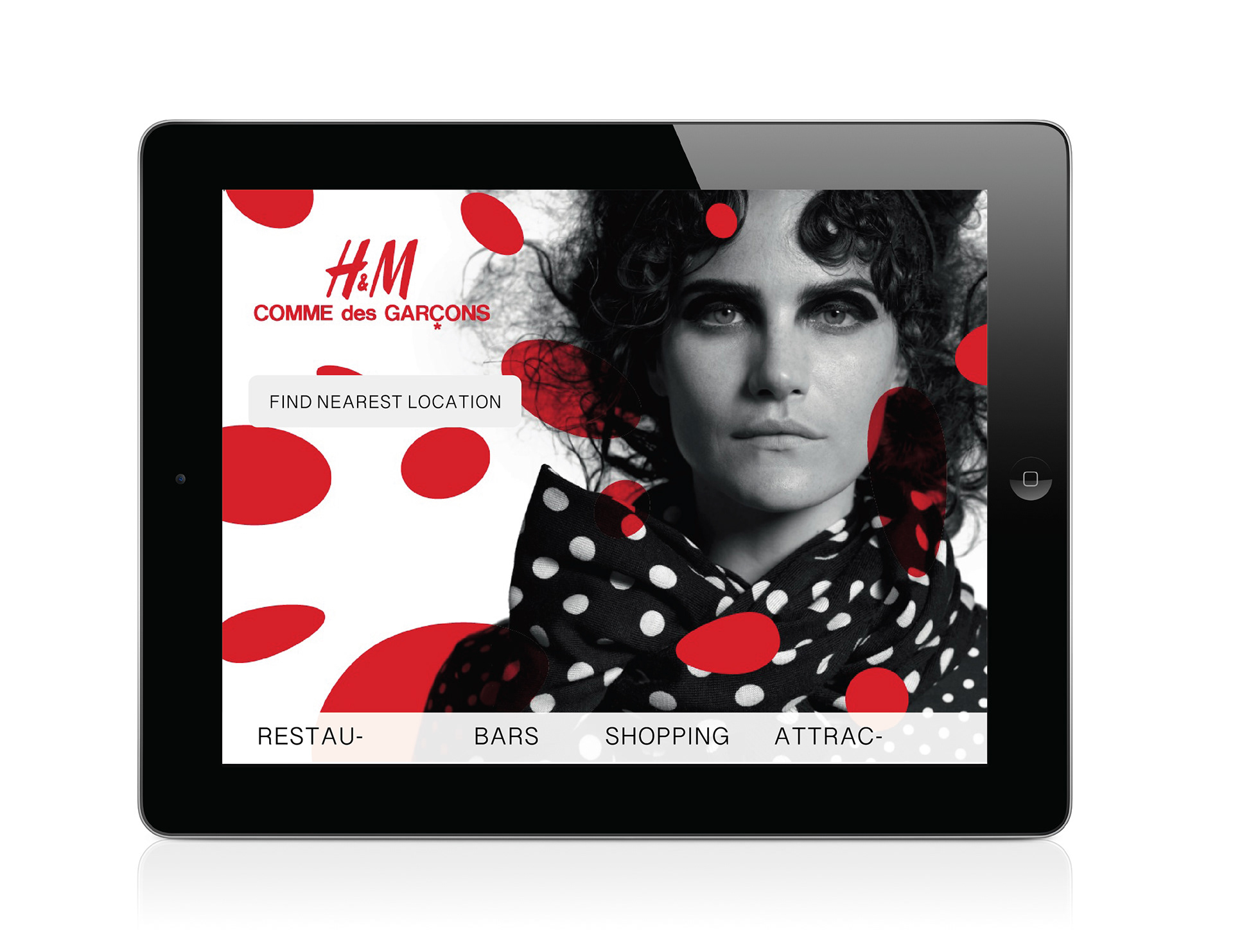
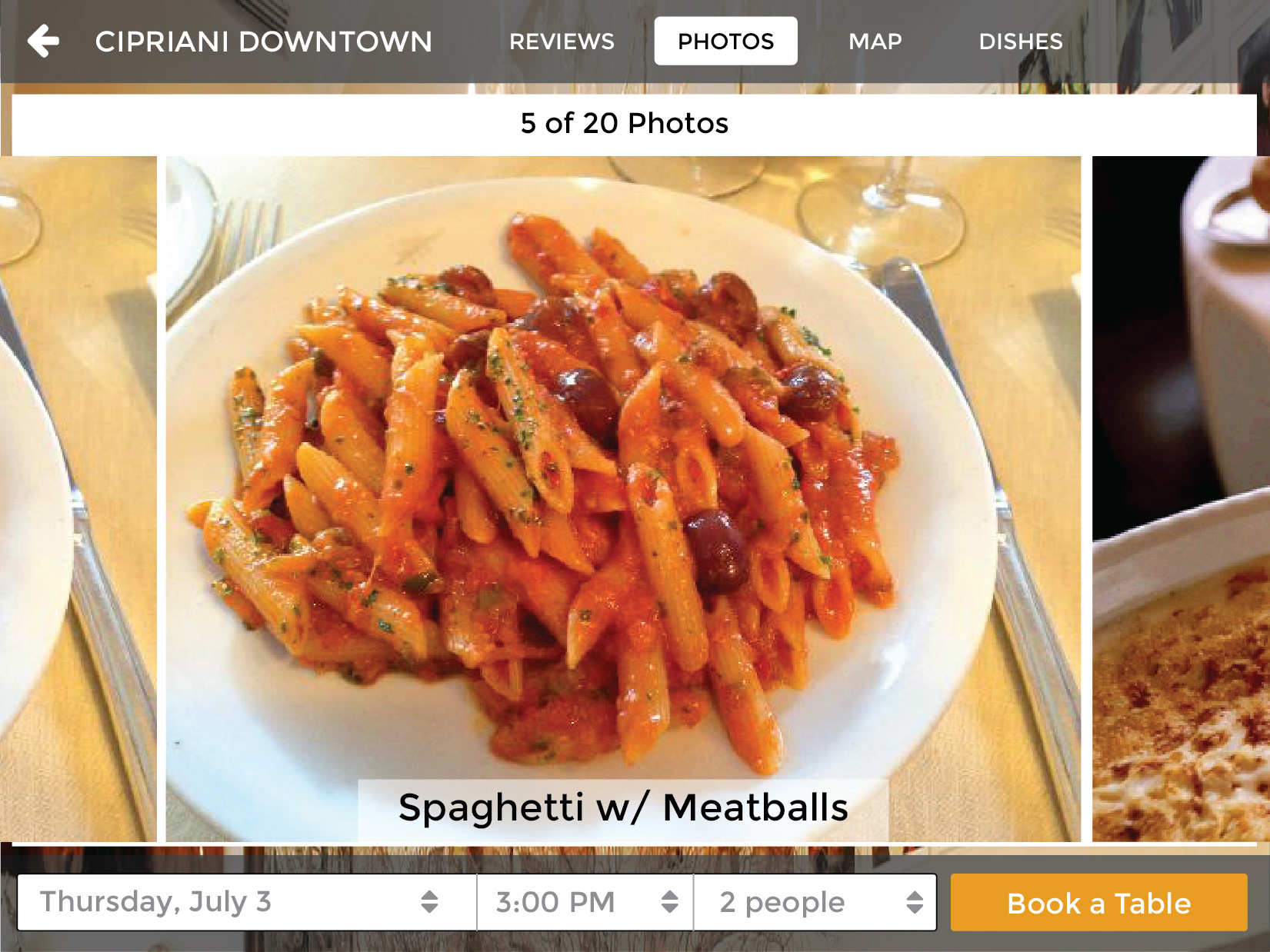
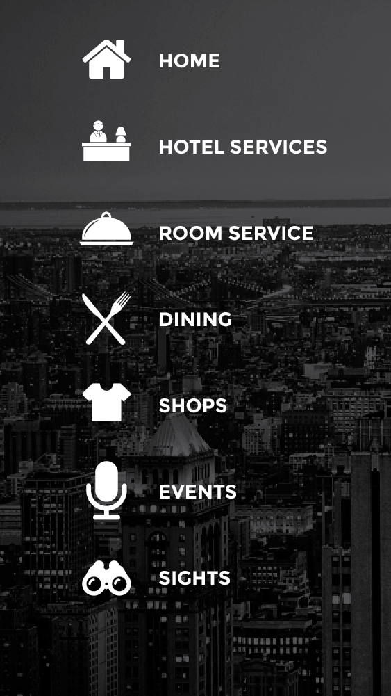
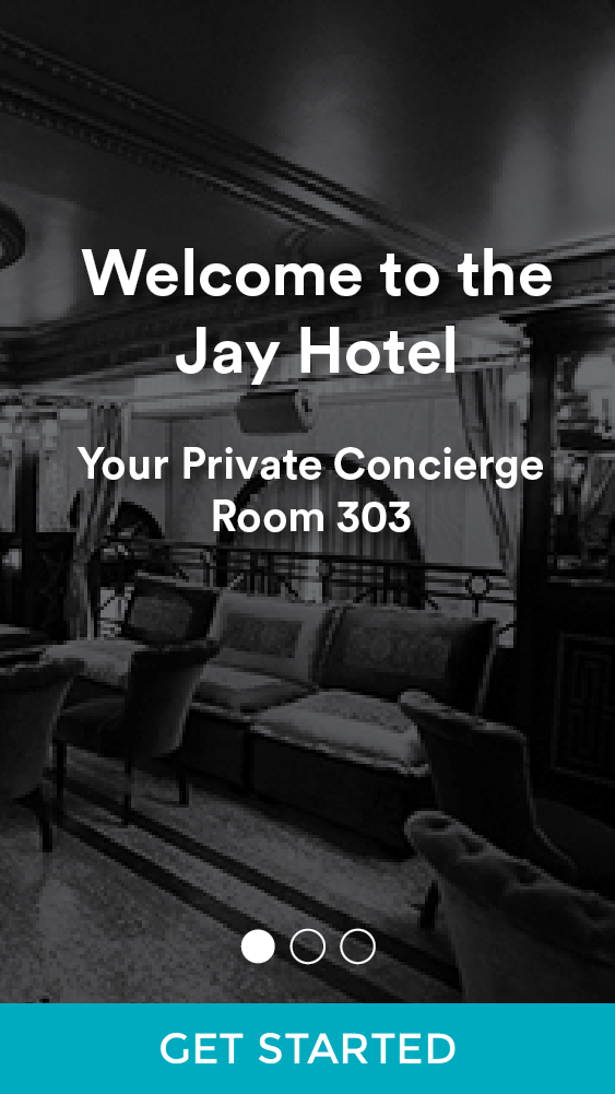
I began to design a custom experience for the hotel guest. I put "Welcome to room 303" right on the screen. Here, I made a blue background I would later remove. Pages now have large icons.
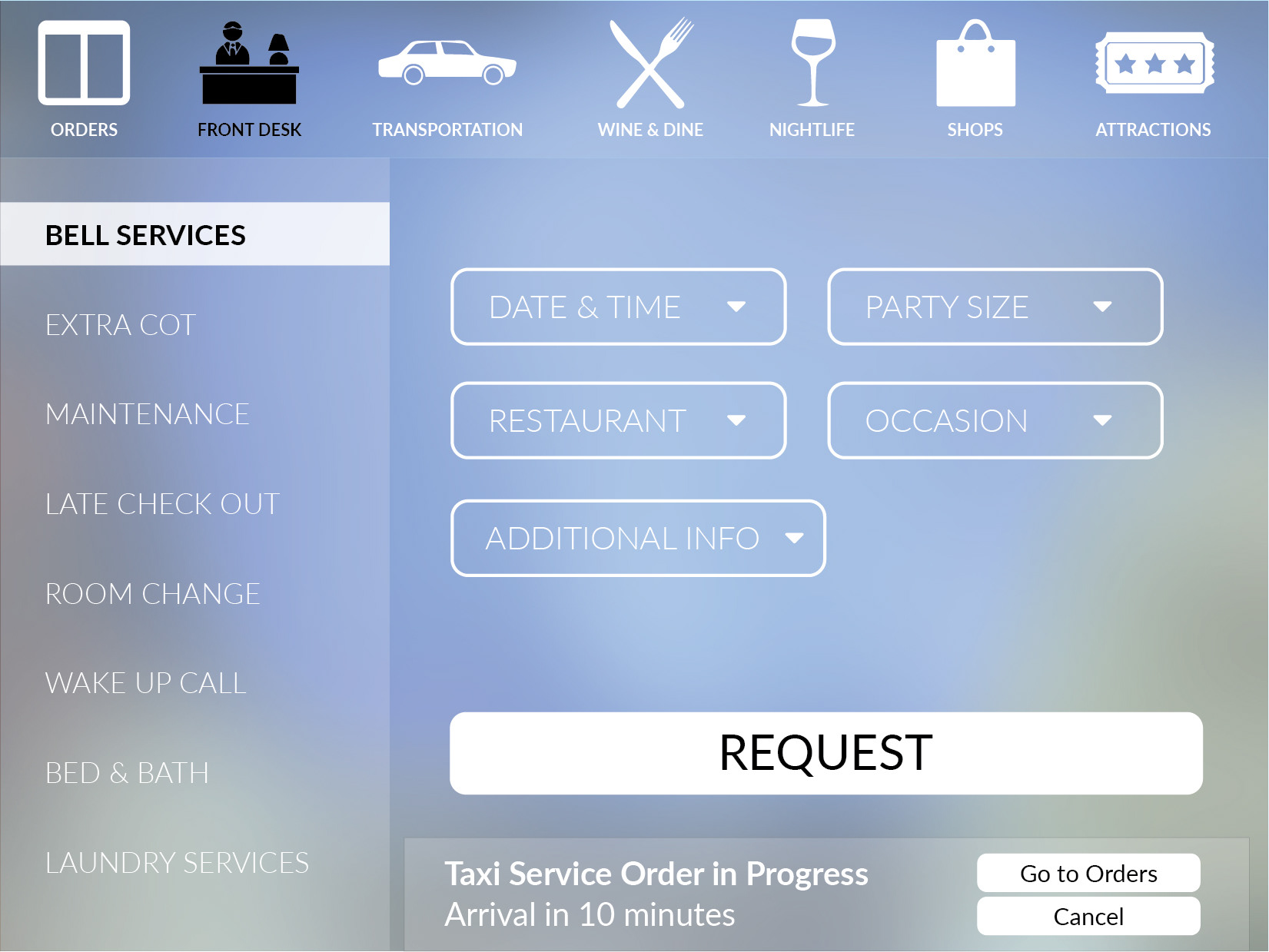
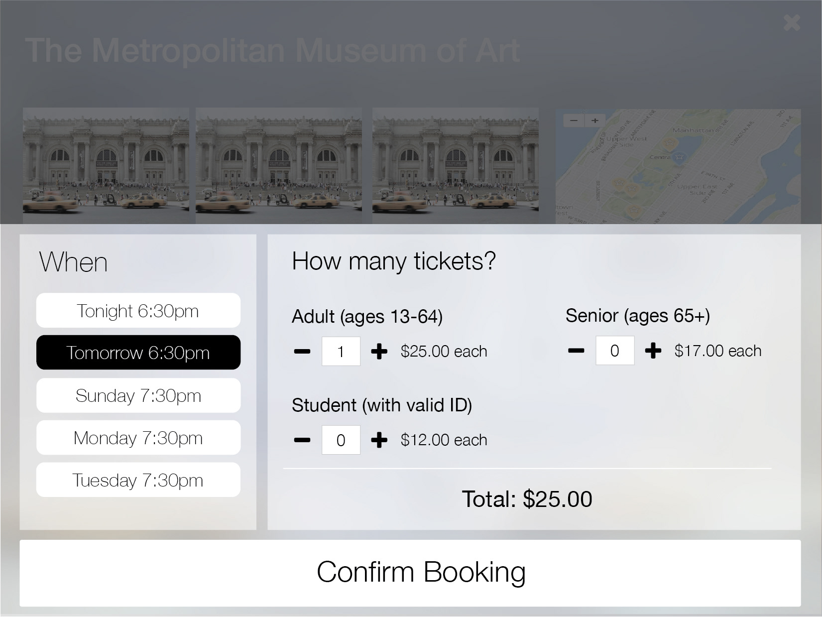
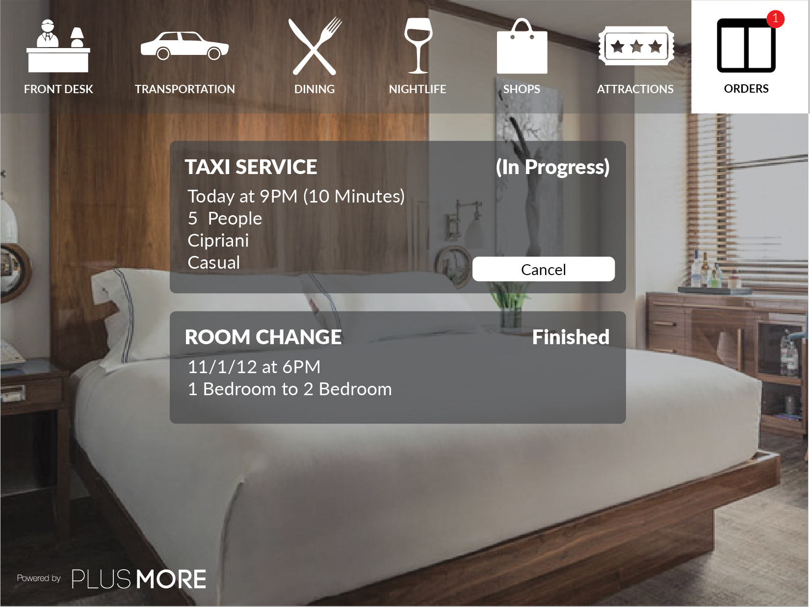
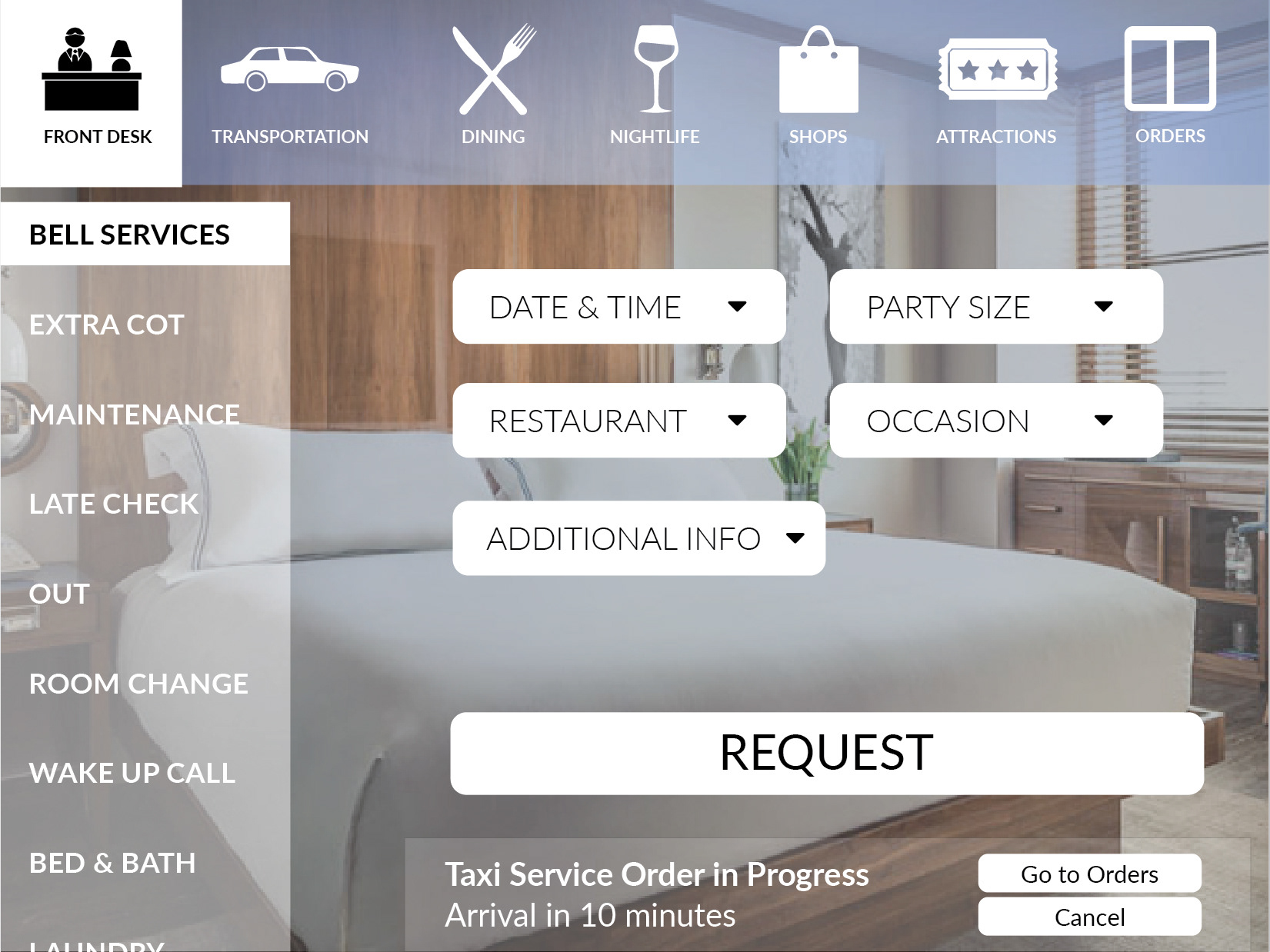
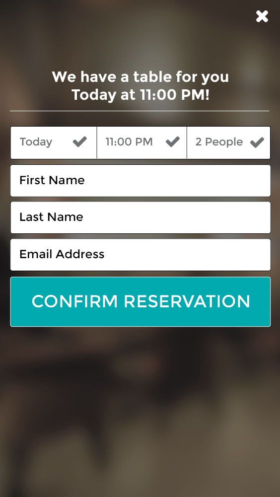
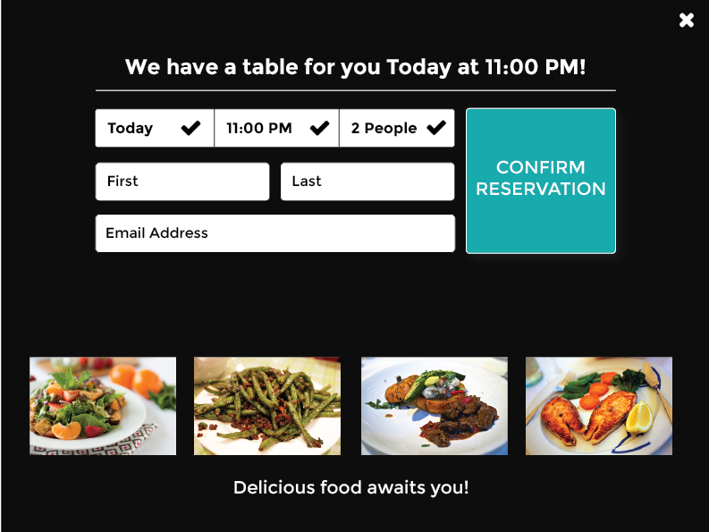
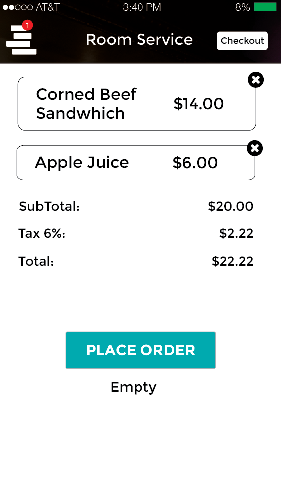
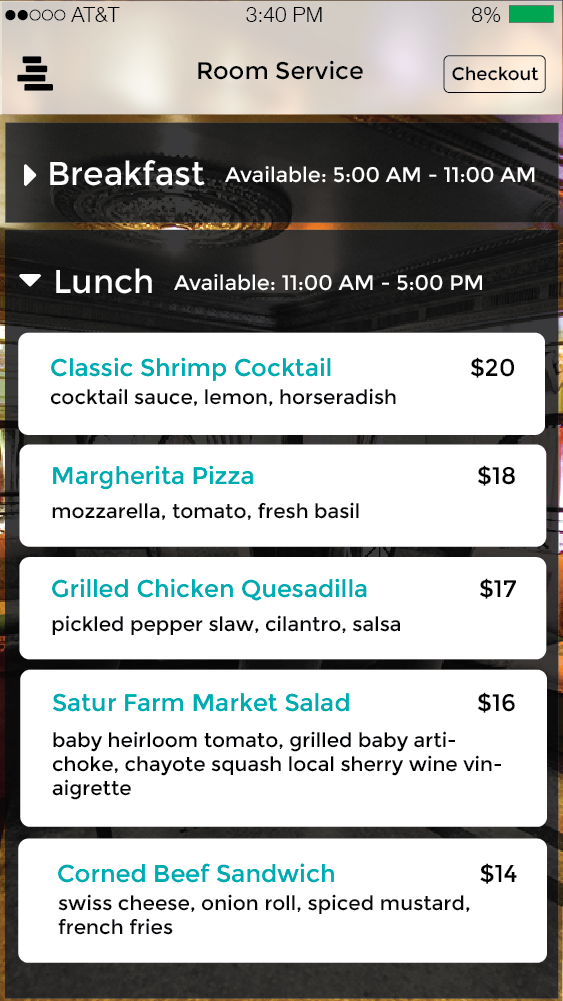
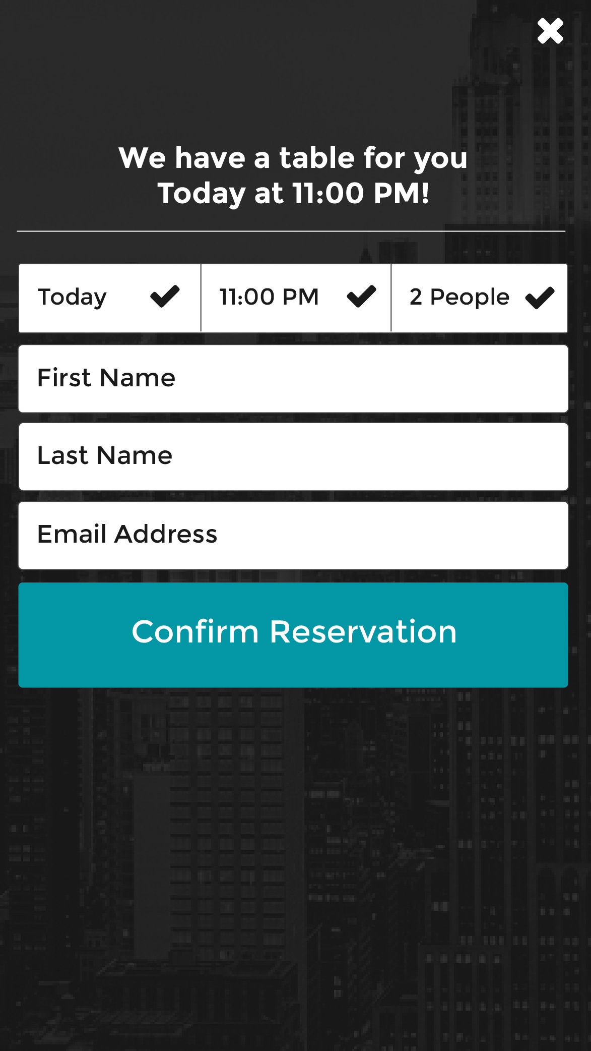
We decided to go all in on room service by having a bell service feature. We also decided to add the ability of making reservations from within the app.
People always asked us why would someone use the tablet in the room to make reservations when they could just use an app on their phone they already have?
The answer was simple, people feel the hotel is special and they trust it. It's the magic of the hotel, in that people trust it over any random app. The hotel knows the area the best right?


Here I tried, multiple colors for the top nav. I am headed to a more "naked" direction. I always try to let the content be the main attraction.
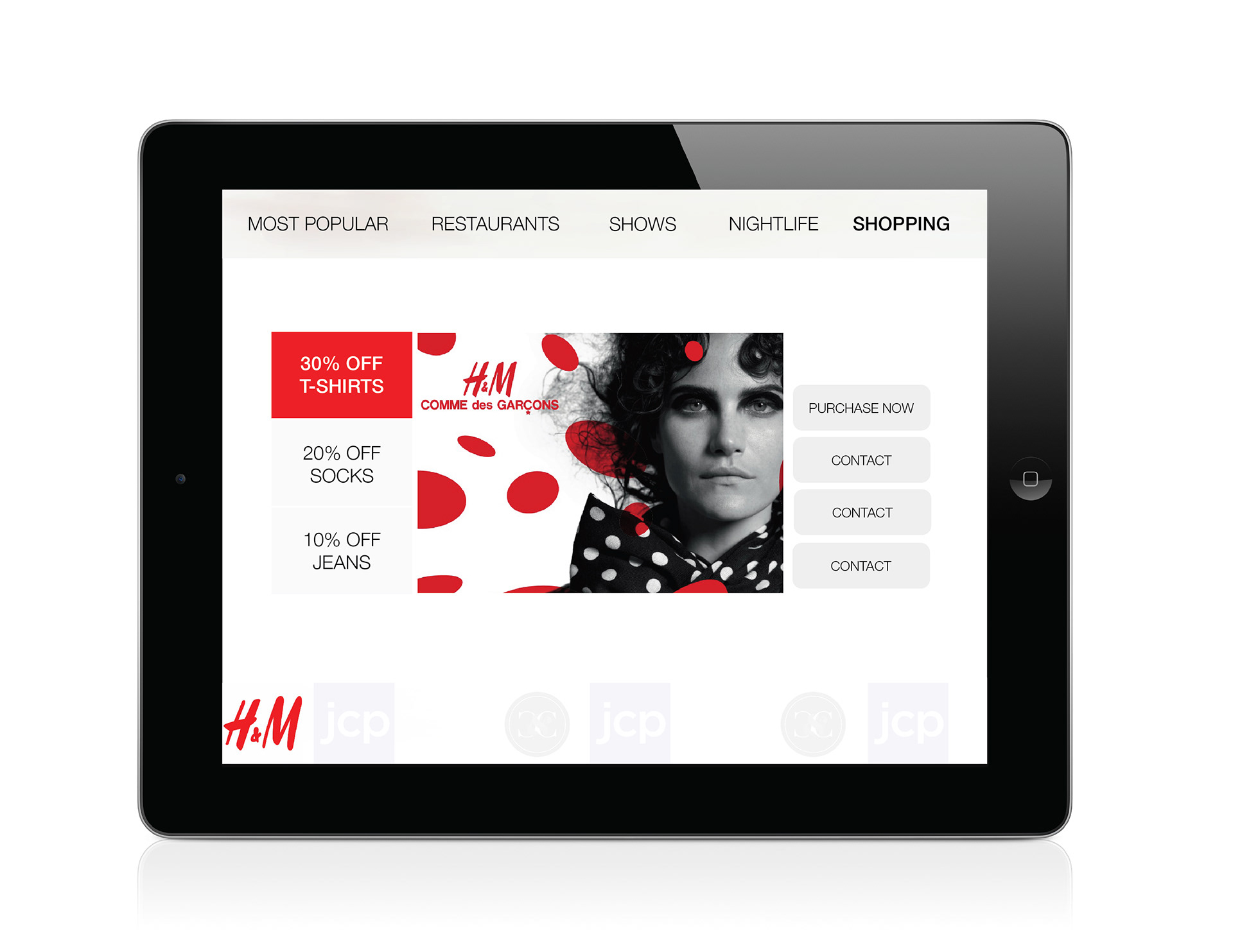
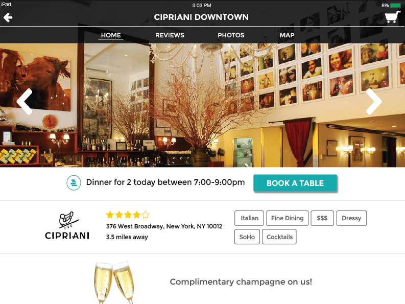
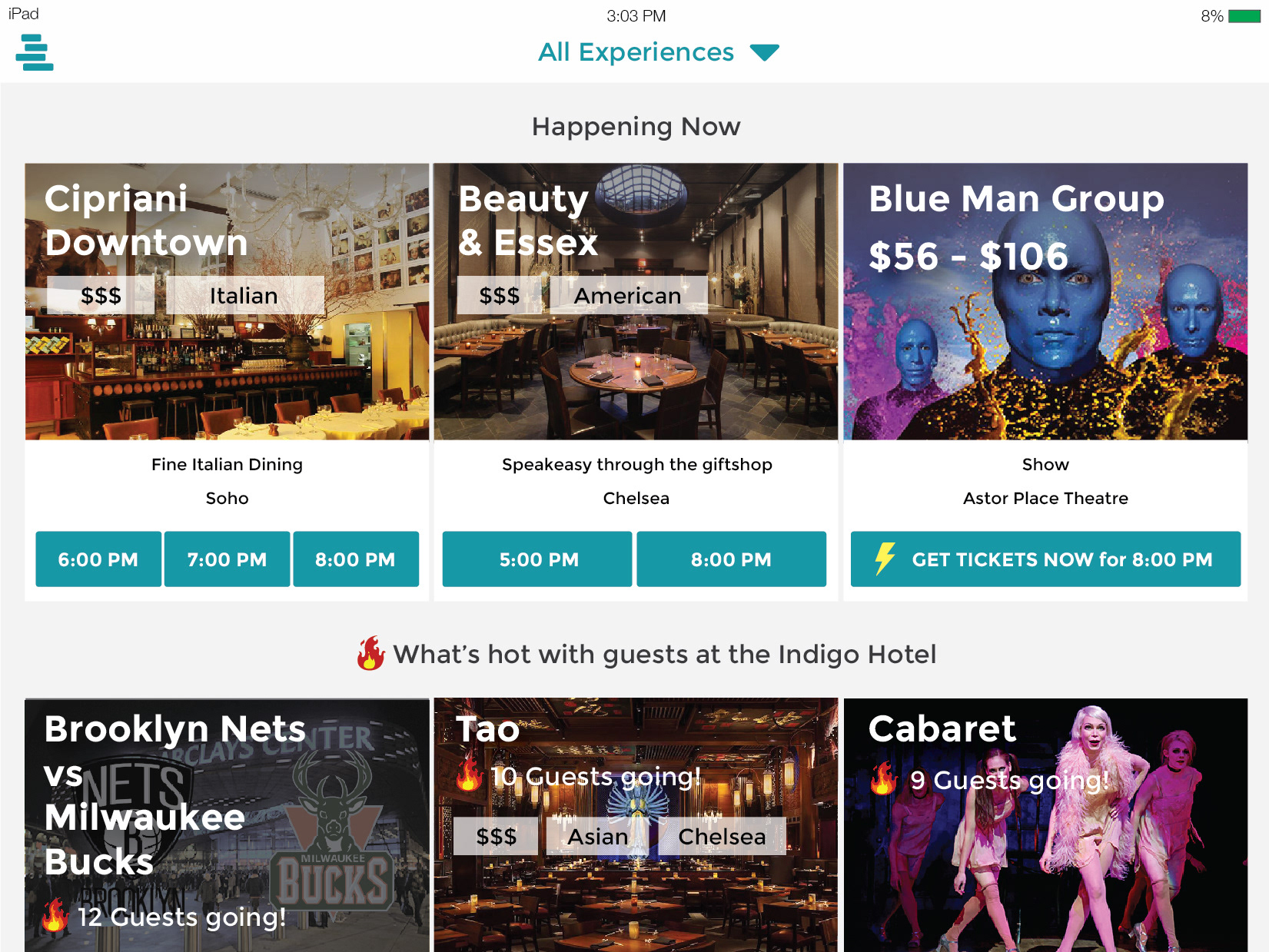
I remove the blue entirely and add a boxed design. You can see the special perks plusmore provides, reviews, address, all on the restaurant homepage.

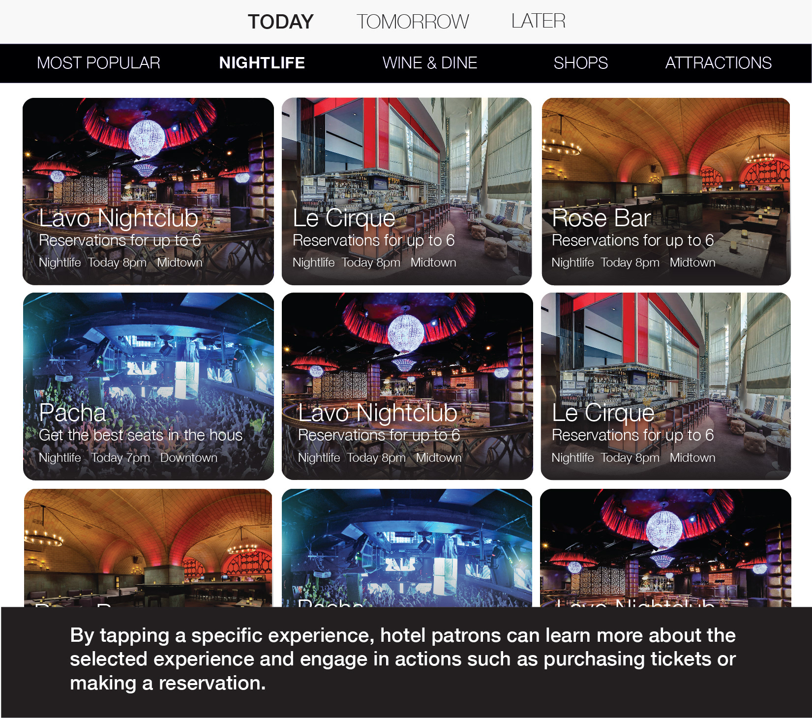
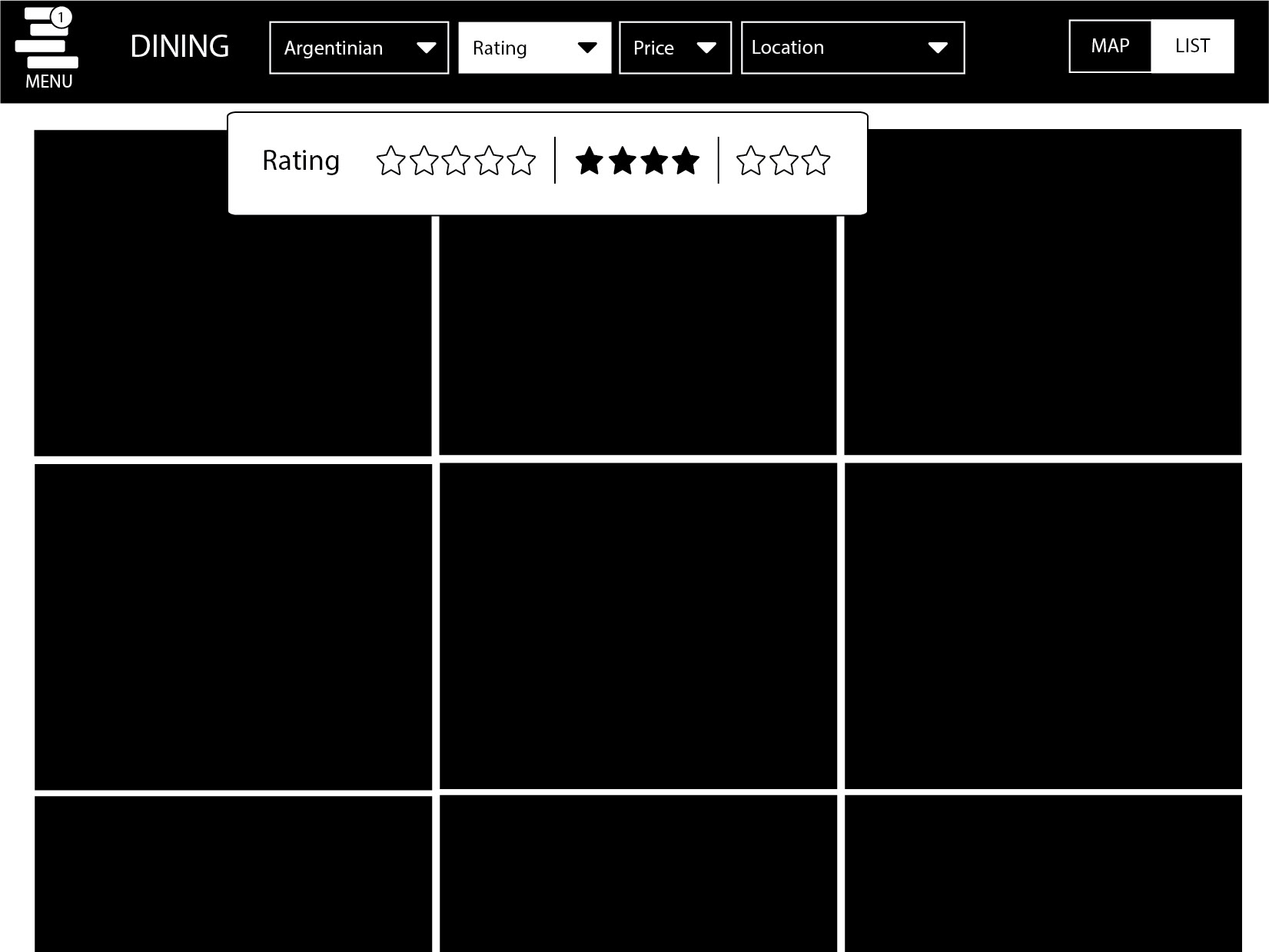
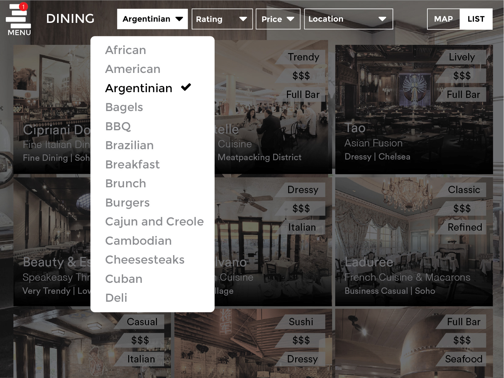
Now I asked myself another question, what if the user could filter in the top nav? I created a wireframe and then a mockup of this design. I also add a map/list toggle. The logo I designed is also used as the hamburger icon, reinforcing the brand.

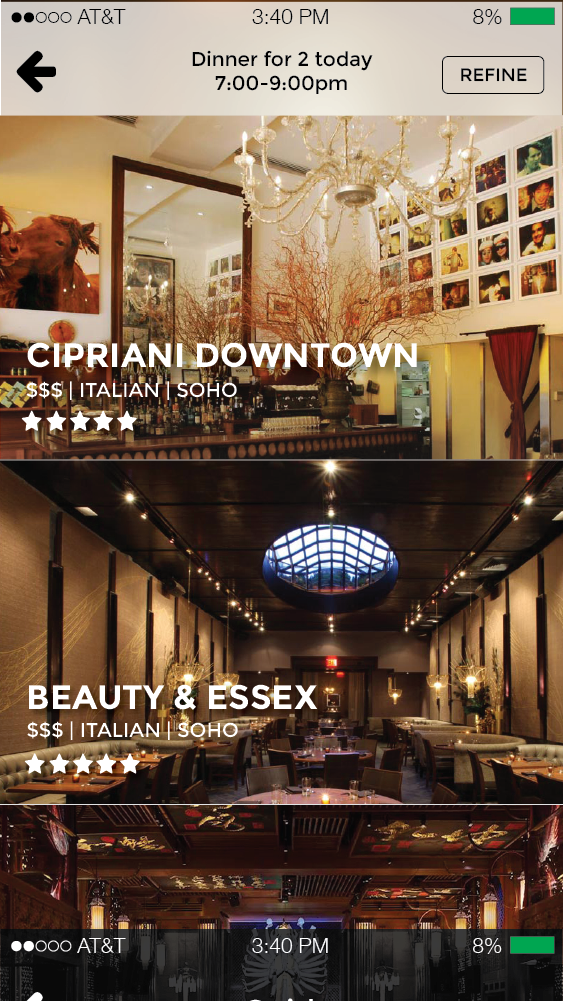
After discussion with the team , we came to the conclusion that we should have a white design, and a black for both phone and tablet. Why just have PlusMore the tablet in the room? Why not have users be able to use it when they leave the room? So, I technically did four different designs for the same app on different devices.
The feeling of the app was coming together as well. I wanted it to be fancy, professional, and fun. I didn't want it to be intimidating or look cheap, a common trap to fall in.
Tablet Design
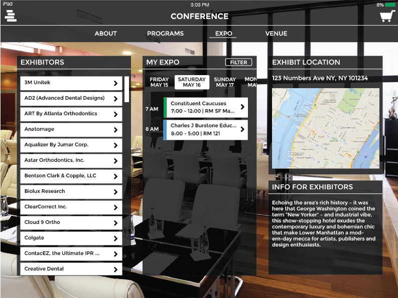
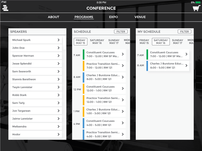
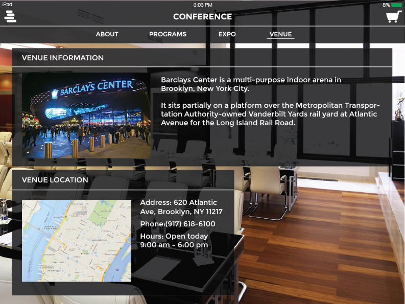
We had thousands of ideas. The amount of possibilities with the app were endless. What if the guest had a conference? Well now they can view information of the conference within plusmore. I designed an entire conference section with a schedule.
Multiple menu mobile dark designs

Room Service feature and Welcome page with black and white design combined.
Events now had a giant CTA with times built in.
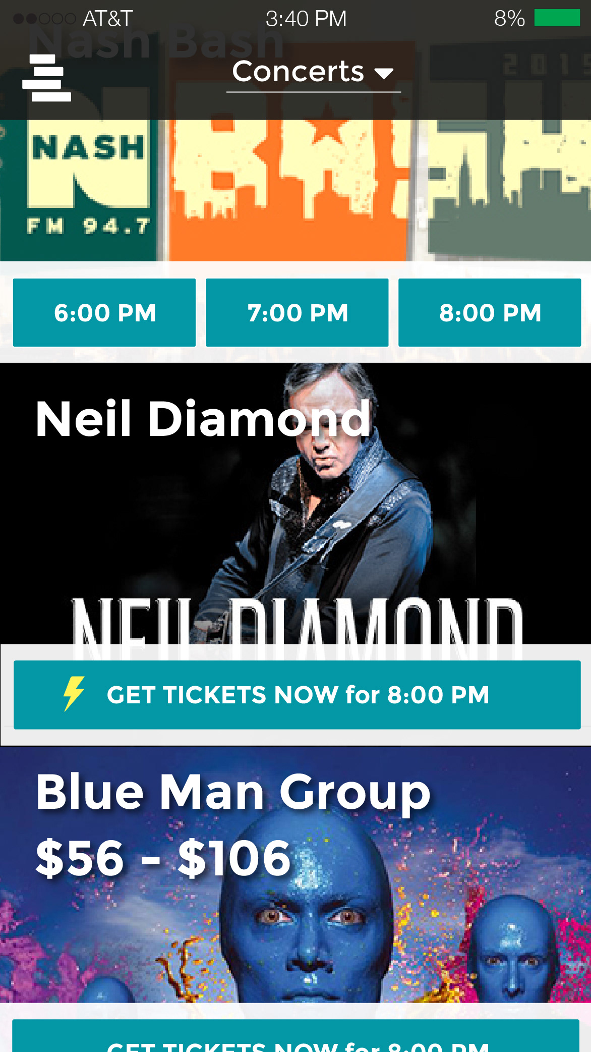


Putting "Welcome to Plusmore" was important for us. We wanted to advertise our brand, not just the hotels

Backend
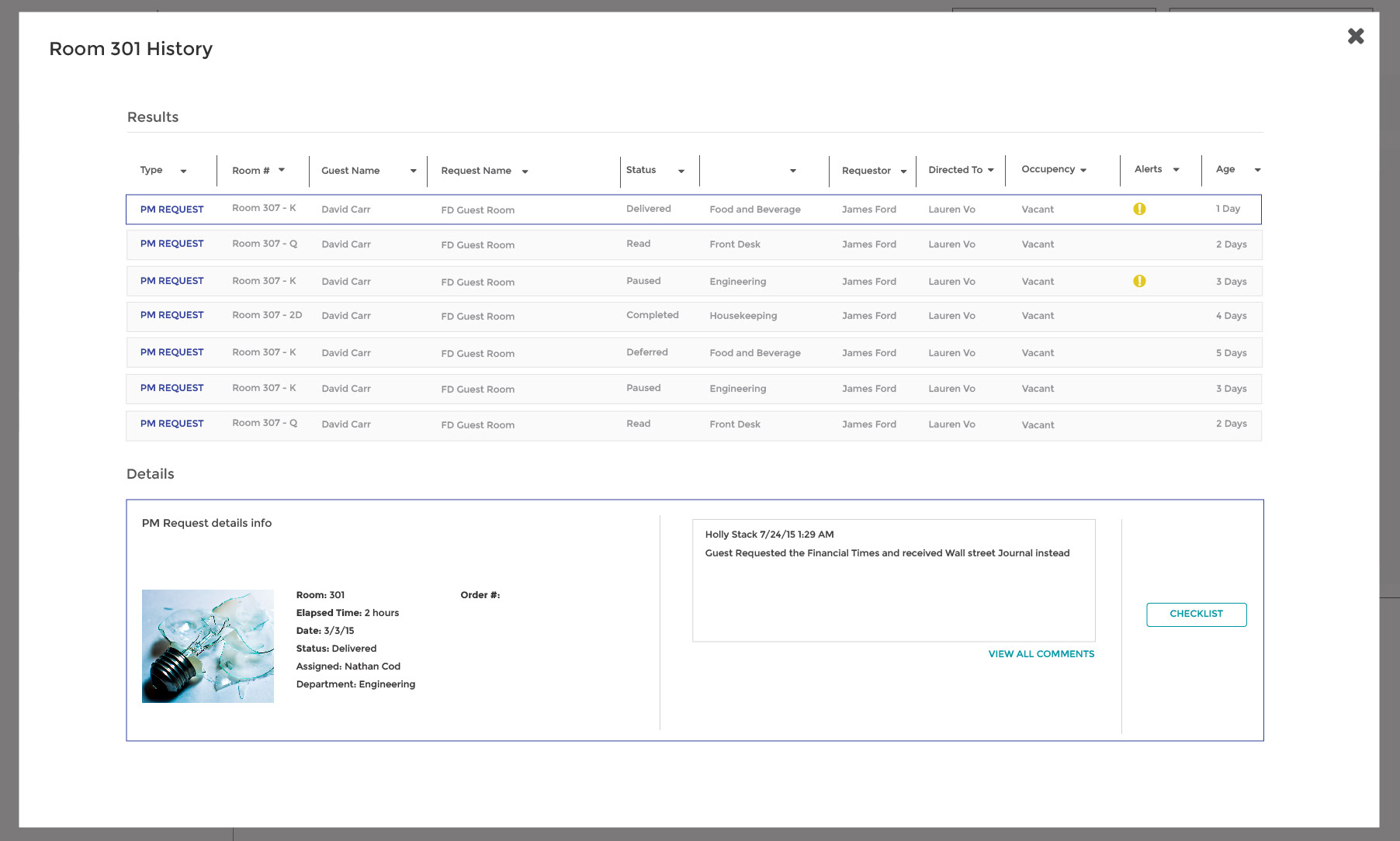
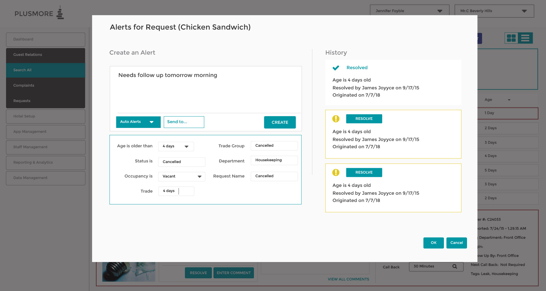
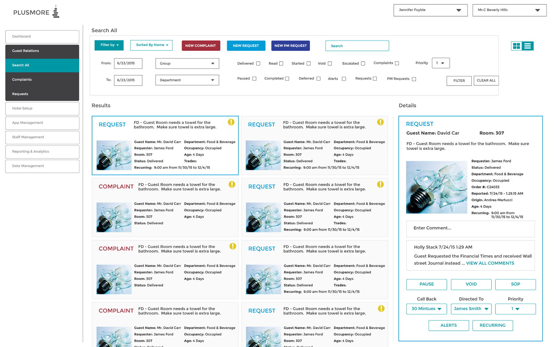
After finishing the guest based interface, we decided to design a backend for the hotel. Hotels are incredibly inefficient, and we saw they were still using 90s era software to organize all guest requests.
Creating a modern system would save hotels hours upon hours of time and work.
I spoke the manager of Indigo Hotel about what their needs were. They had a lot. They wanted information on what rooms guests stayed in, and what their requests were. They also wanted to organize how issues and requests of each room and guest
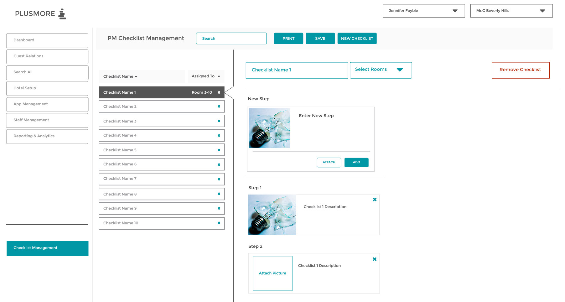
The manager could filter based on complaints, and requests. For example, a complaint would the lightbulb was broken. A request would be for a burger. The manager can see all the rooms and users of said requests. Organizing all this data to look seamless was a task.
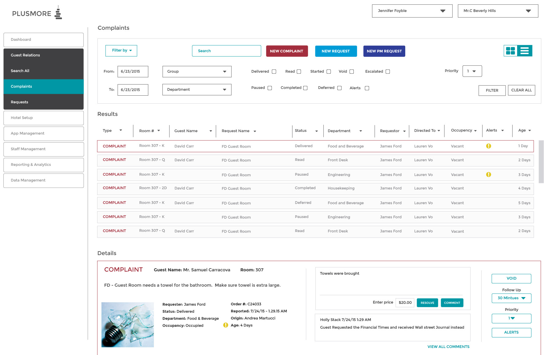

The manager can also view the history of a specific room and leave comments

If a new room was created, the manager could select New Area to add that new room.


The manager can now view all the rooms and see which ones the housekeepers made ready for that day. Grey means the room is unoccupied, green means the room is ready

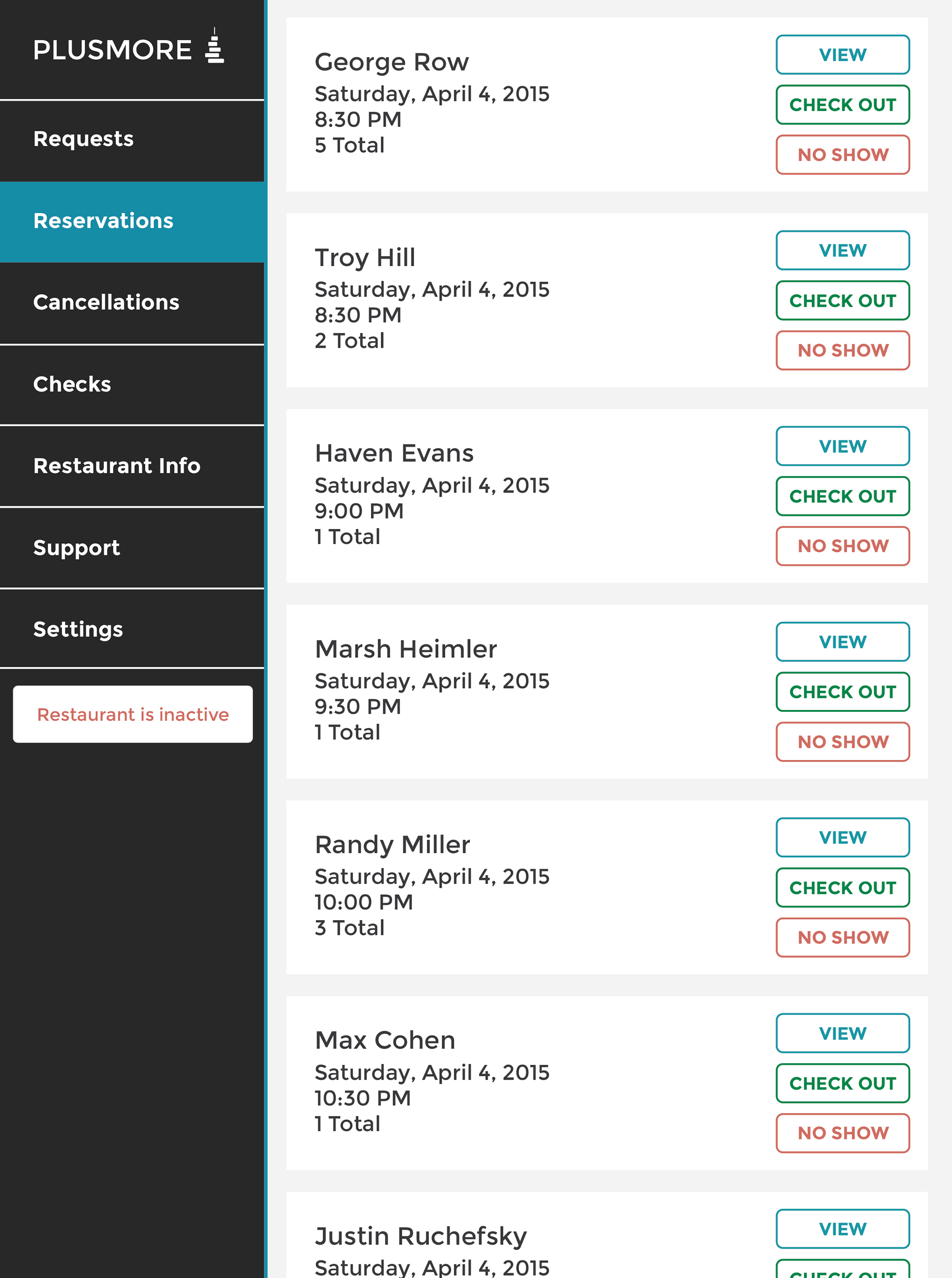
Restaurant Backend
If the guest was going to make reservations with plusmore, the restaurant needed PlusMore software as well to receive the orders. So I designed an entire UX specifically for the restaurant.
An entire wireframe for the Hotel process.
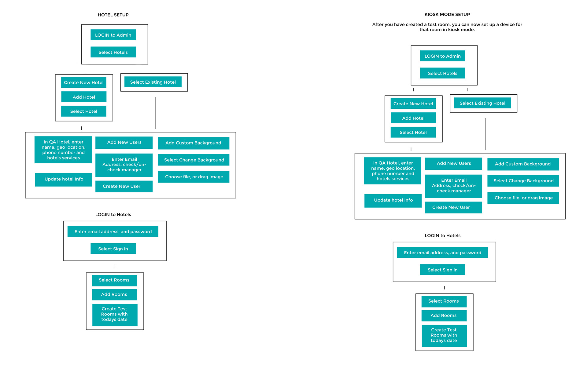
PlusMore was always constantly changing and evolving. As a result, the architecture of the site was always fragmented because one new idea would radically change the entire design. Creating mock ups of the screens proved to be a more effective way of communicating ideas to my teammates.
LOGO

To do a logo right, you need months. As you learn what your startup is, your branding and visual identity will adapt with it. A good designer can anticipate where the company might go, so that the logo doesn’t alienate future identities.